

Tripway • Design Proposal • 2023
Streamlining shared travel expenses
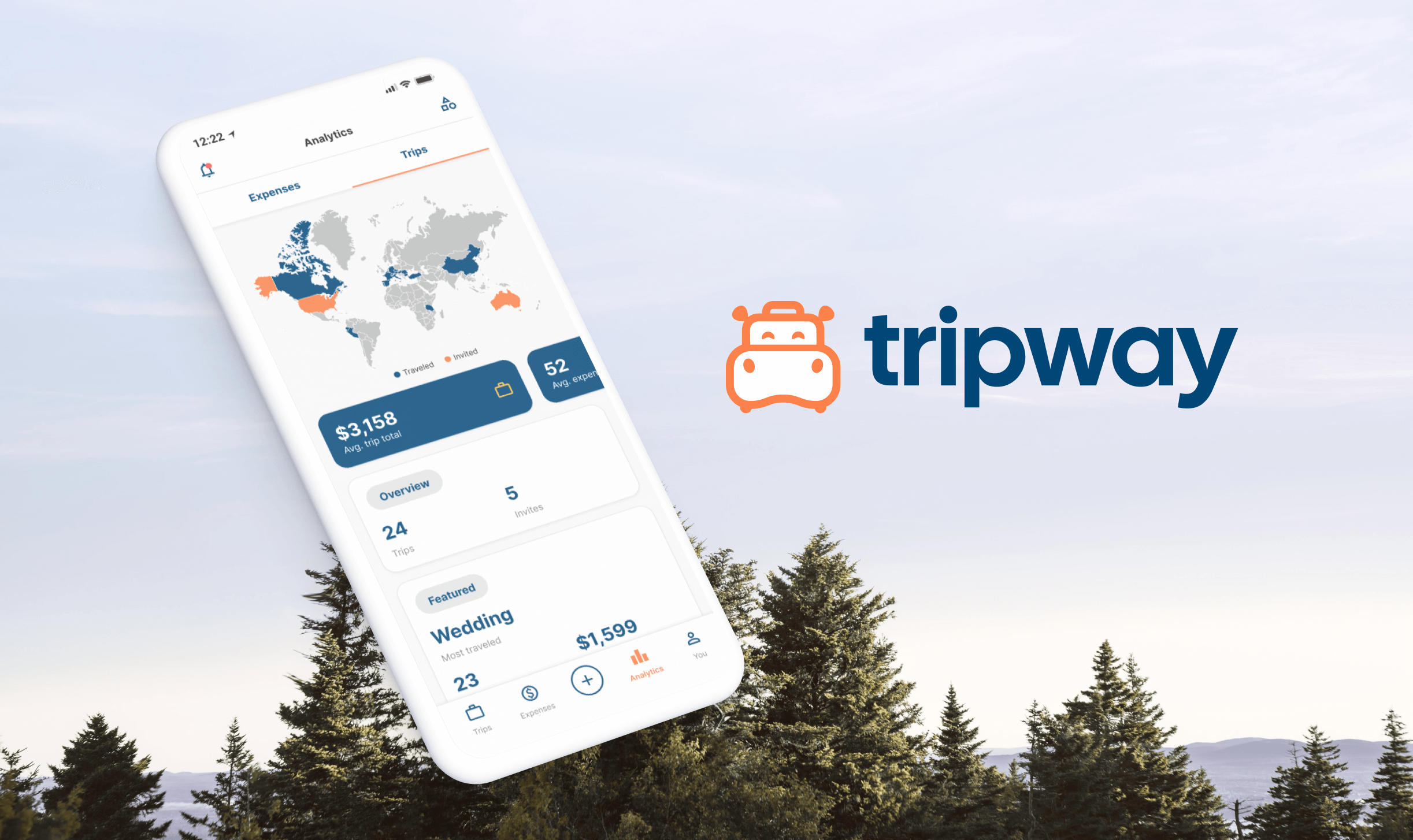
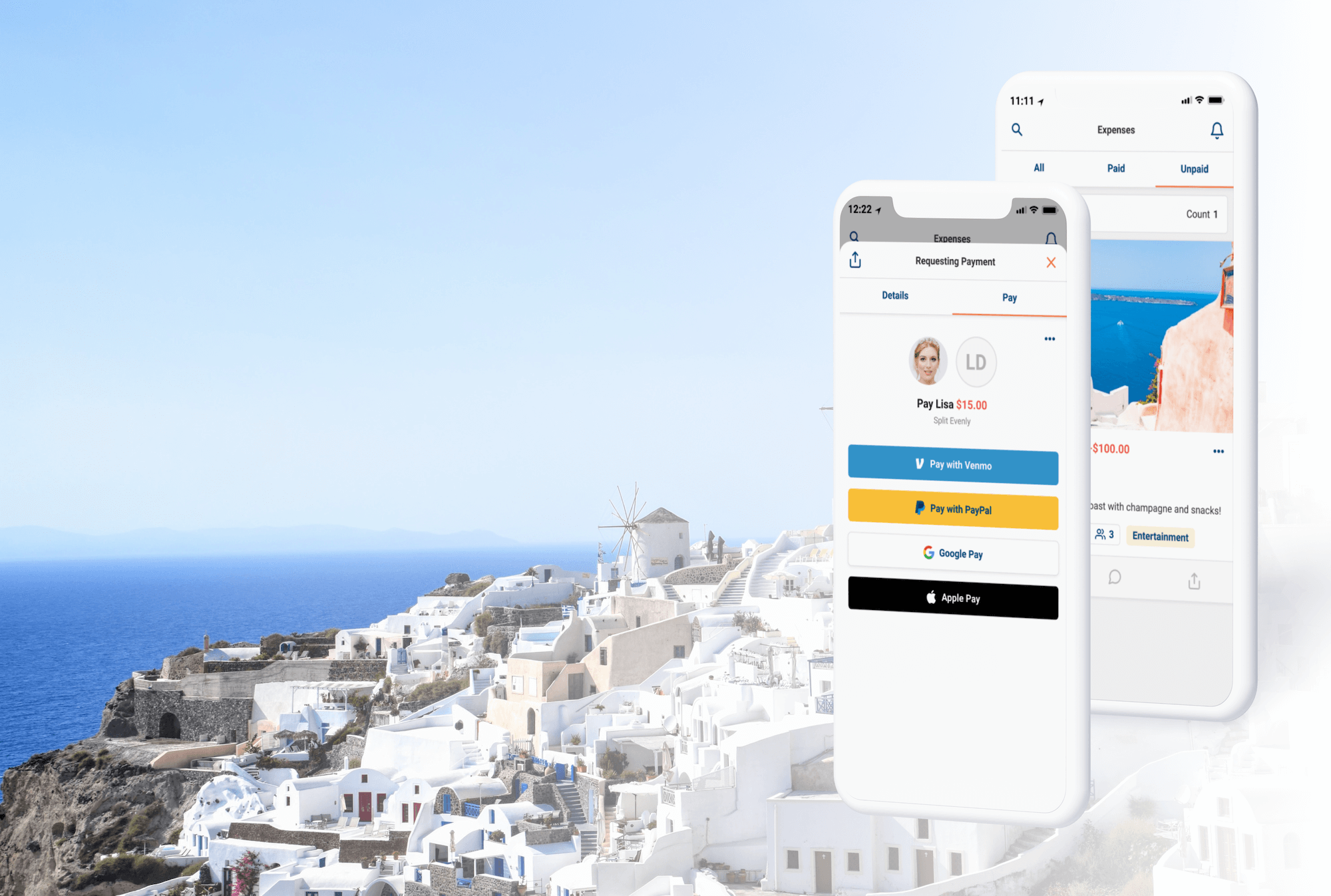
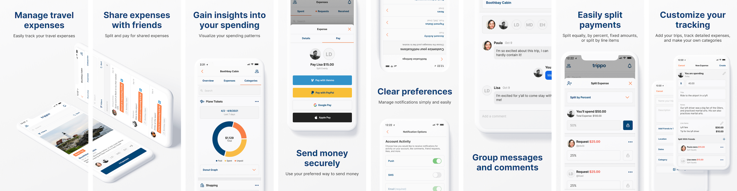
Tripway helps you track your travel expenses, split payments with friends, and gain insight into your travel spending patterns. Keep track of who owes what, how much you've paid for different trip and expense categories, and make payments to friends and family through your trusted payment service, like Venmo or PayPal.
0:00 / 0:00

Problem
It is difficult and time-consuming to track travel expenses with friends, and calculating expense splits can be tricky. If expenses are kept in an external document, it takes a lot of back and forth to sync payments, requests, etc. Additionally, there is not an easy way to identify spending patterns, view travel insights, and learn about your spending.
Proposal
Design a mobile app to help users track and split travel spending. This app needs to have a defined data structure and a seamless user experience. Along with the app there needs to be a brand, custom assets and animations, and a frontend marketing website.
Impact & outcomes
This comprehensive design proposal resolves the friction of group travel finance, delivering a cohesive brand and product ecosystem that transforms complex expense splitting into an intuitive and stress-free experience.
Complete design
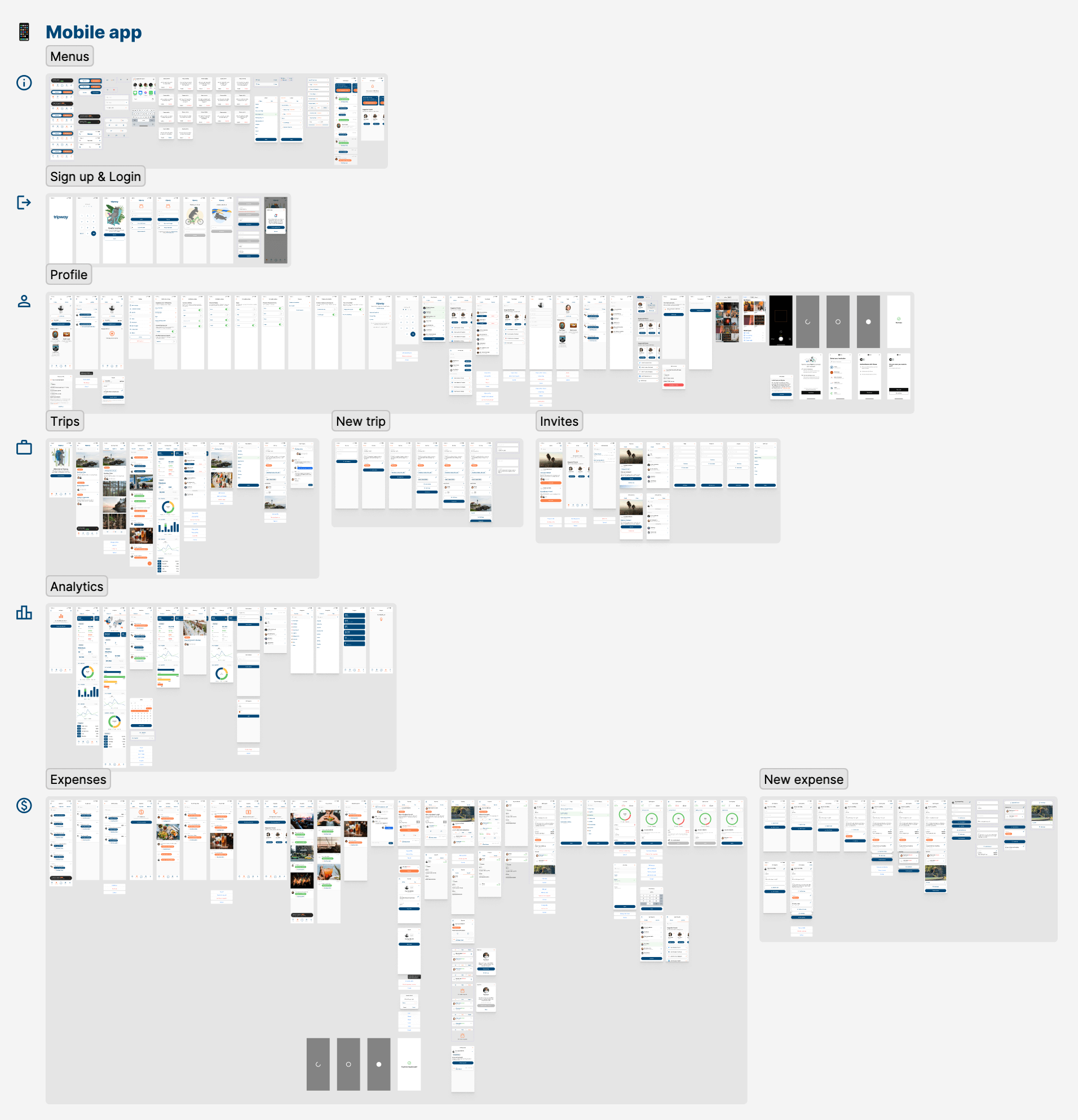
Fully designed and prototyped app, from sign up and getting started, to tracking payments and splitting expenses.
Brand & marketing
Complete brand and website design, from logo and brand guidelines, to animations and copy.
Actionable data
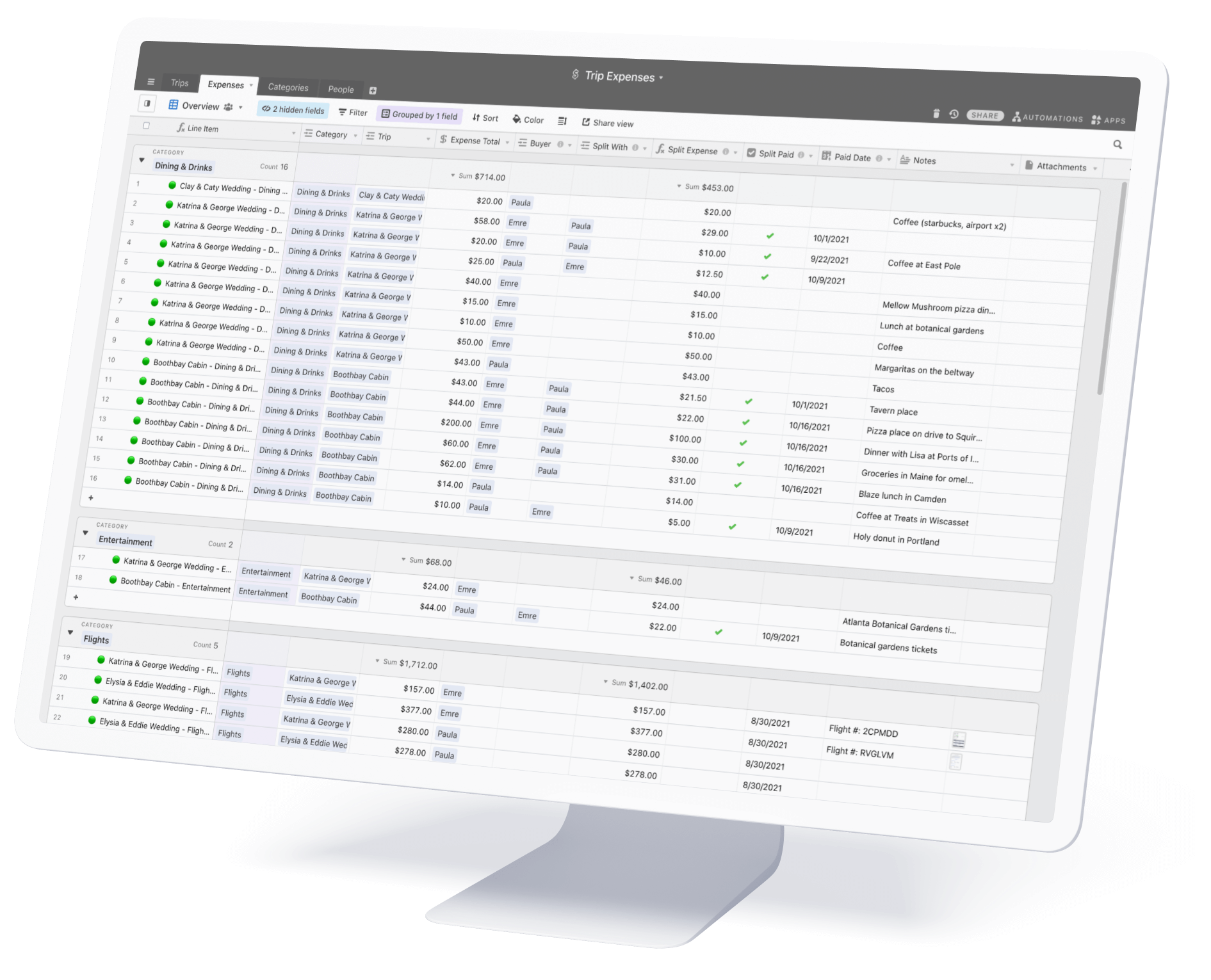
Mapping out the relation between data points, what inputs are necessary, and how data is stored was an important step in setting up the conceptual foundation of the user interface. This provided a way to put a view on the data, which streamlined the product requirements and clearly outlined the organization of the app.
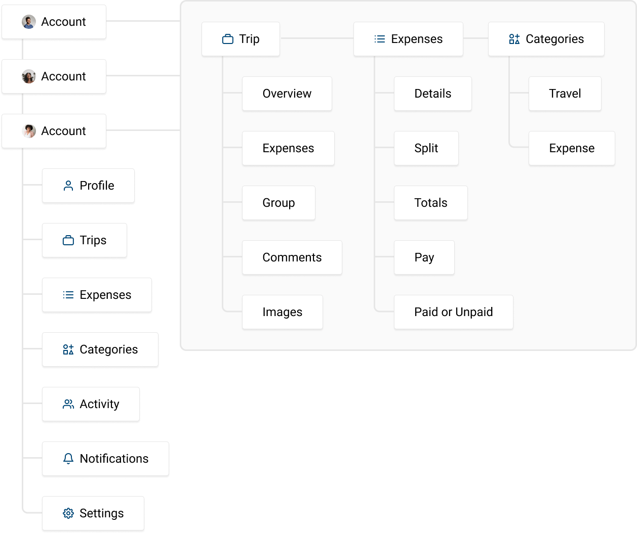
Conceptual framework
Mapping out the database schema defines different ways the product is organized. For example, the Trips table lists each trip record that expenses are linked with. When considering the layout of the user interface, Trips is represented as its own section. A trip also needs to be created first, in order for expenses to then be linked. This also outlines some of the initial user flows for creating new records.
Designing the interface
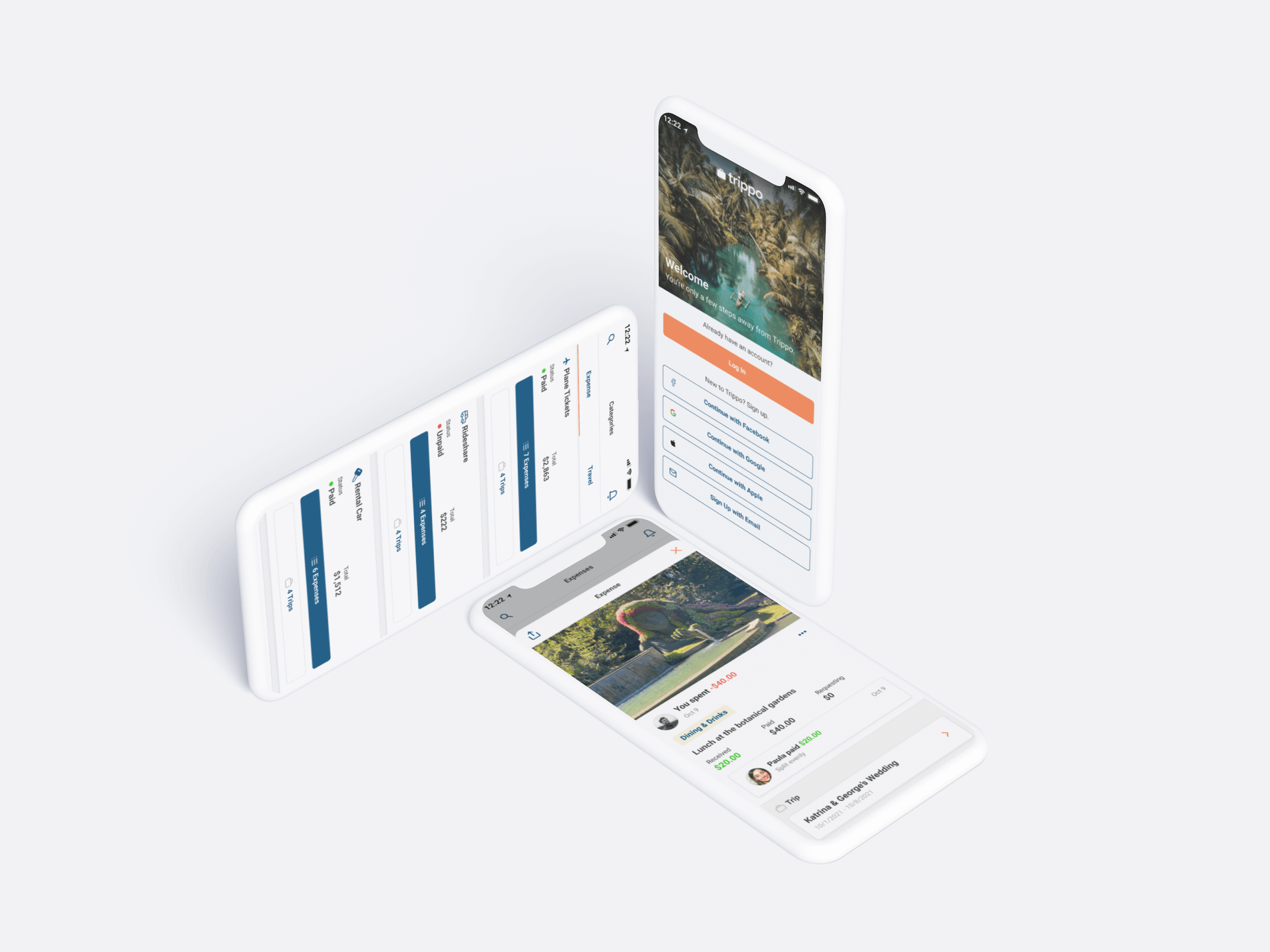
I started this project working directly in Figma. I began with the trips page, representing all of the data points available for that page. These included: the trip name, description, location, category tags, the dates, the expense total, which profiles were tagged on that trip (who was included on the trip), and the paid status (paid or not paid).
Once the framework of the design was in place, new features were incorporated into the concept. These included liking posts, uploading photos, comments, and exporting posts.
Interactions & prototype
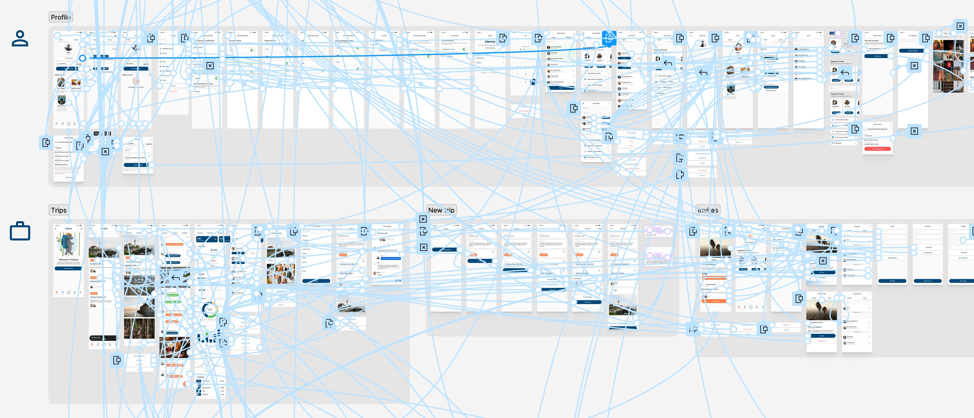
Interactions were carefully chosen based on the visual input from the user interface. Pages that push in from the right side can be closed by swiping from the left side, tabs pan the corresponding way, fly up menus close down, etc. More importantly are the sections that open as an overlay instead of a navigation / view reload. If a user closes an overlay the previous section is still visible, uninterrupted. This can be especially beneficial in scenarios where the user needs to engage a creation flow (like creating a new category), without needing to change the view.
User testing
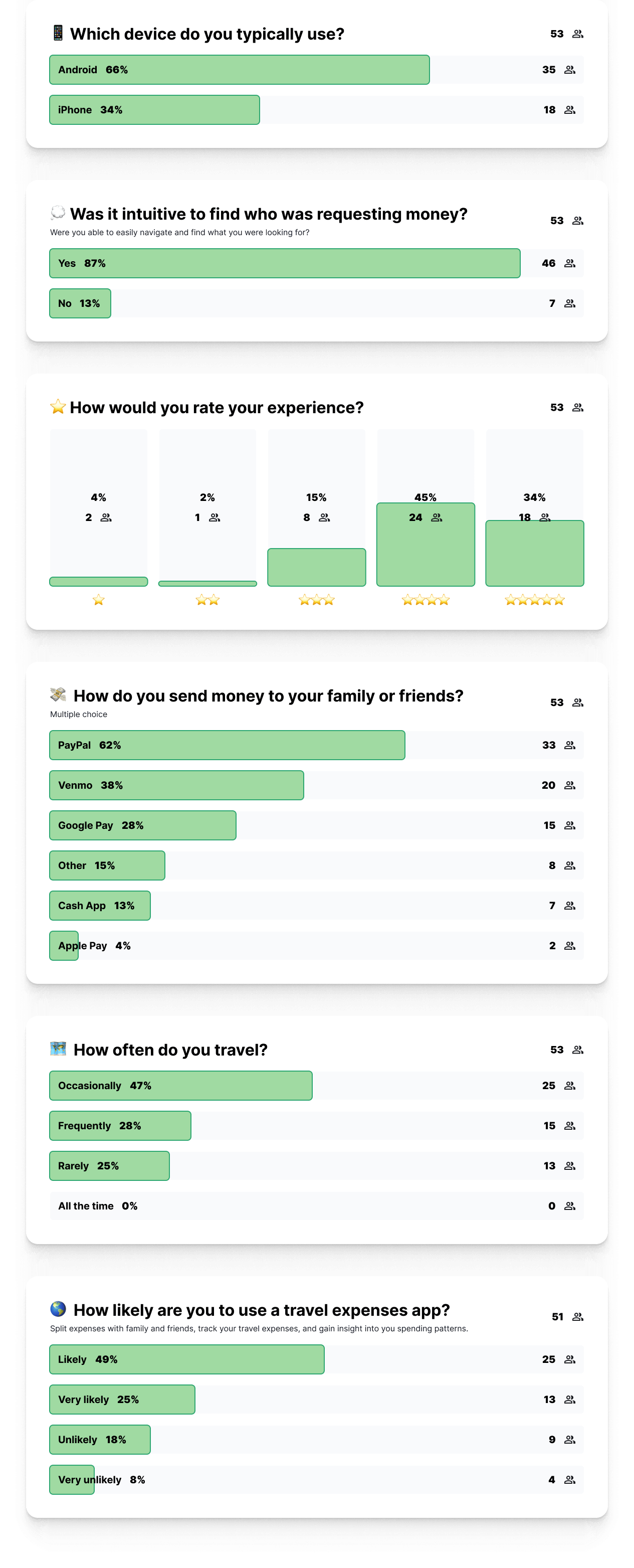
I conducted a series of user tests with the prototype to get some feedback on the user experience and learn more about the app's potential users. The main test asked users to sign in and pay for an expense request. This required users to navigate through the app, to locate an expense request, and then pay. This task is the core functionality of the app, so if done right everything else is added around this. Feedback indicated that the user experience was intuitive and easy to use.
Creating a travel brand
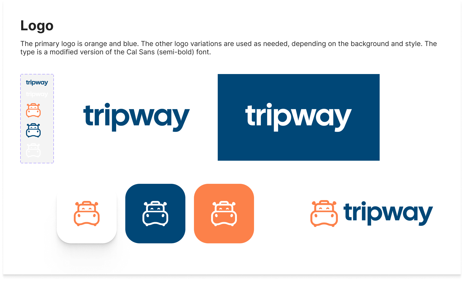
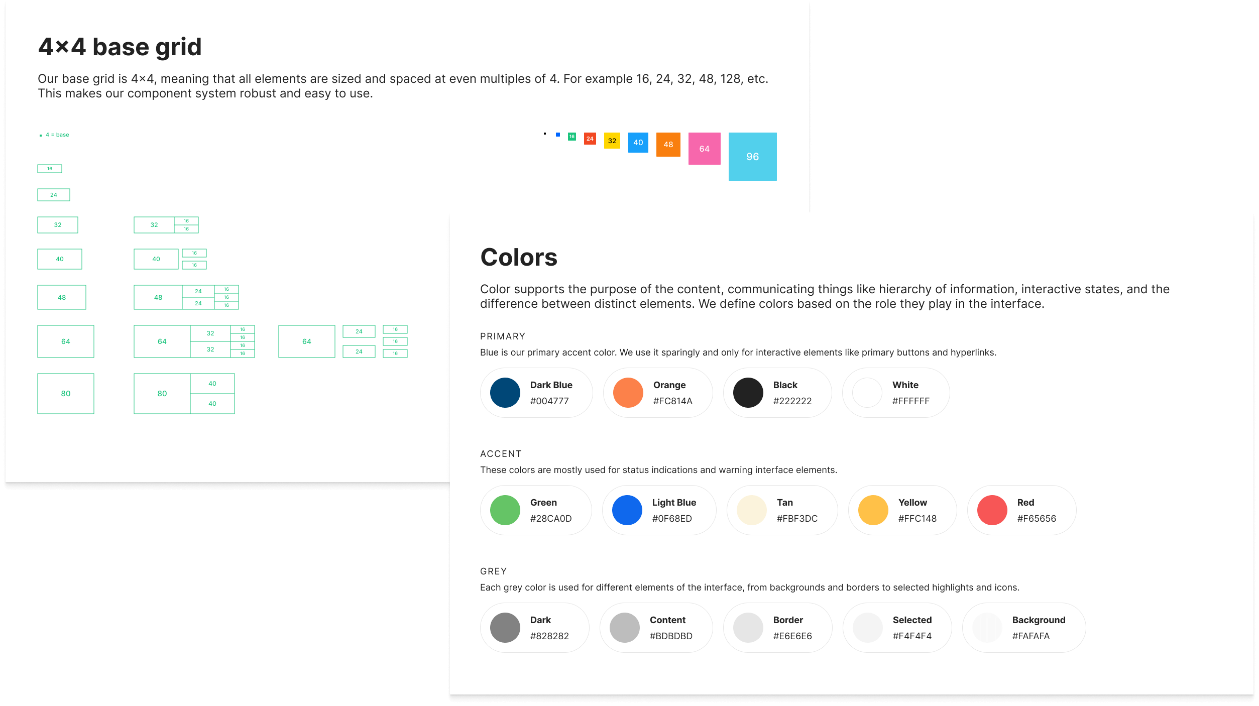
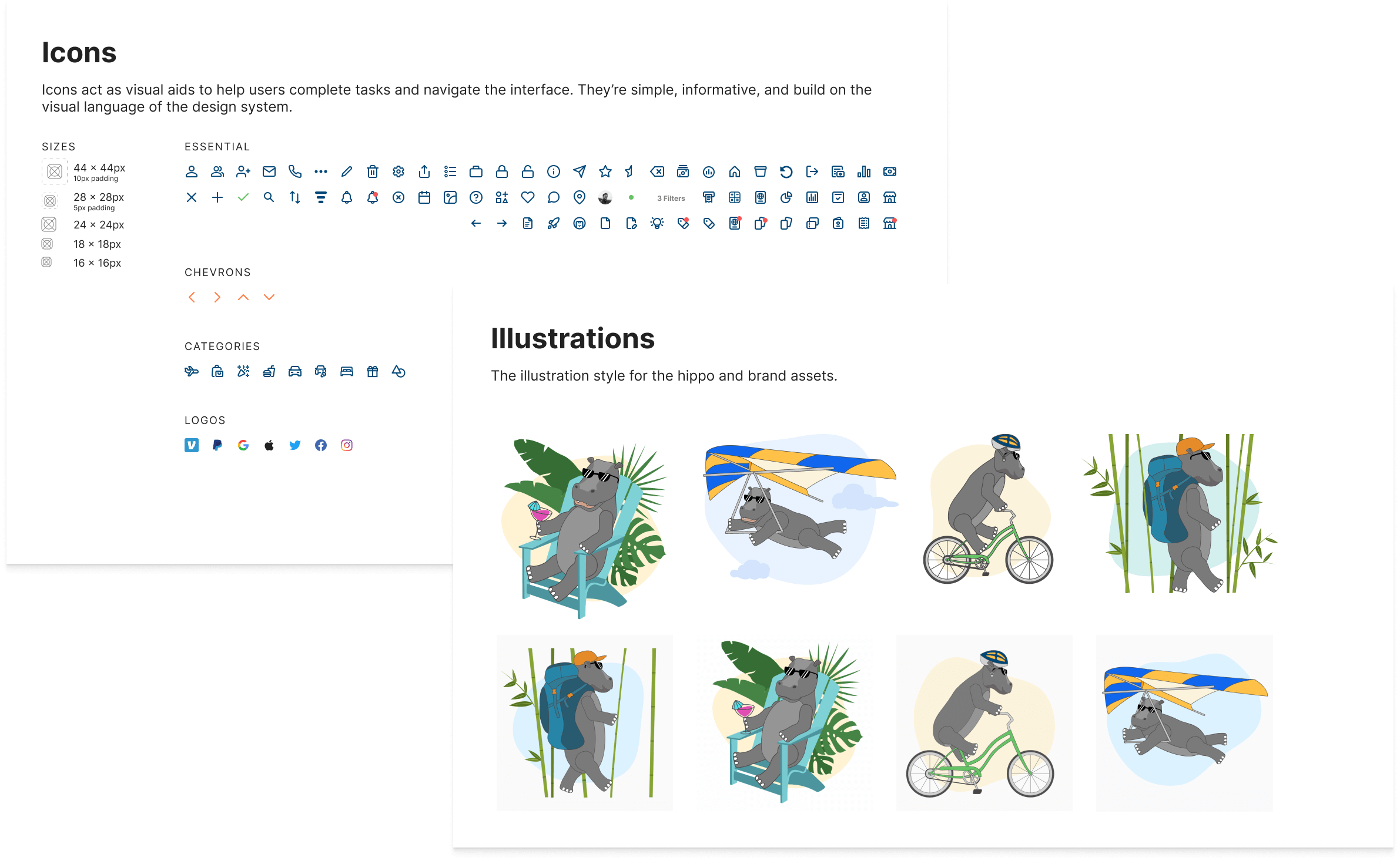
The project was originally called "Trippo" which is the inspiration for the hippo graphics and animations. The logo mark is a hippo face and a suitcase (easier to see in the animation below). Due to trademarks the project had to be renamed to Tripway. The brand colors are bold and contrast well across the website and the product. The Tripway brand is meant to convey a fun, playful spirit, with a clean and professional aesthetic.

Skills & competencies
Key areas of expertise and methodologies applied during this project.