

Eureka Software • Lead Designer • 2025
Restoring user trust
I led the redesign of a rehearsal tool that professional performers rely on. When we started, the app was outdated and struggling with stability. My team and I rebuilt it into a modern, accessible product—focusing entirely on reliability, so performers could trust the technology when the stakes were high.
0:00 / 0:00
Problem
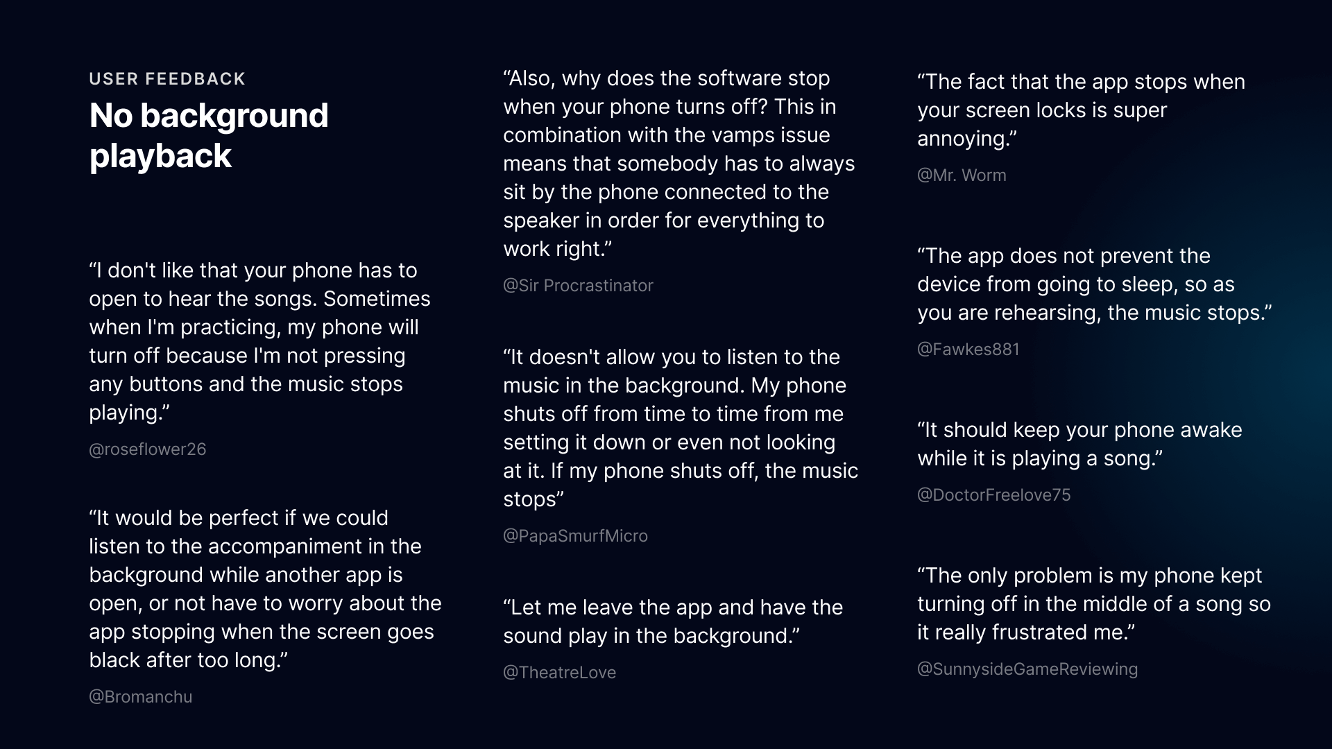
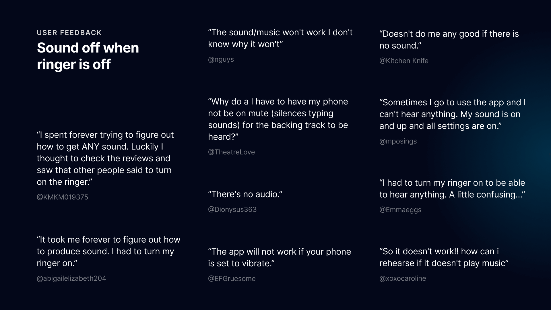
The legacy application was fundamentally unreliable, with critical failures in audio playback and onboarding driving high churn. The interface was outdated and inaccessible (non-compliant), failing to meet the rigorous demands of professional rehearsal environments.
Proposal
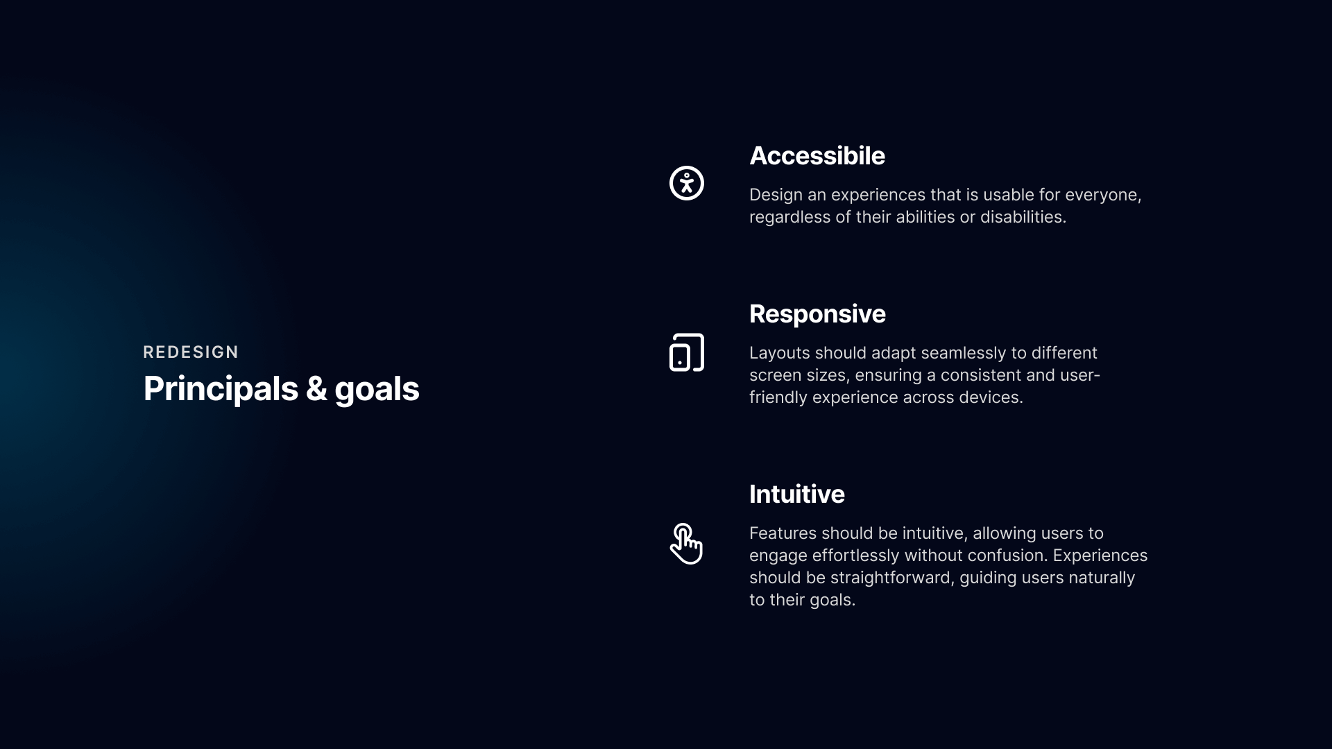
Champion a "reliability-first" redesign to modernize the architecture. I replaced account-gated friction with a seamless access-code model and synthesized separate tools into a single, intuitive interface, prioritizing WCAG compliance to ensure accessibility for all performers.
Impact & outcomes
By resolving critical stability issues and streamlining the user experience, we restored user trust and significantly increased platform engagement.
Setup steps
12 → 3
Streamlined the onboarding flow by replacing user accounts with direct access codes.
Accessibility
100%
Achieved full WCAG 2.1 AA compliance, ensuring an inclusive experience for all performers.

Auditing the legacy app
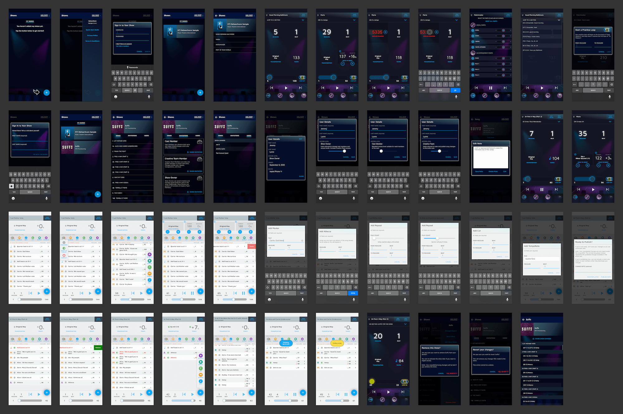
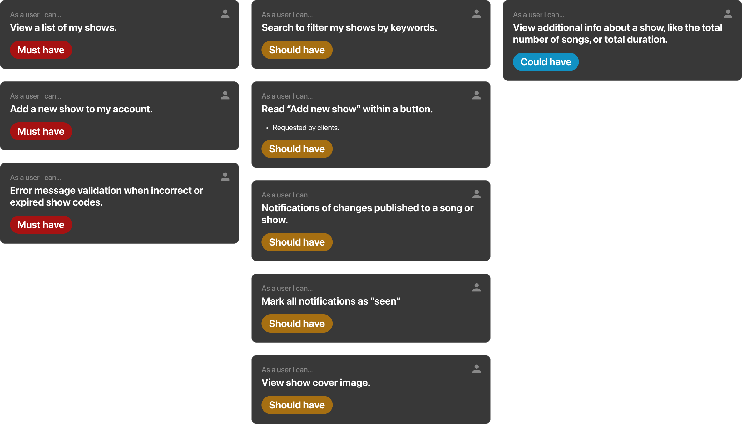
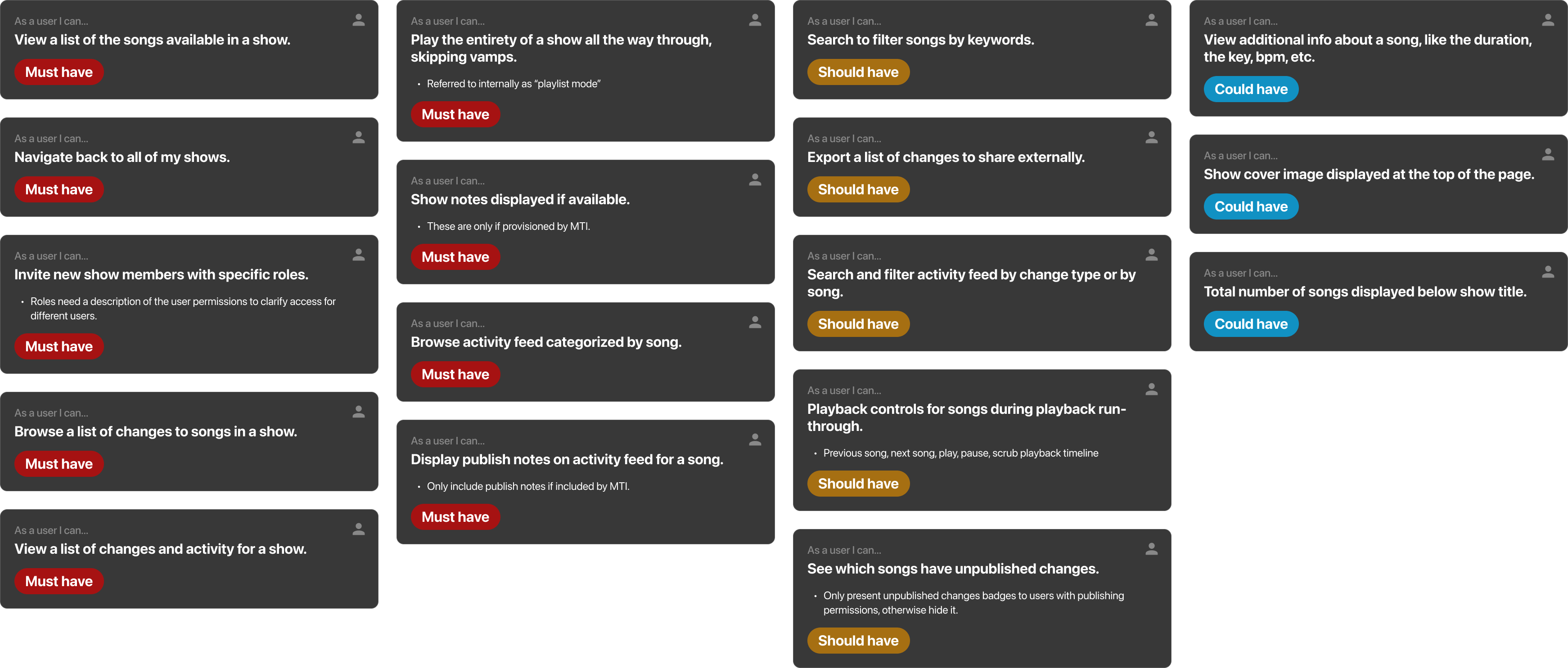
The project directive was strict: deliver a complete technical rewrite that preserves all existing functionality while modernizing the codebase. To ensure zero feature regression, I conducted a comprehensive visual audit, cataloging every screen, error state, and interaction flow of the legacy application.
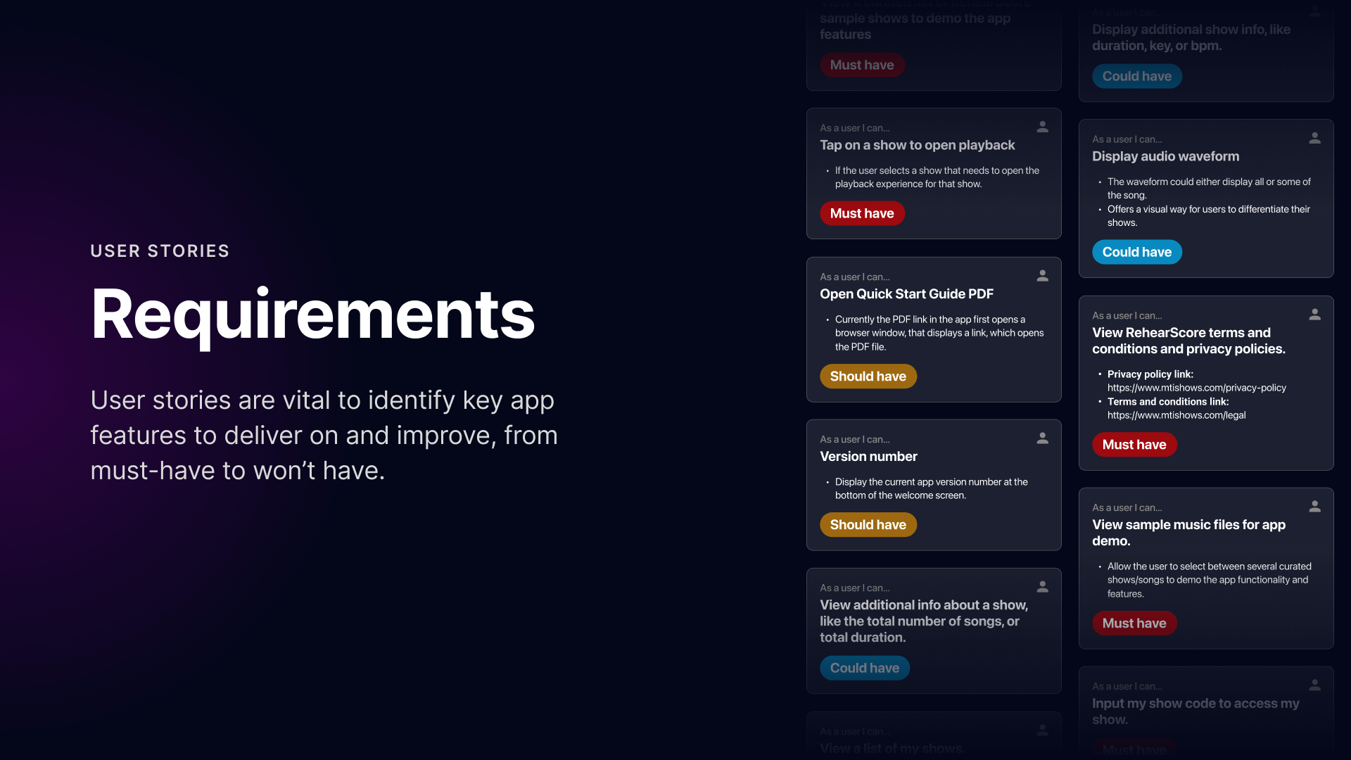
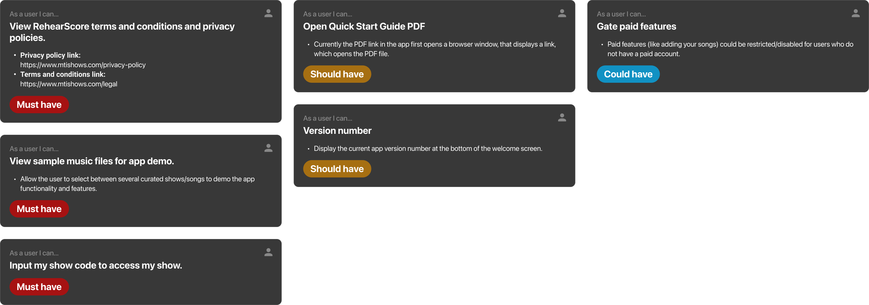
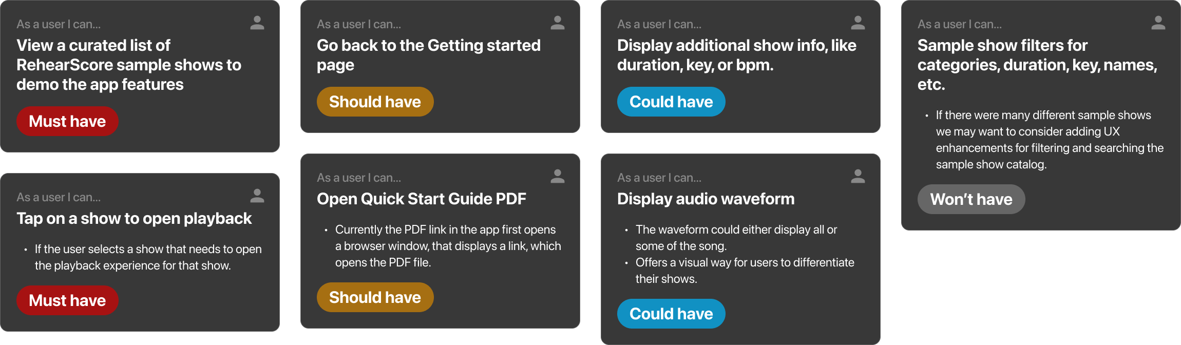
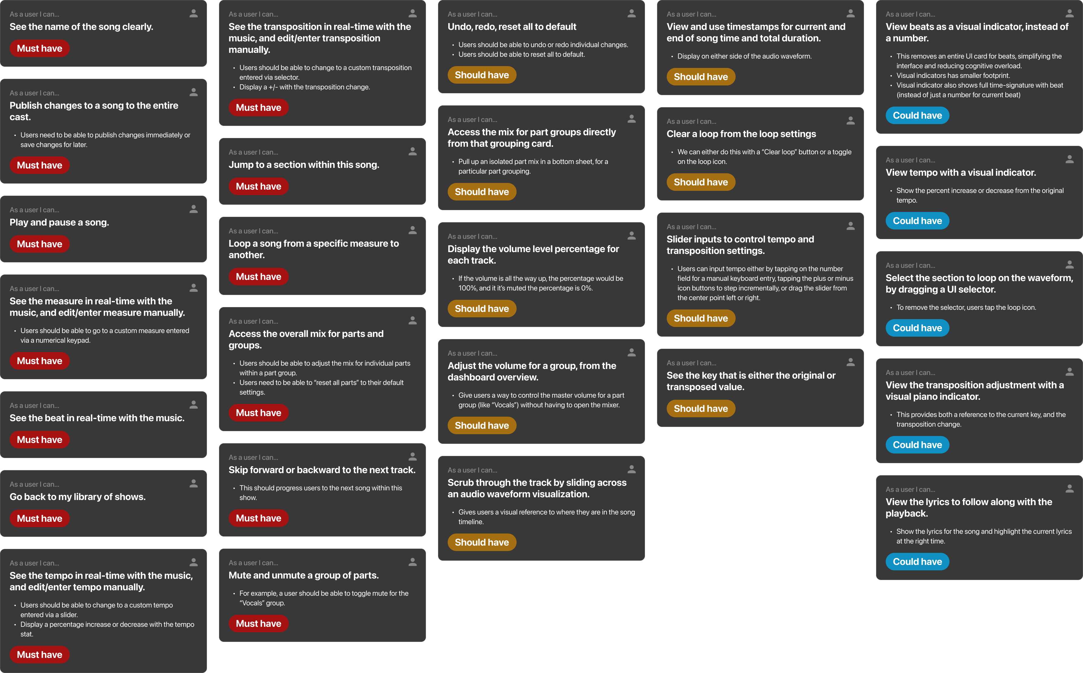
I translated this audit into a robust set of user stories that served as our "source of truth." These stories defined the functional requirements for complex features like vamp creation, track mixing, and tempo adjustment. This documentation was critical for validating our design direction, ensuring that every new interface decision supported the professional workflows performers relied on.
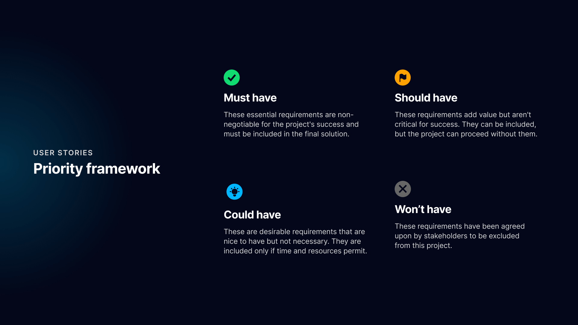
The audit also exposed fundamental UX issues we needed to resolve, such as ambiguous iconography and poor accessibility. We expanded the scope to include WCAG 2.1 AA compliance and specific "quality of life" features, such as a new "Playlist Mode" for uninterrupted run-throughs and clearer error messaging for login failures.
Removing barriers to entry
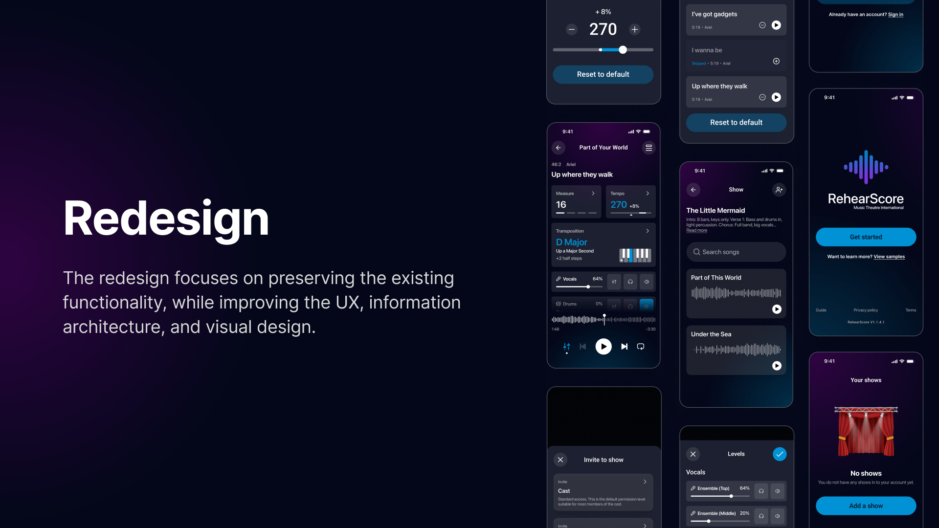
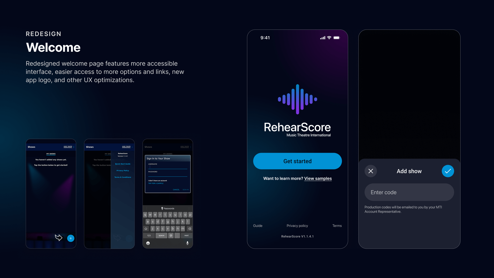
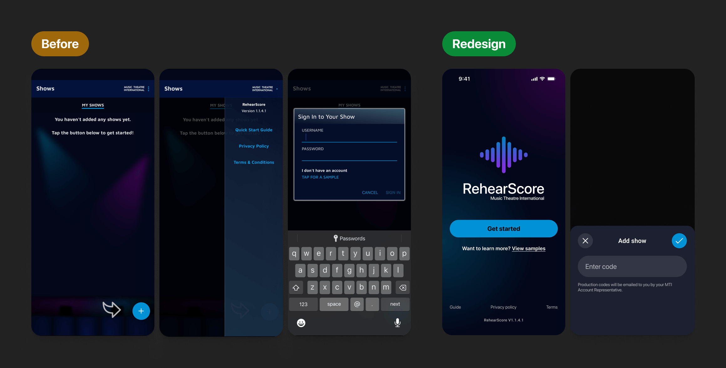
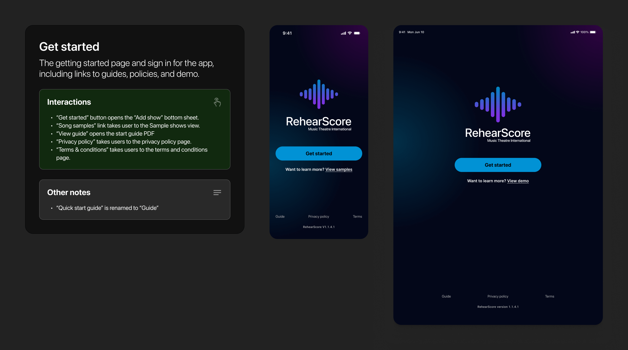
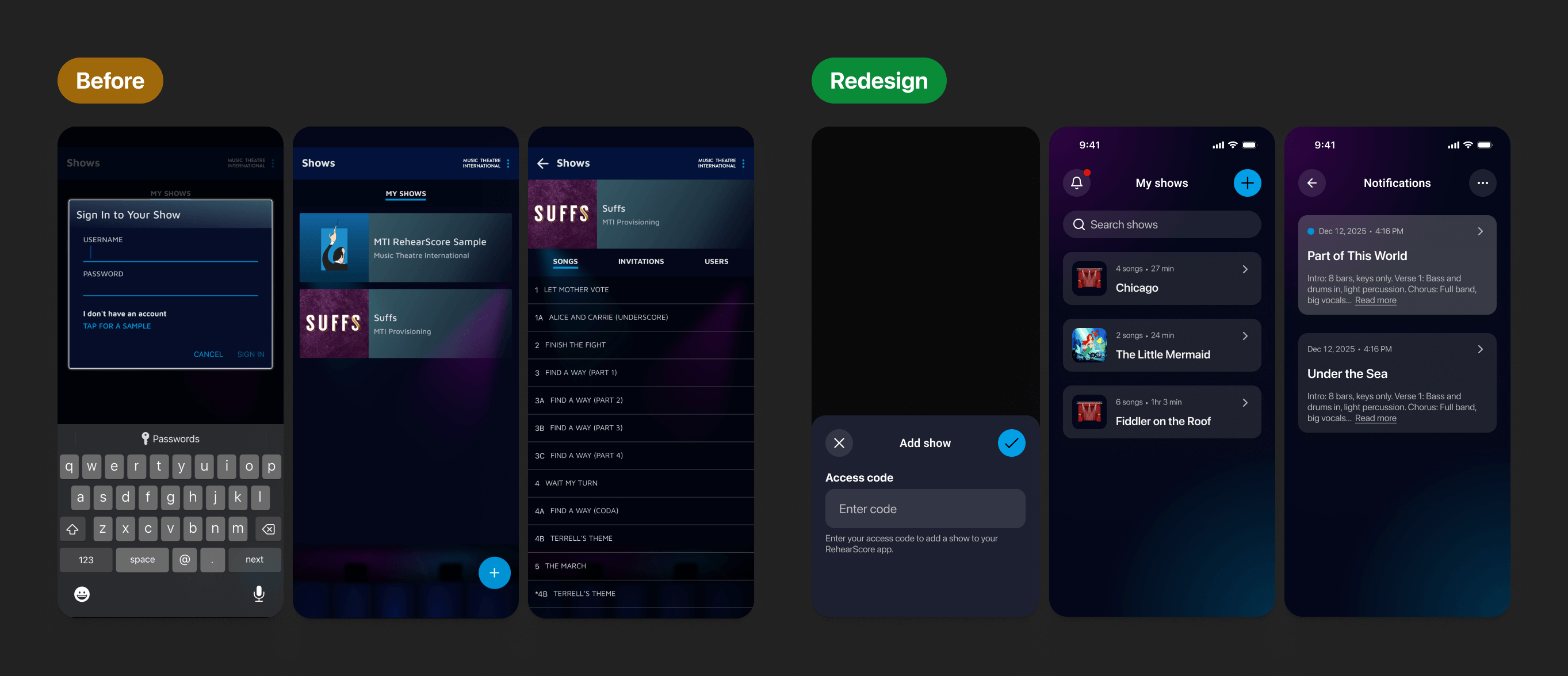
The previous design relied on confusing UI patterns, such as a static arrow pointing to a generic plus button, which left new users unsure of how to begin. To streamline access and reduce data liability, we removed user accounts entirely in favor of a direct 'Show Code' system. I redesigned the interface to prioritize clear, labeled actions—allowing users to instantly download their show, access policy links, or demo the app with sample songs—significantly reducing the number of screens required to get started.
Richer, clutter-free sampling
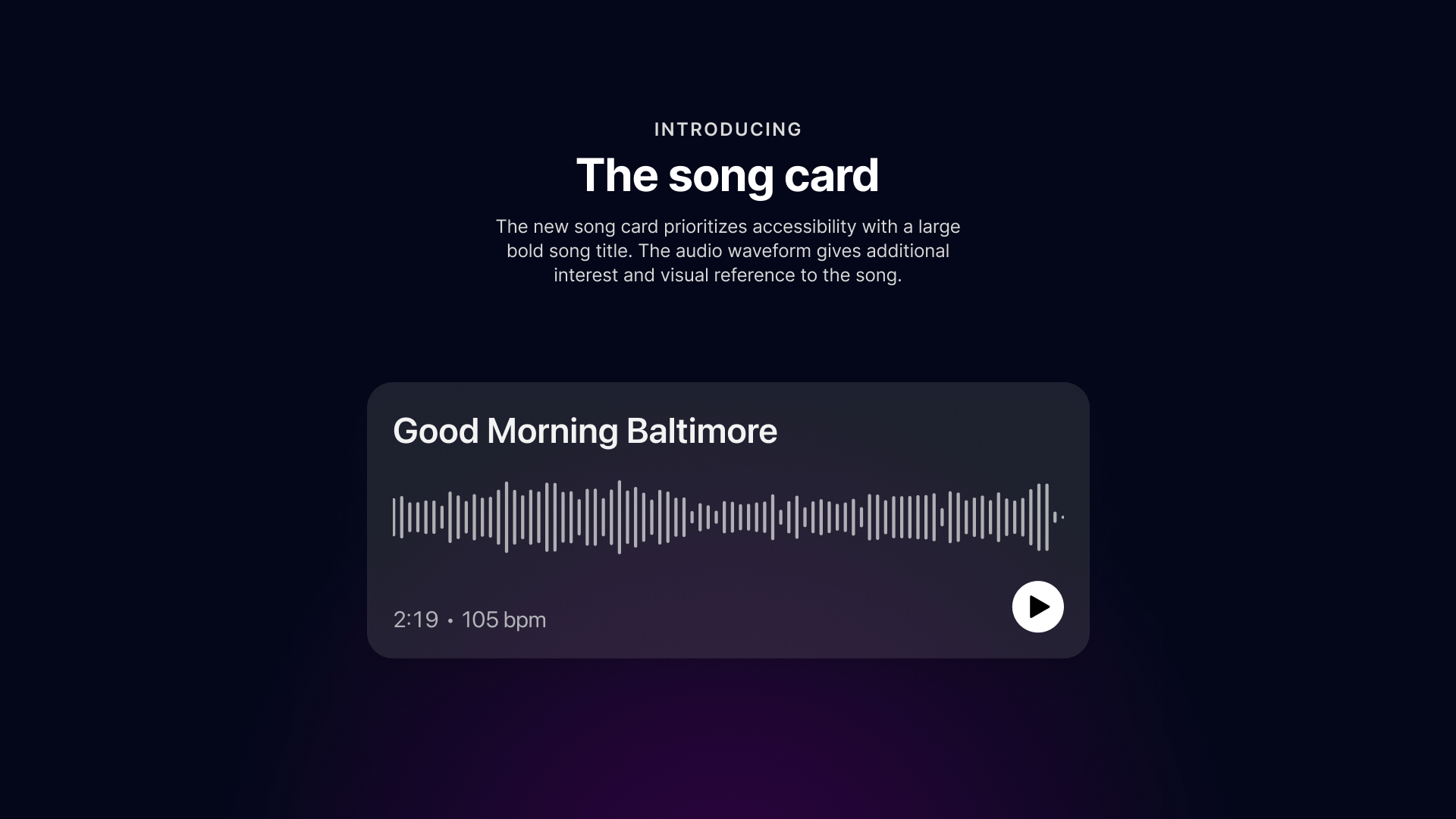
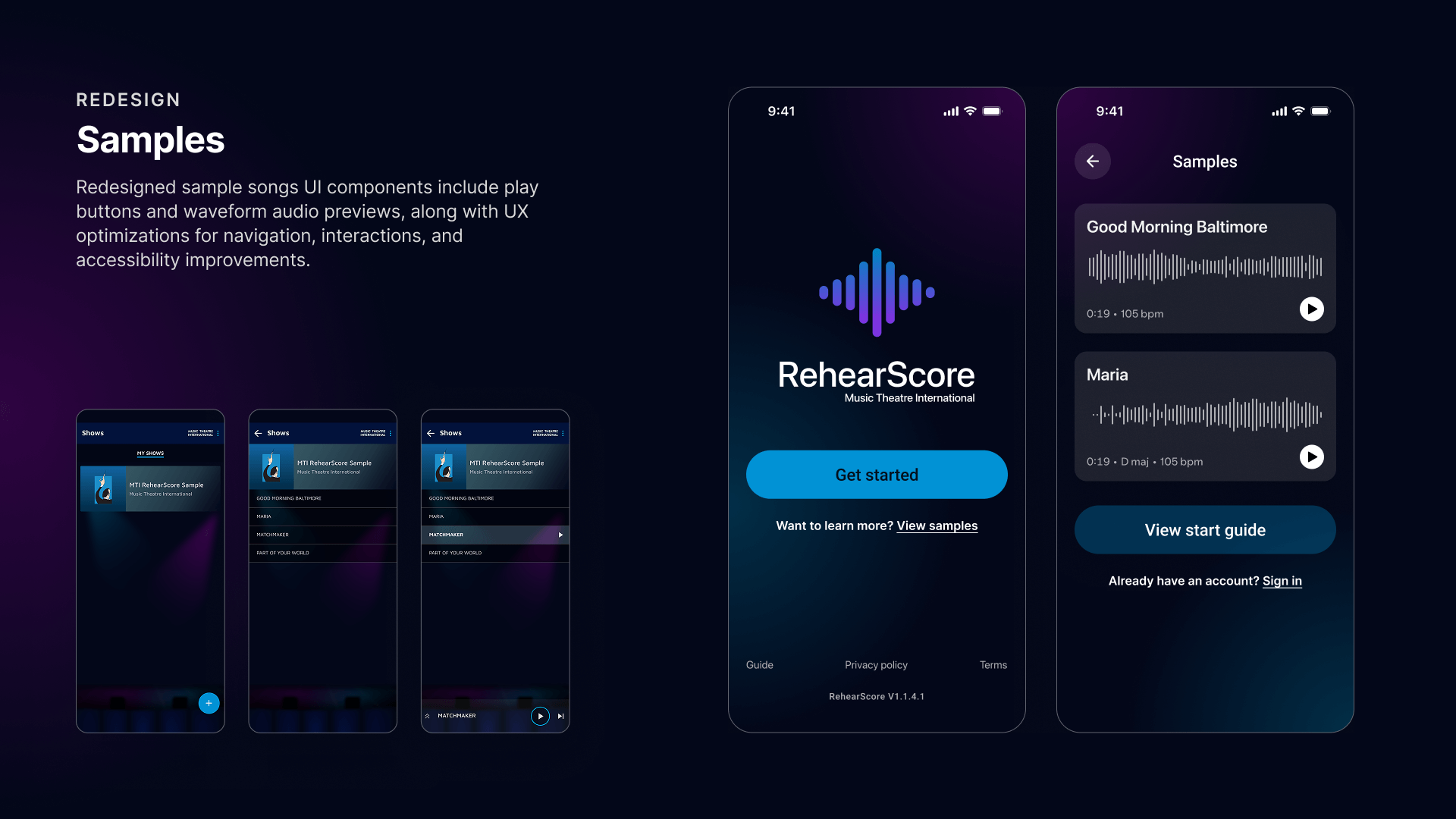
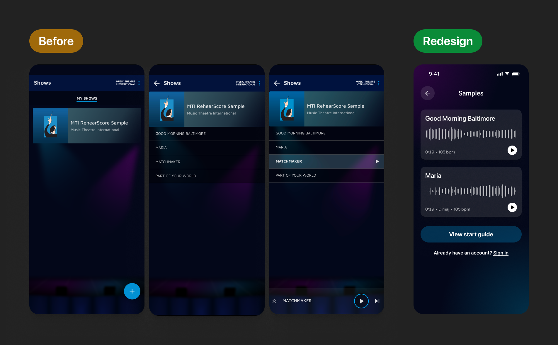
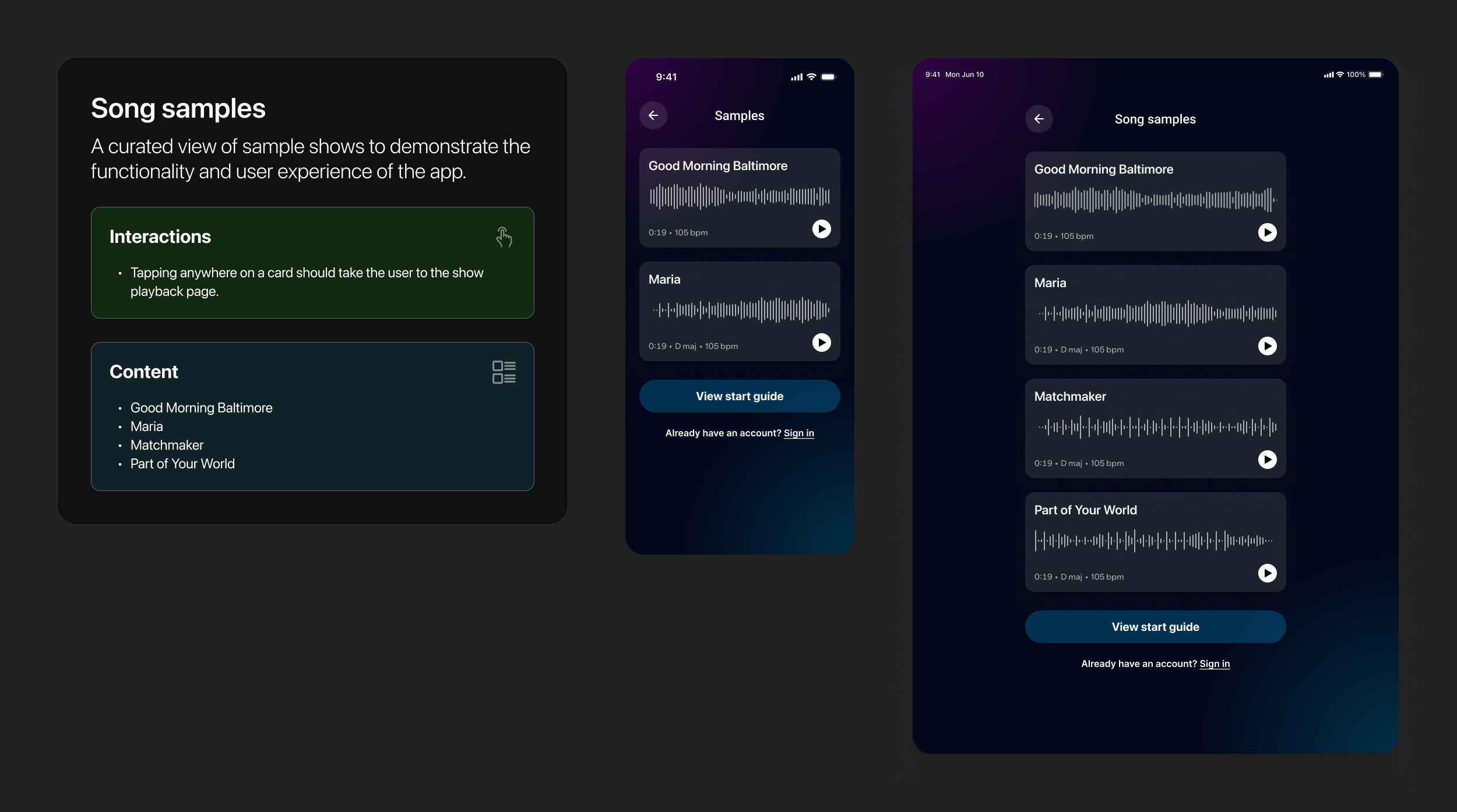
Previously, sample songs were permanently injected into a user's library, creating unnecessary clutter. I introduced a dedicated samples page accessible directly from the 'Get Started' screen, allowing users to explore the app's capabilities without polluting their personal repertoire. I upgraded the UI from narrow list items to immersive song cards featuring visualized audio waveforms, making the content feel richer and more engaging, while also providing quick access to the company's essential start guide.
A unified repertoire hub
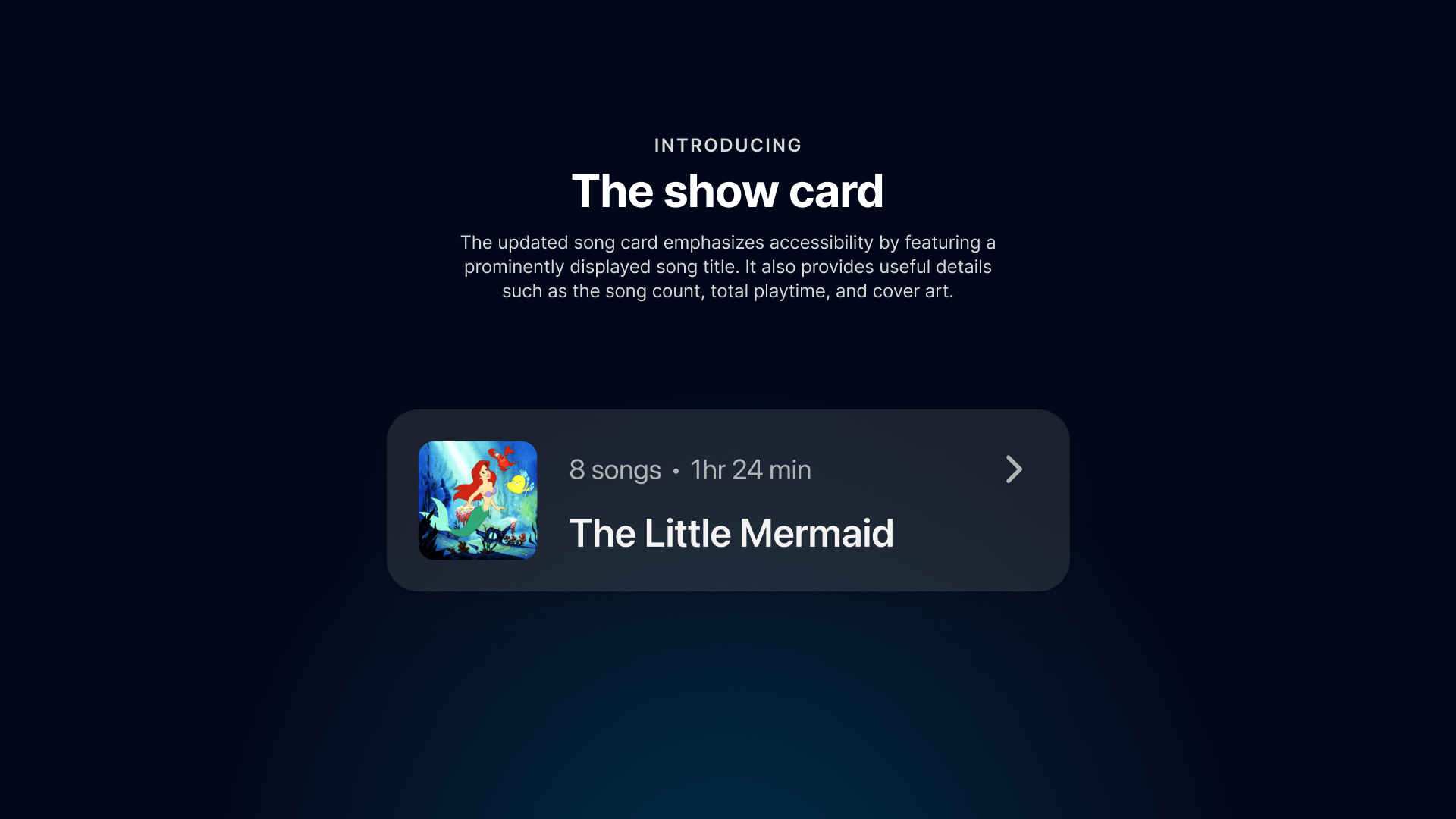
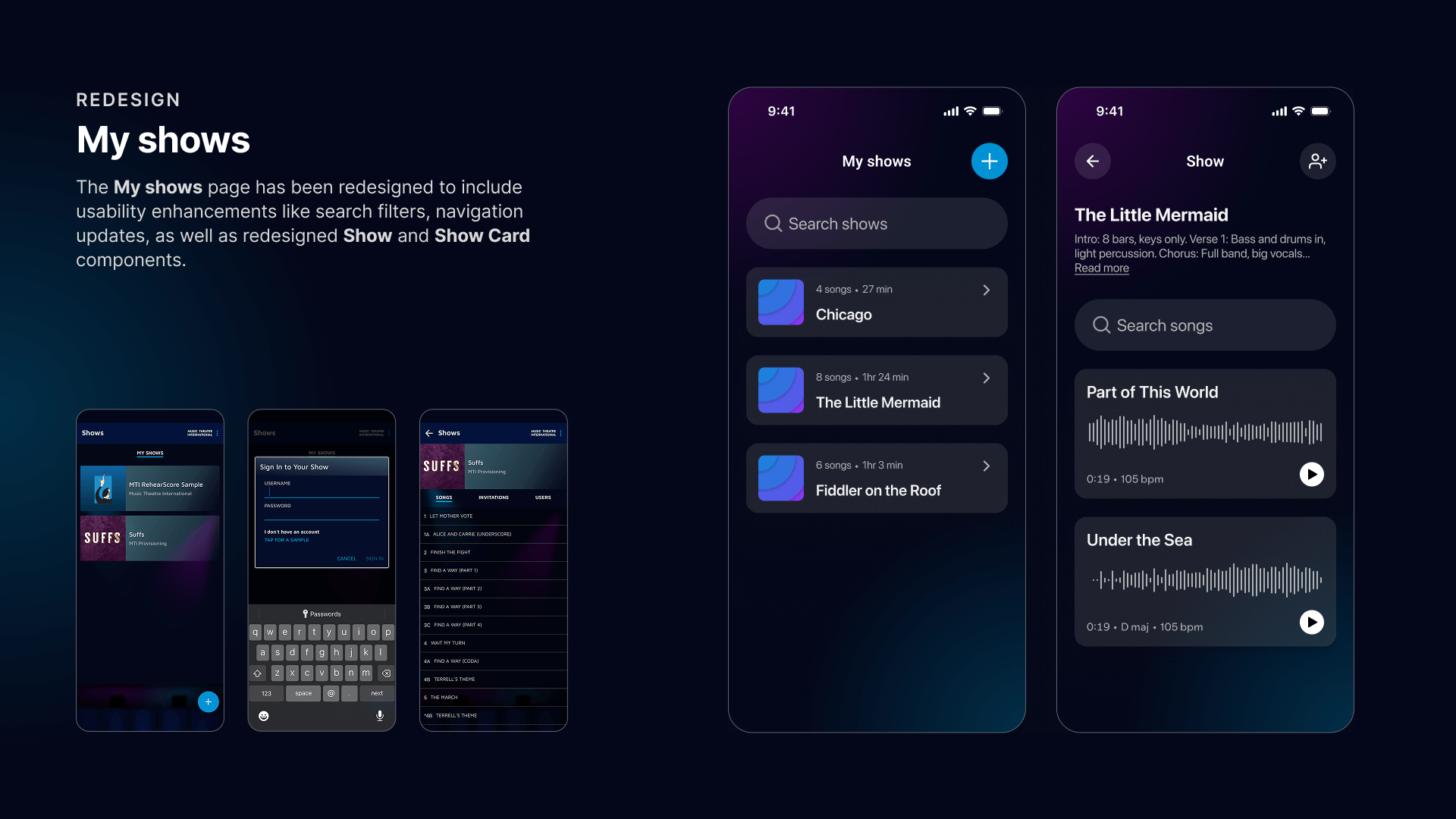
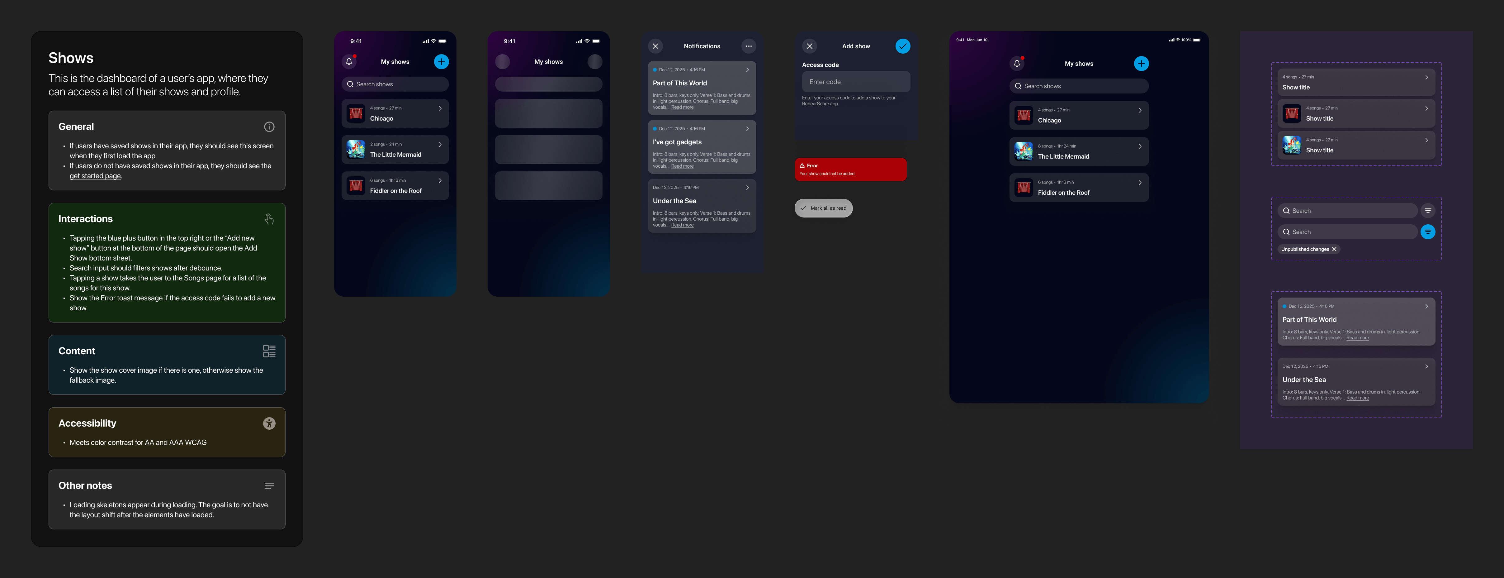
The shows dashboard is the performer's home base. I moved away from dense lists to spacious, information-rich cards that display key details—like song count and duration—at a glance. To handle growing libraries, I introduced a dedicated search bar for instant access. I also streamlined the acquisition flow with a clear 'Add Show' button, triggering the code entry bottom sheet so users can expand their repertoire without leaving the dashboard.
A visual command center
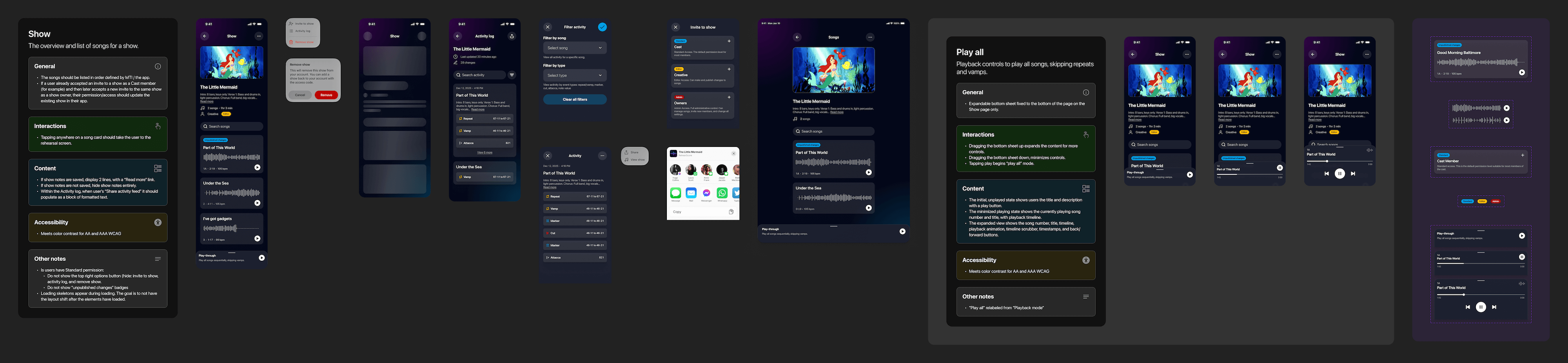
I transformed the show dashboard into a rich, visual hub. A high-fidelity cover image and key metadata now ground the experience, while song lists have been upgraded to detailed cards featuring audio waveforms. This allows users to visually identify tracks instantly and see the "shape" of the music before they even press play.
We also refactored member management to align with strict privacy standards. By removing personal user data requirements, we created a seamless, account-free invite system that maintains security without the friction of traditional sign-up flows.
Finally, the activity log was reimagined from a dense text list into a structured, searchable UI. The new design uses intuitive icons to visualize specific changes—like vamps or cuts—at a glance, turning a static list of edits into a powerful version control tool.

The reimagined rehearsal studio
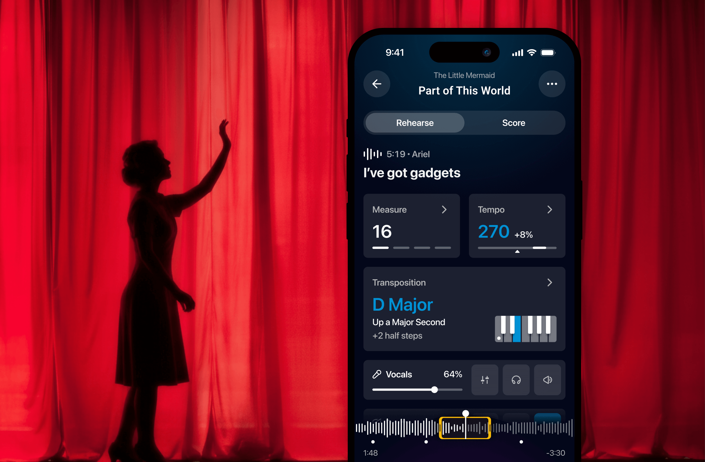
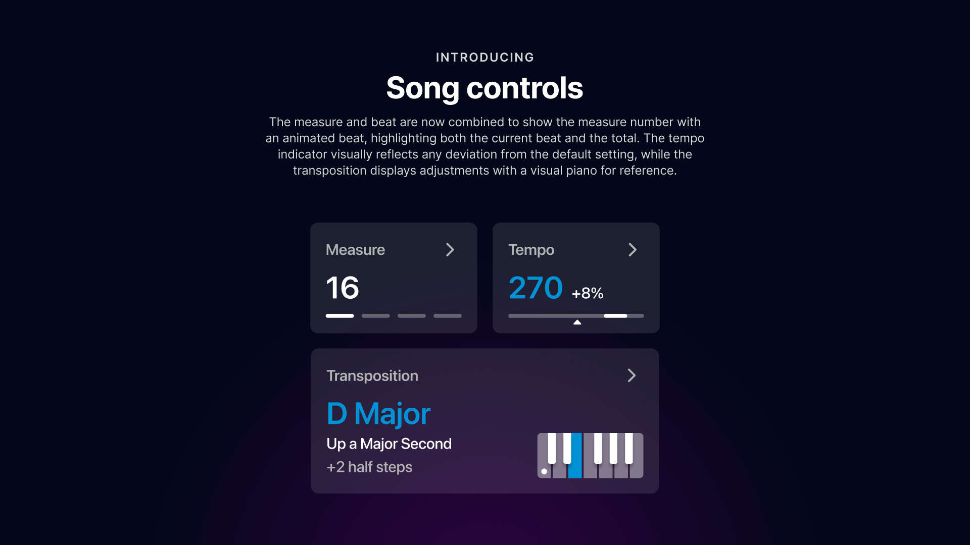
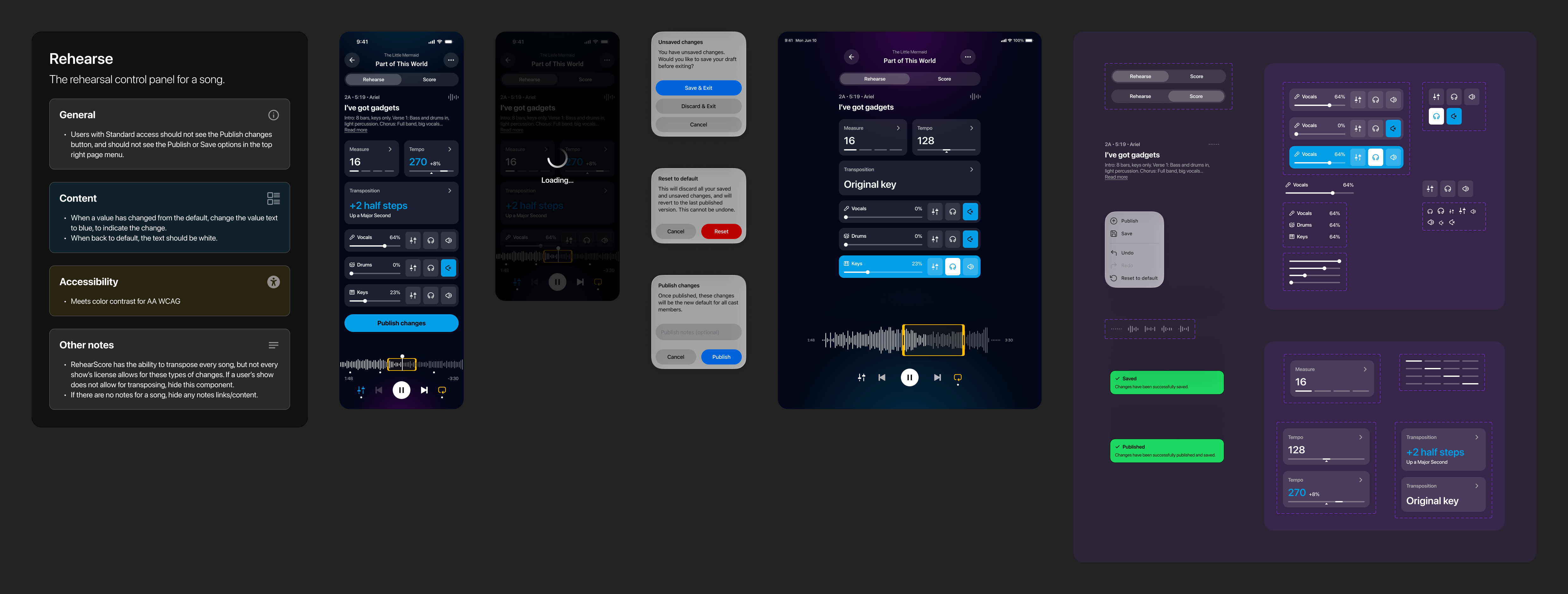
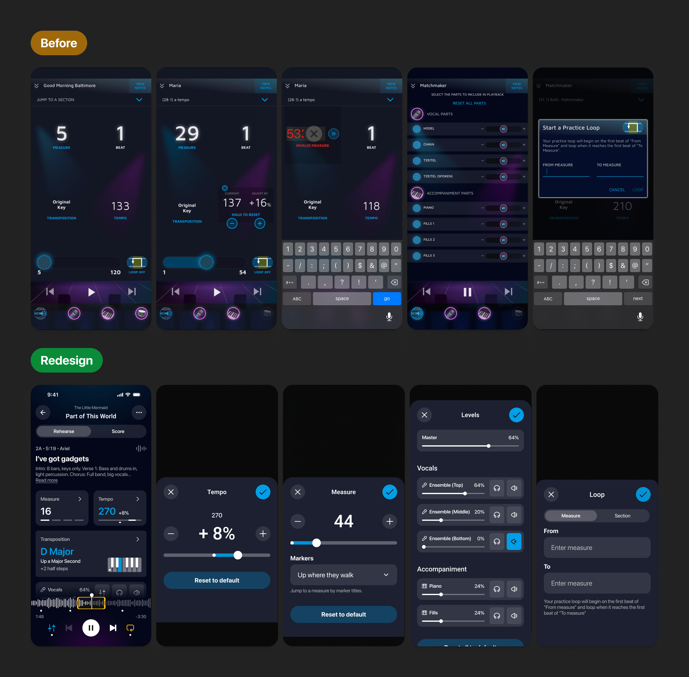
To declutter the interface, I bifurcated the core experience into two distinct hubs: 'Rehearse' and 'Score.' In the focused 'Rehearse' view, I replaced the static playback bar with a dynamic audio waveform, giving performers a visual map of the song's dynamics to anticipate crescendos and decrescendos. I also redesigned the measure indicator into a single, rhythmic card that highlights the current beat line-by-line, helping users stay in sync without needing to count manually.
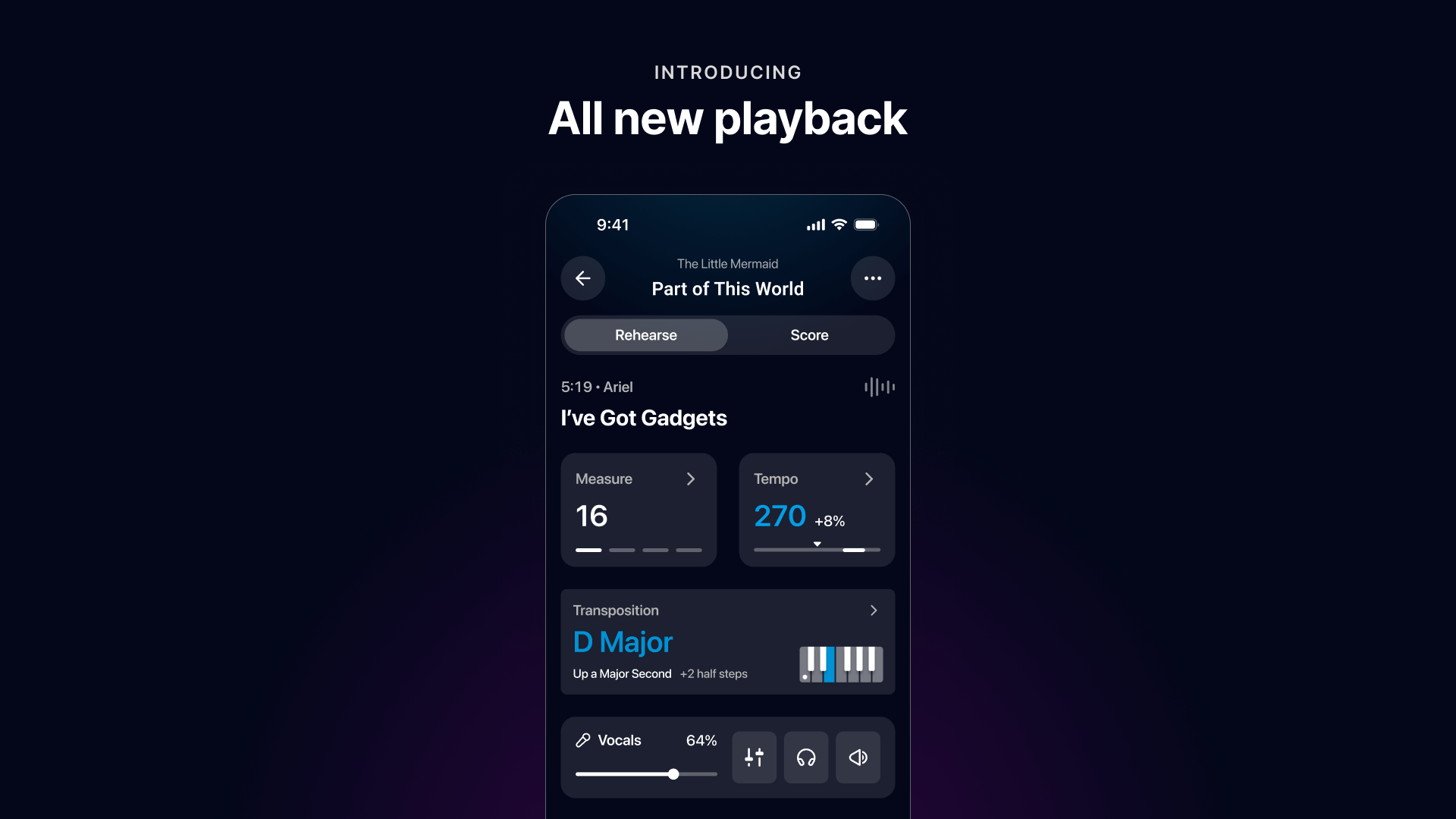
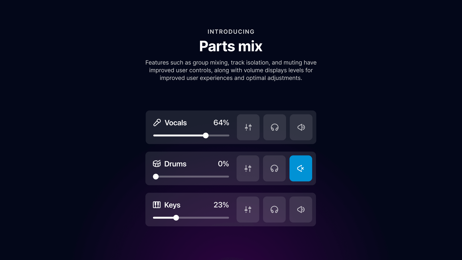
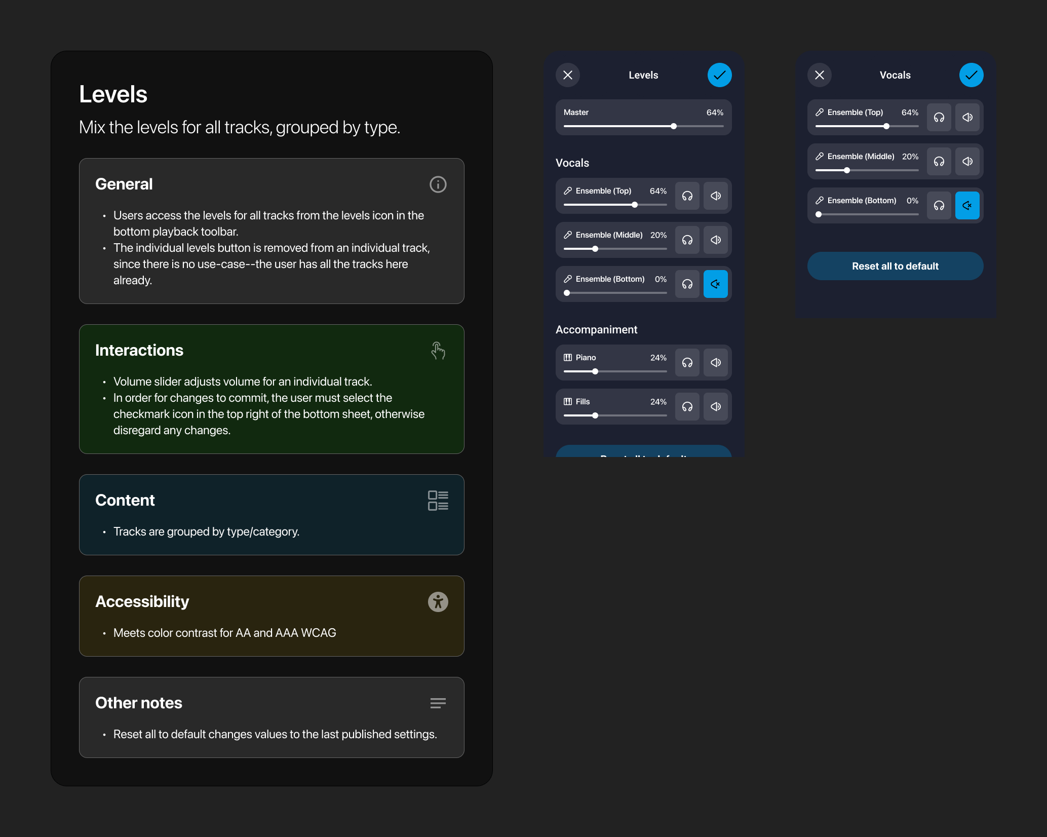
The legacy app's mixing controls were buried in a confusing bottom navigation bar that mimicked global navigation. I surfaced these controls into dedicated 'Track Cards' for Vocals, Drums, and Piano. This modular UI puts volume sliders, mute toggles, and a new 'Isolate' button directly on the canvas—eliminating the need for users to tediously mute every other track just to hear their own part.
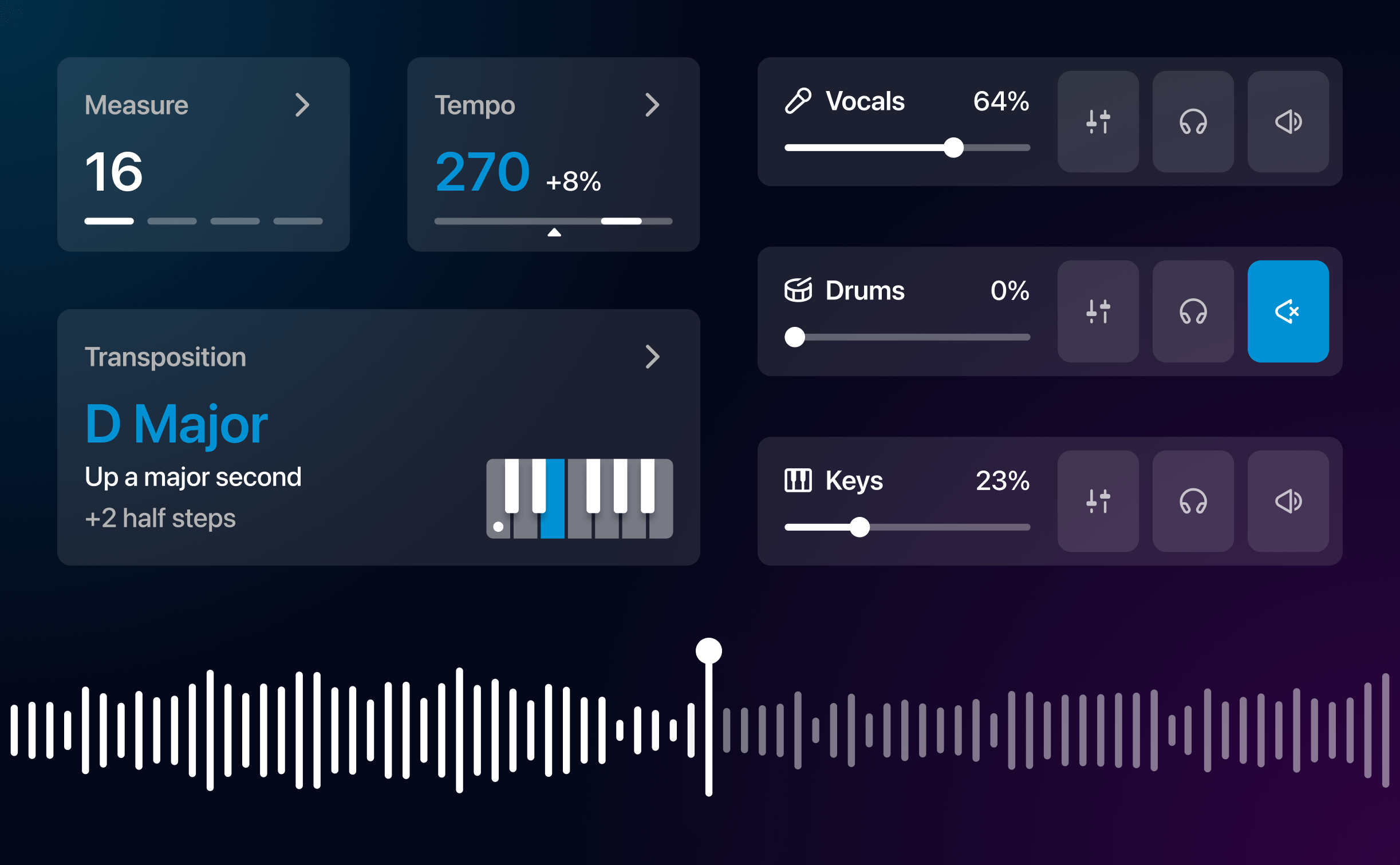
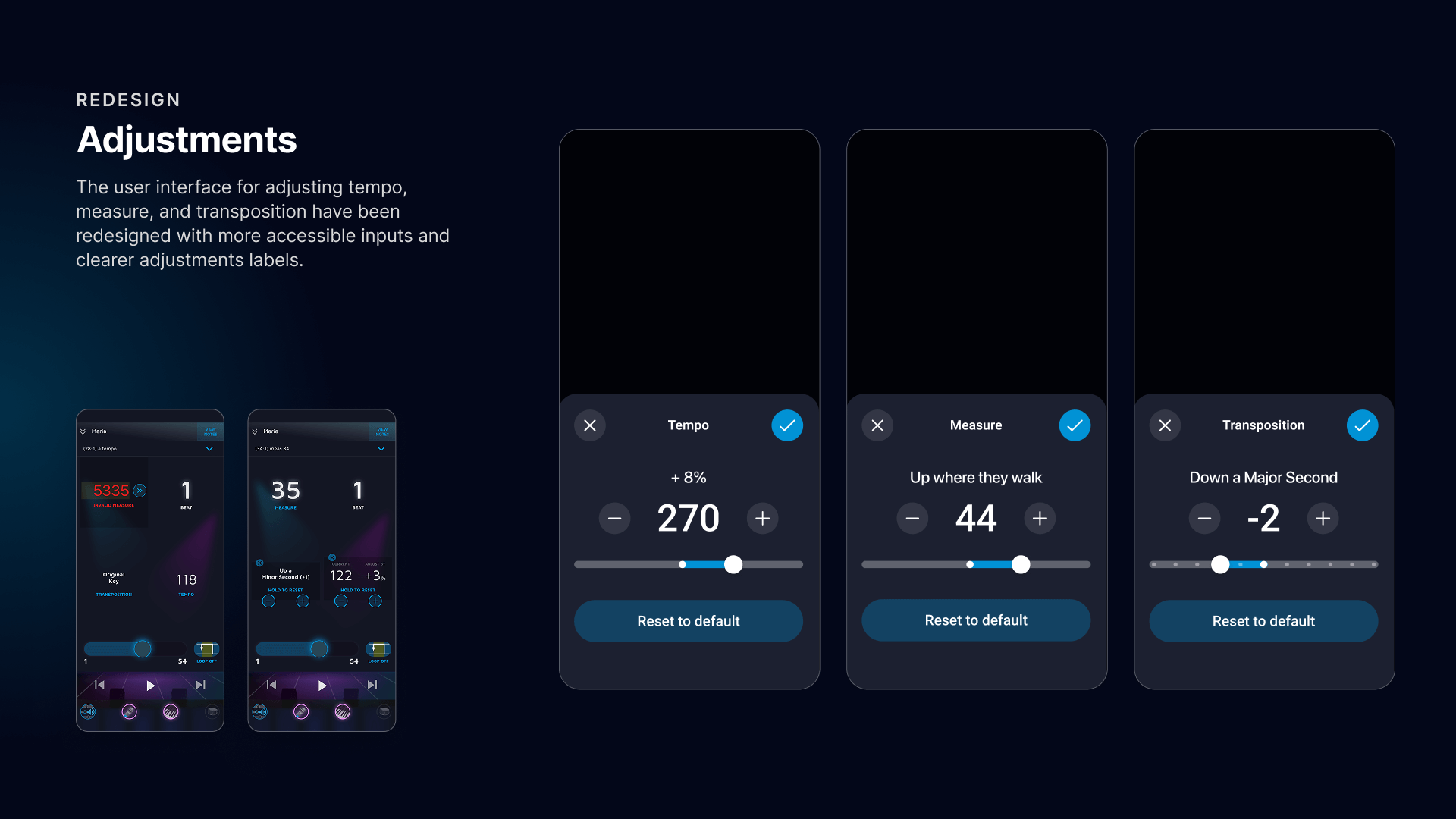
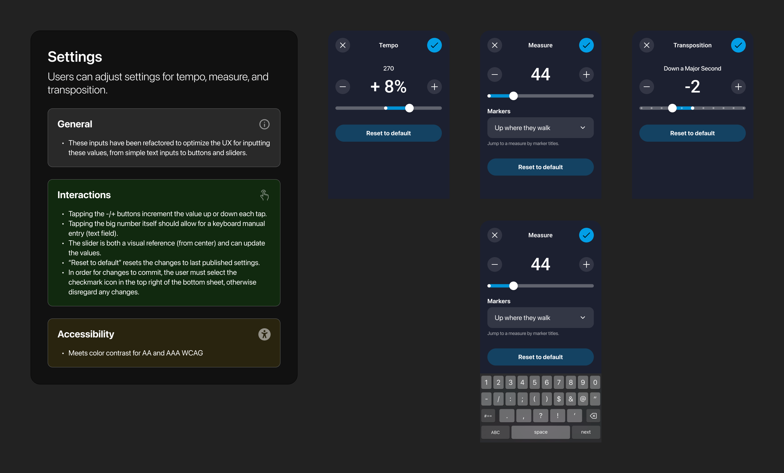
In a fast-paced rehearsal, reading small text is challenging, so we replaced error-prone manual inputs with accessible bottom sheets for Tempo and Transposition. These provide ample space for sliders and validation, while the interface itself now communicates status through color and shape. A shift to the brand's teal color instantly signals a modified tempo, while a dynamic piano graphic provides a concrete visual reference for key changes, removing the need to mentally calculate semi-tones.
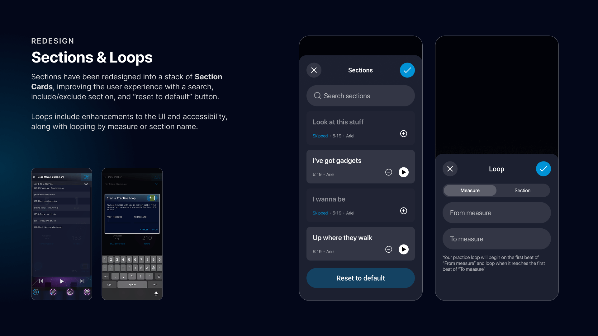
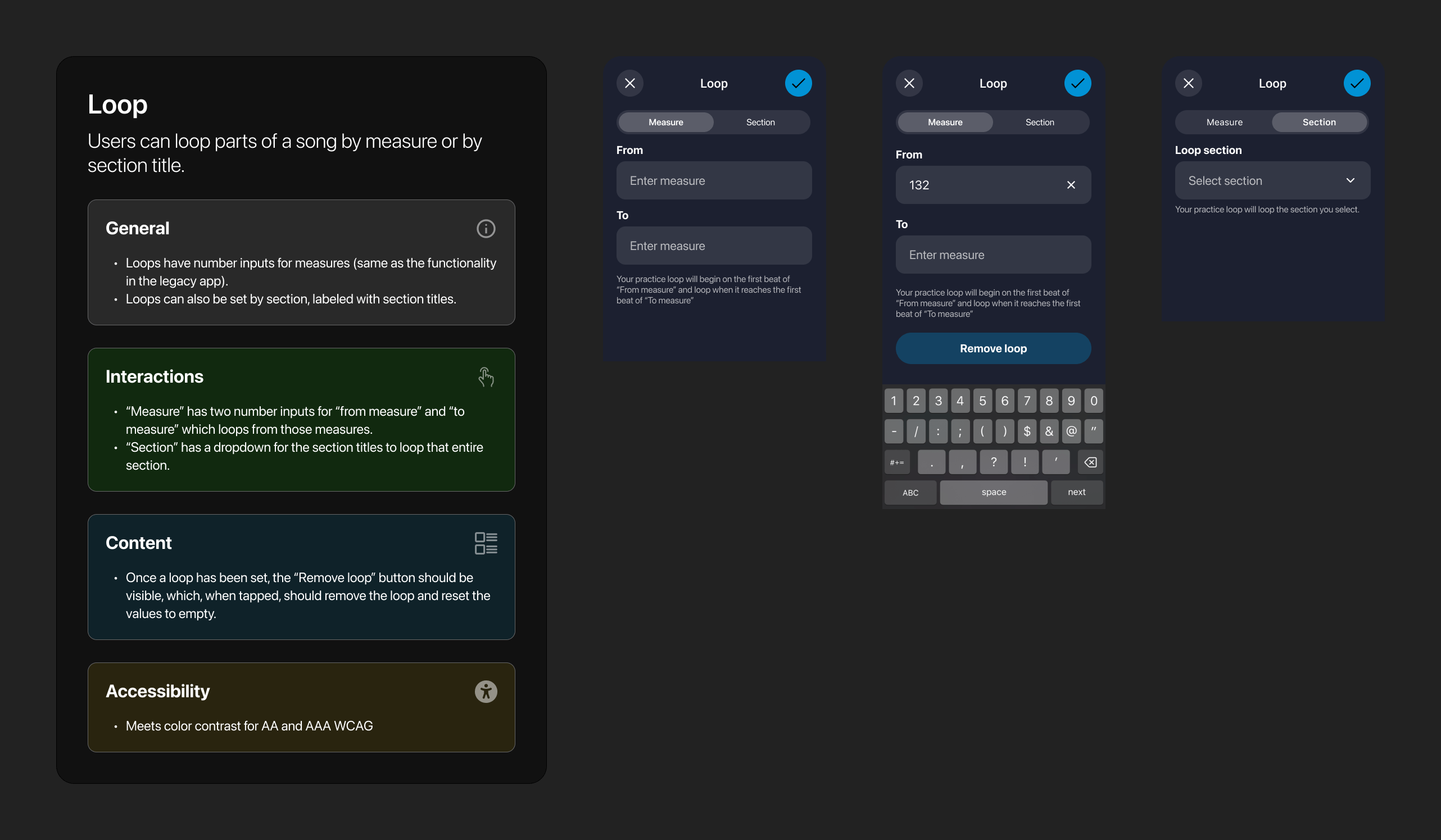
Finally, I overhauled the looping experience to be both visual and semantic. Users can now set loops by dragging a yellow container directly over the audio waveform or by selecting specific song sections (e.g., 'Up where they walk') by name. This flexibility allows performers to practice difficult passages intuitively, rather than memorizing measure numbers.
A unified table of contents
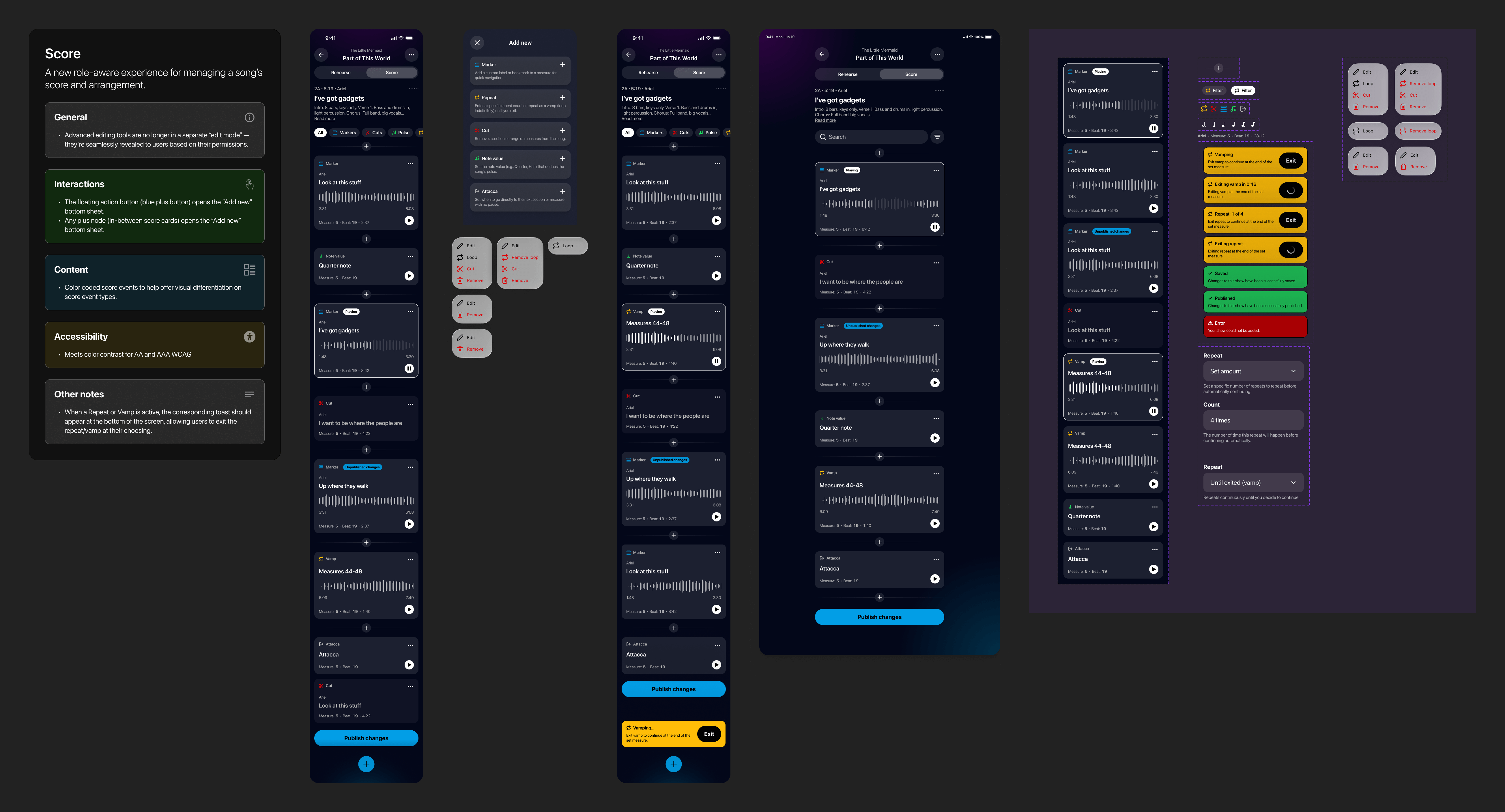
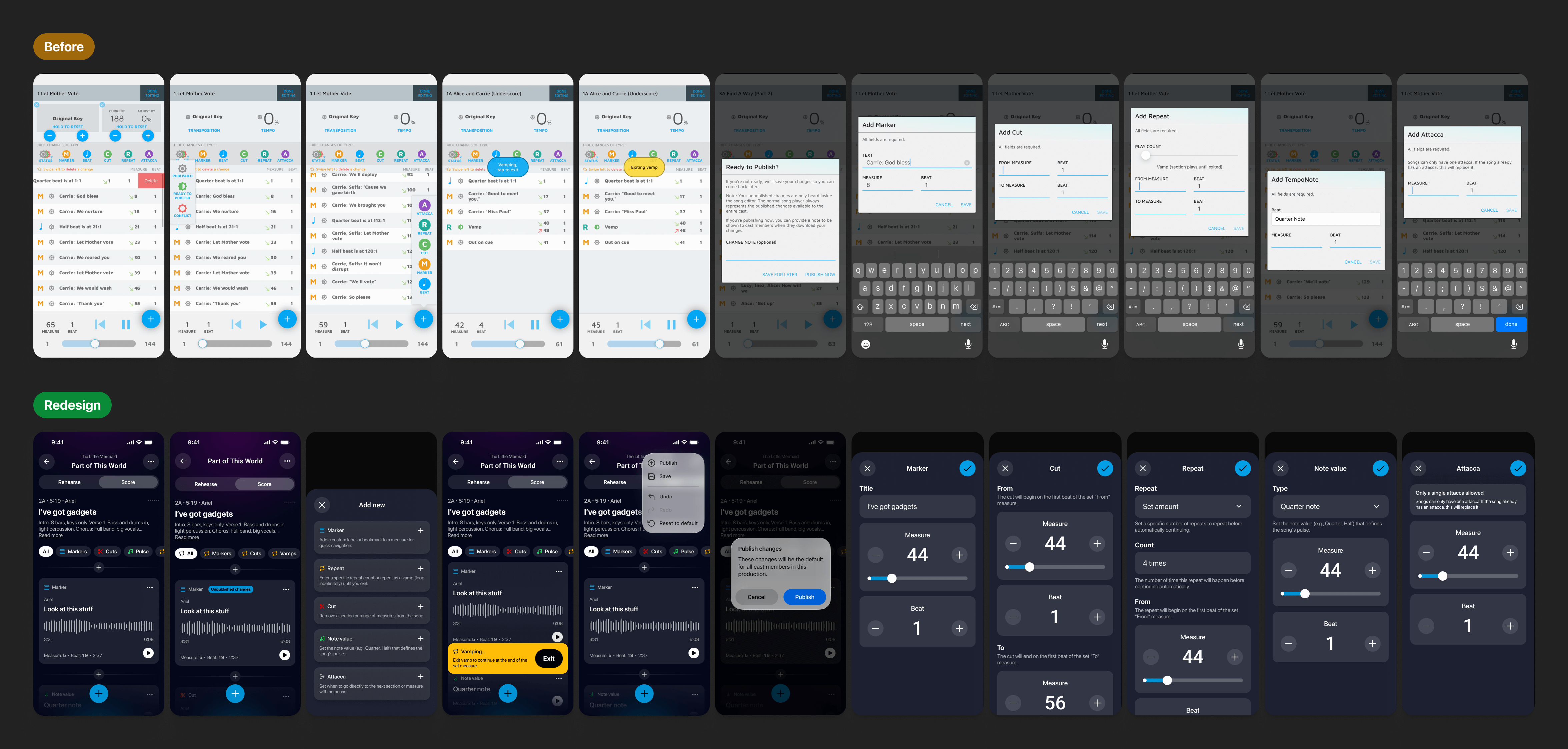
In the legacy app, the 'Score' view was an isolated environment that shifted abruptly from the app's standard dark mode to a blinding white editing UI. Worse, this view was gated behind permissions, meaning only editors could see the song's structure. I integrated this view directly into the main player as a dedicated tab, maintaining visual consistency with the dark-mode interface. This change democratized the song structure; now, all users benefit from a visual table of contents, allowing performers to see the song's progression and jump to specific sections effortlessly, regardless of their permission level.
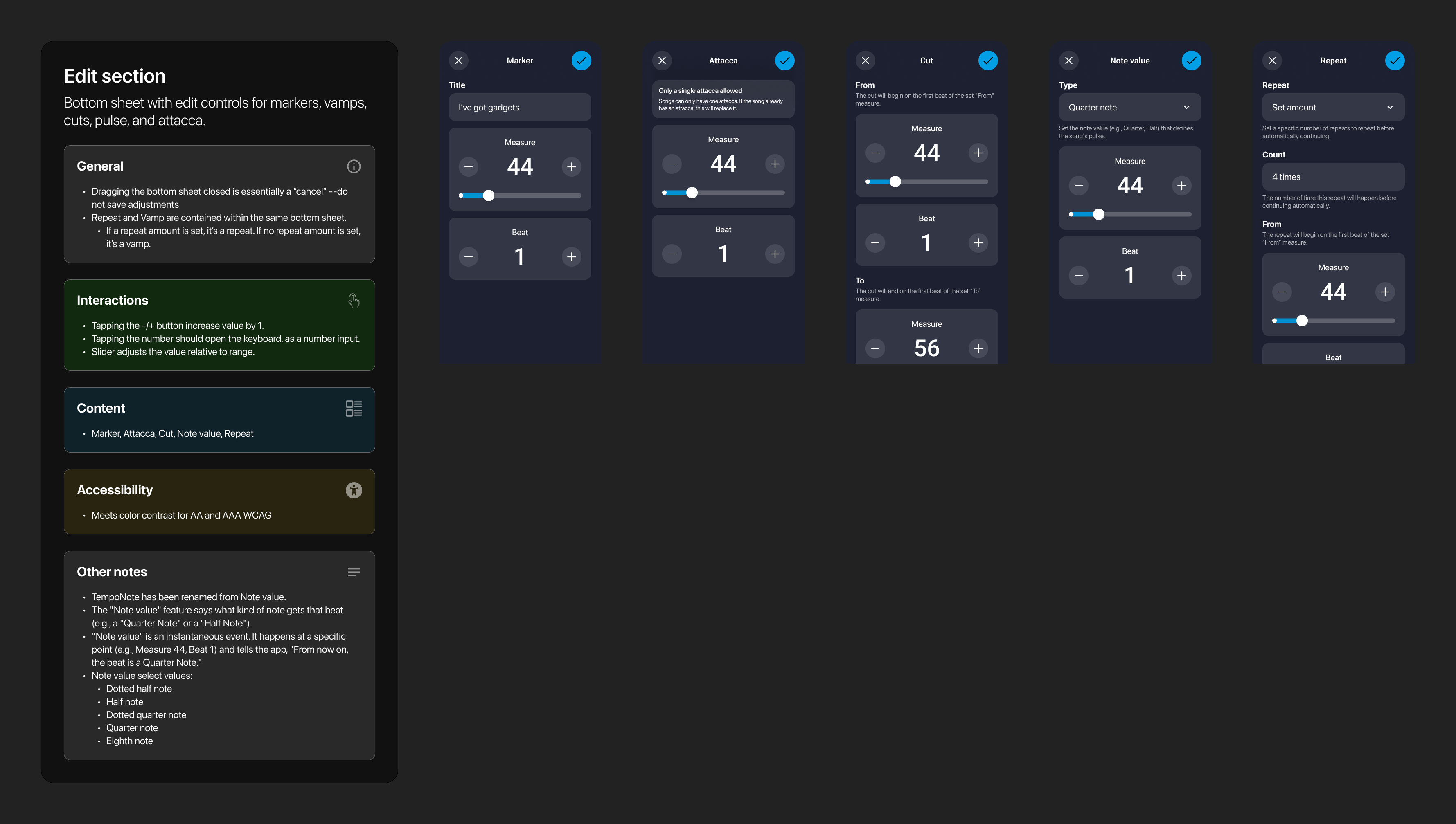
We also resolved critical logic and usability flaws. The legacy app used confusing metaphors—like a 'sun' icon to indicate status changes—and allowed impossible states, such as placing multiple 'Attacca' (immediate transition) markers anywhere in the stack. I replaced these with standard, clear UI elements and a logical, single-toggle Attacca switch at the bottom of the list. We also introduced powerful filters, making it easy to sort through markers, vamps, and cuts without getting lost in the data.
The redesign synthesizes these features into a single, intuitive interface that adapts to the user. While everyone has access to the navigation timeline, only those with edit permissions see the 'Add' button for inserting elements like markers, vamps, or repeats. This approach ensures that the app feels complete for a performer using it as a guide, yet powerful for a music director making changes, all within the same unified surface.

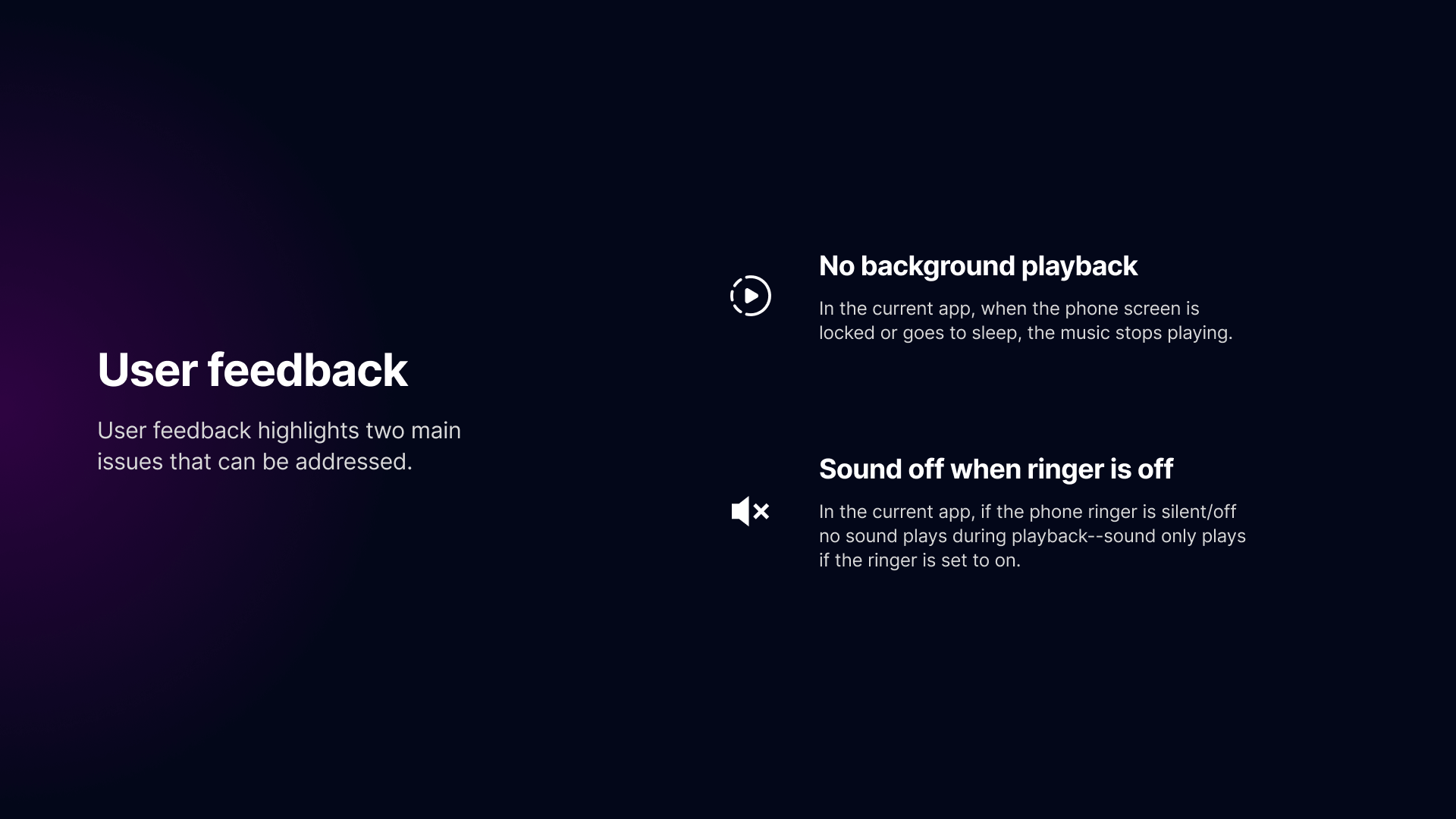
The redesign successfully stabilized the product, resolving the critical audio and login issues that plagued the legacy version. By delivering a modern, professional-grade interface, we restored trust with the user base and provided performers with a reliable tool they can confidently use on stage and in the studio.
Skills & competencies
Key areas of expertise and methodologies applied during this project.