Vivint • Lead Designer • 2026
A new design foundation for Vivint
I identified that the legacy design infrastructure was insufficient. I spearheaded the complete re-creation of Vivint's design system and color logic. This overhaul established a modern, token-based architecture that streamlined design-to-dev handoff and ensured visual consistency across the entire smart home ecosystem.
Listen to case study
Loading case study audio...

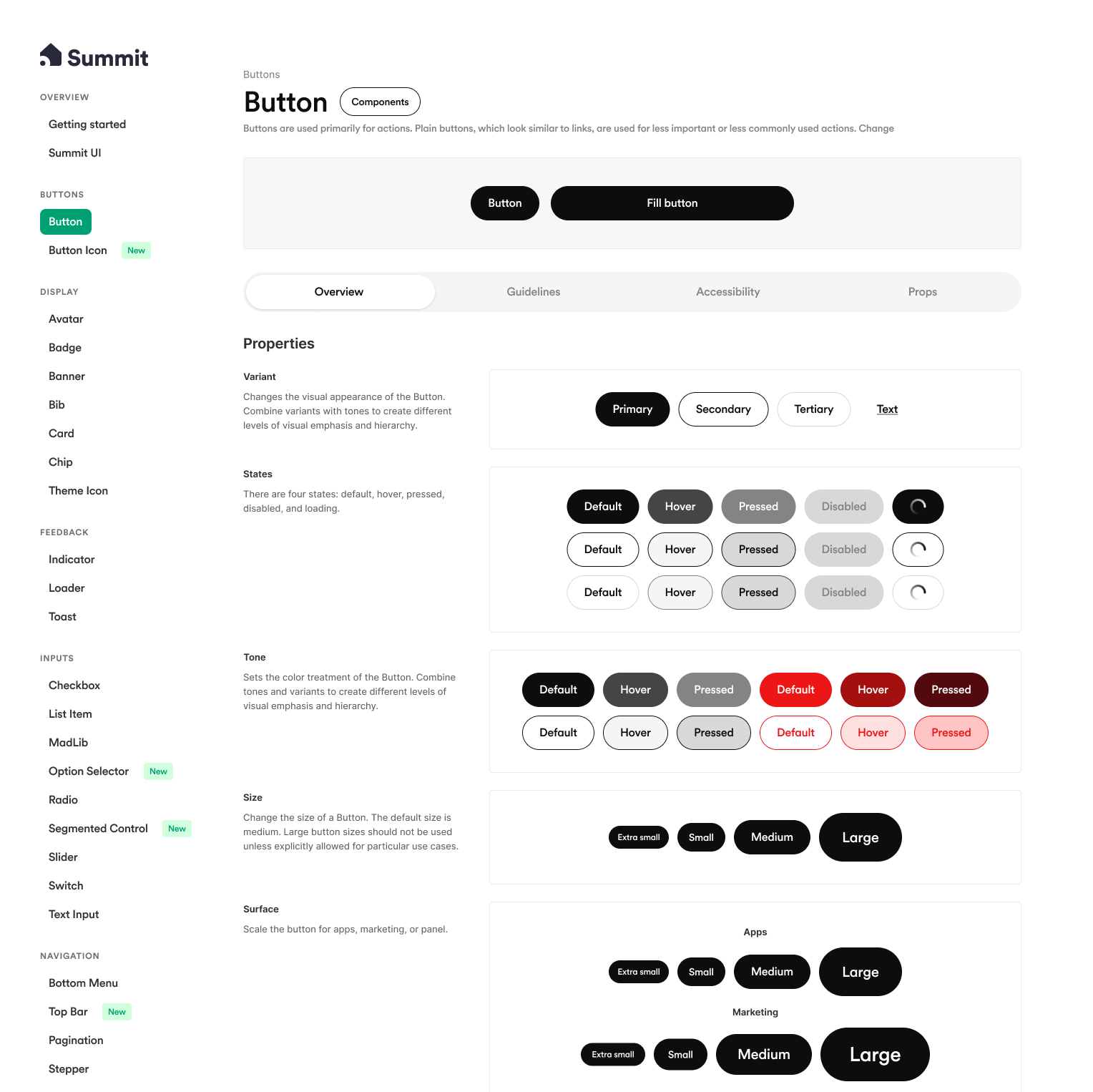
Problem
For four years, the design system had been a chaotic, disorganized effort. It was a 'Frankenstein' of legacy files and broken components that were difficult to maintain and inconsistent. A team member had struggled to get it working, resulting in a system that was hard to use and riddled with technical debt.
Proposal
I stepped in to completely overhaul the infrastructure. I organized the Figma files, rebuilt every single component from the ground up, and cleaned up props to clarify usability. Furthermore, I re-architected the color system to support a company rebrand, enabling fully tokenized Light and Dark modes.
Impact & outcomes
Transforming a fragmented legacy library into a robust, tokenized system accelerated design velocity and ensured visual consistency across the entire product ecosystem.
Development Velocity
2x
Reduction in time-to-ship for new features due to reusable components and standardized tokens.
Optimized components
50+
A comprehensive suite of fully documented, accessible atomic elements ready for cross-platform use.

A fractured foundation
For four years, the design system had been trapped in a cycle of incomplete iterations. It was a "Frankenstein" creation—cobbled together from legacy files, half-baked new elements, and disjointed styles. The organization was chaotic; instead of a structured library, the system lived on a single "sticker sheet" page featuring a jumble of disorganized frames, making it nearly impossible for the team to find what they needed. By the time I joined this project the versioning had become so convoluted that "V4" was a discinct version from "v4" causing confusion amongst designers and developers.
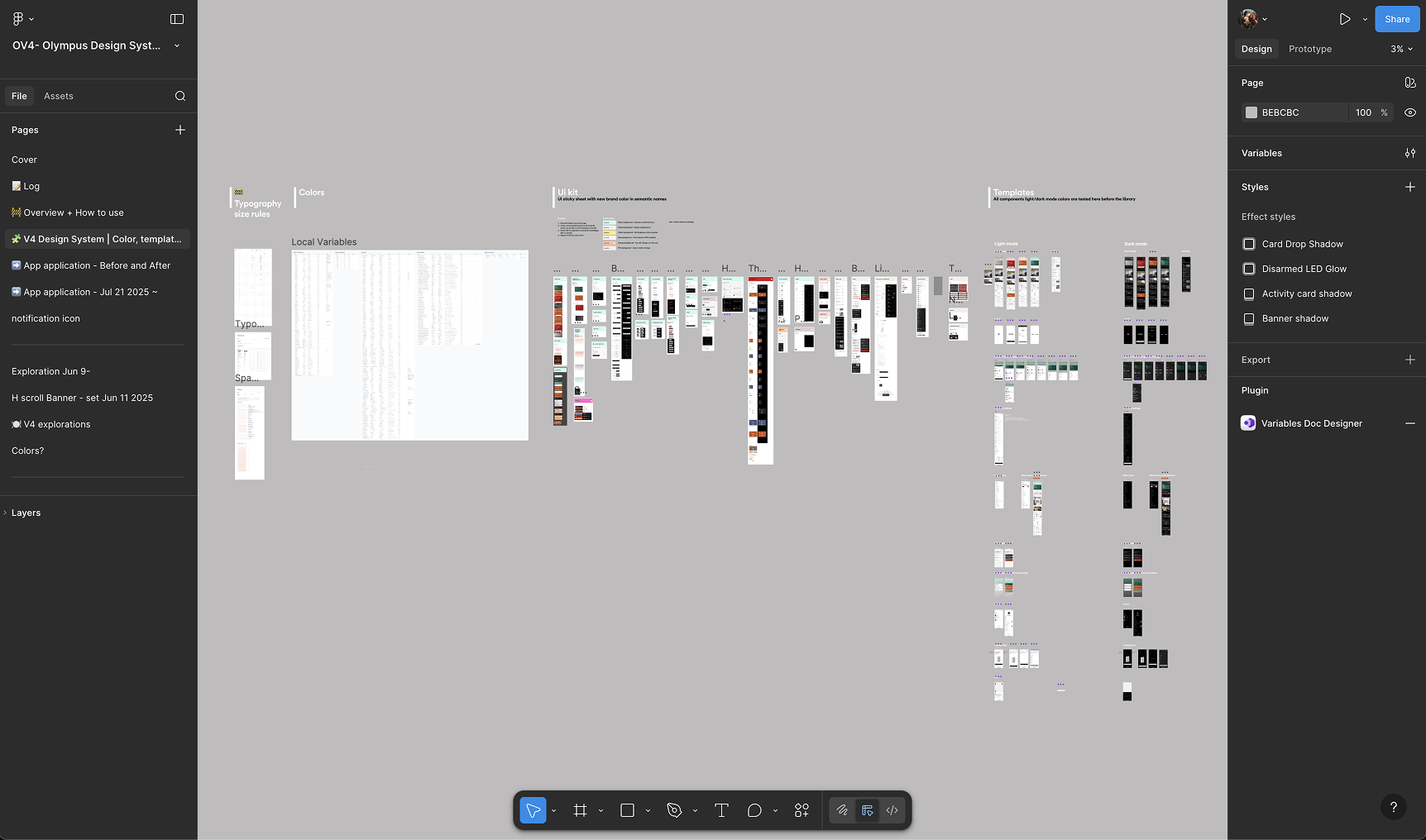
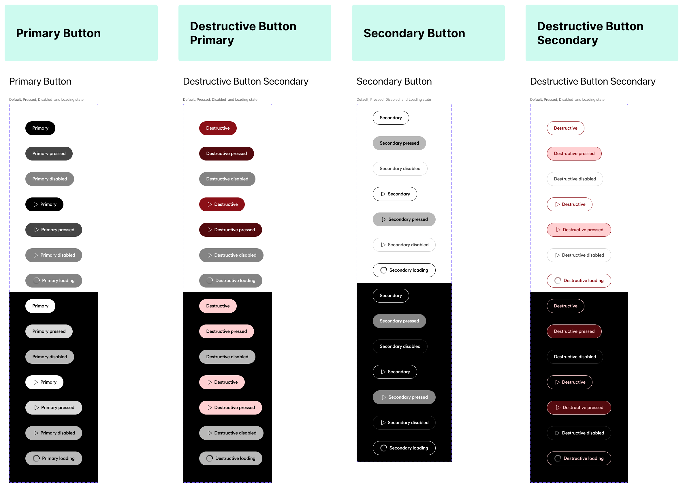
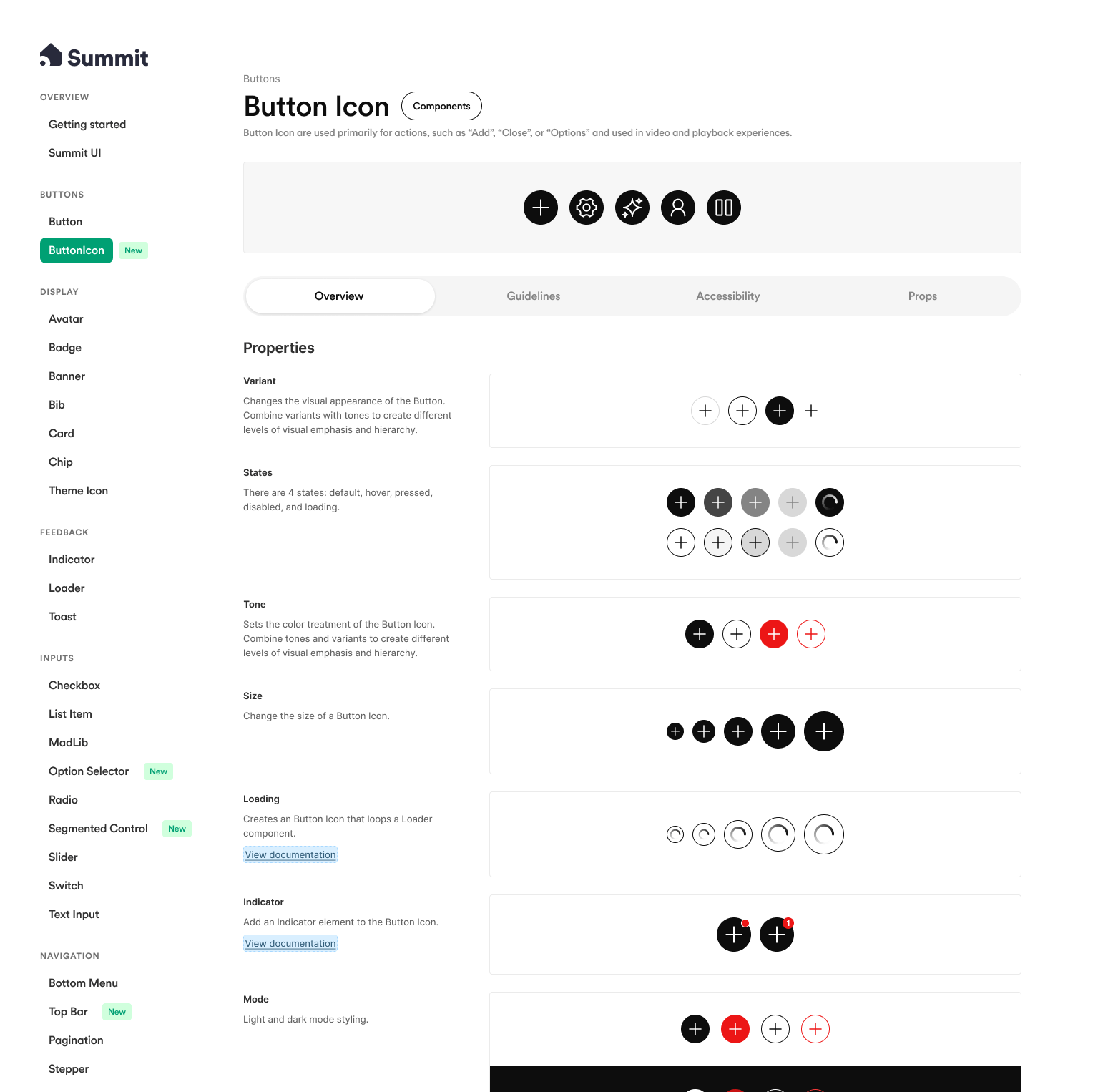
The implementation itself was a major risk. Components were unreliable and inconsistent—primary and secondary buttons were built as separate components rather than variants, meaning that swapping between them destroyed existing text and overrides. Visual rules changed seemingly at random; one week the gray scale ran 0-to-8 (dark to light), and the next it was inverted, with no communication or versioning. This instability led engineers to view the system as a liability rather than a tool, while designers struggled with a unified UI experience that felt disjointed and sloppy.
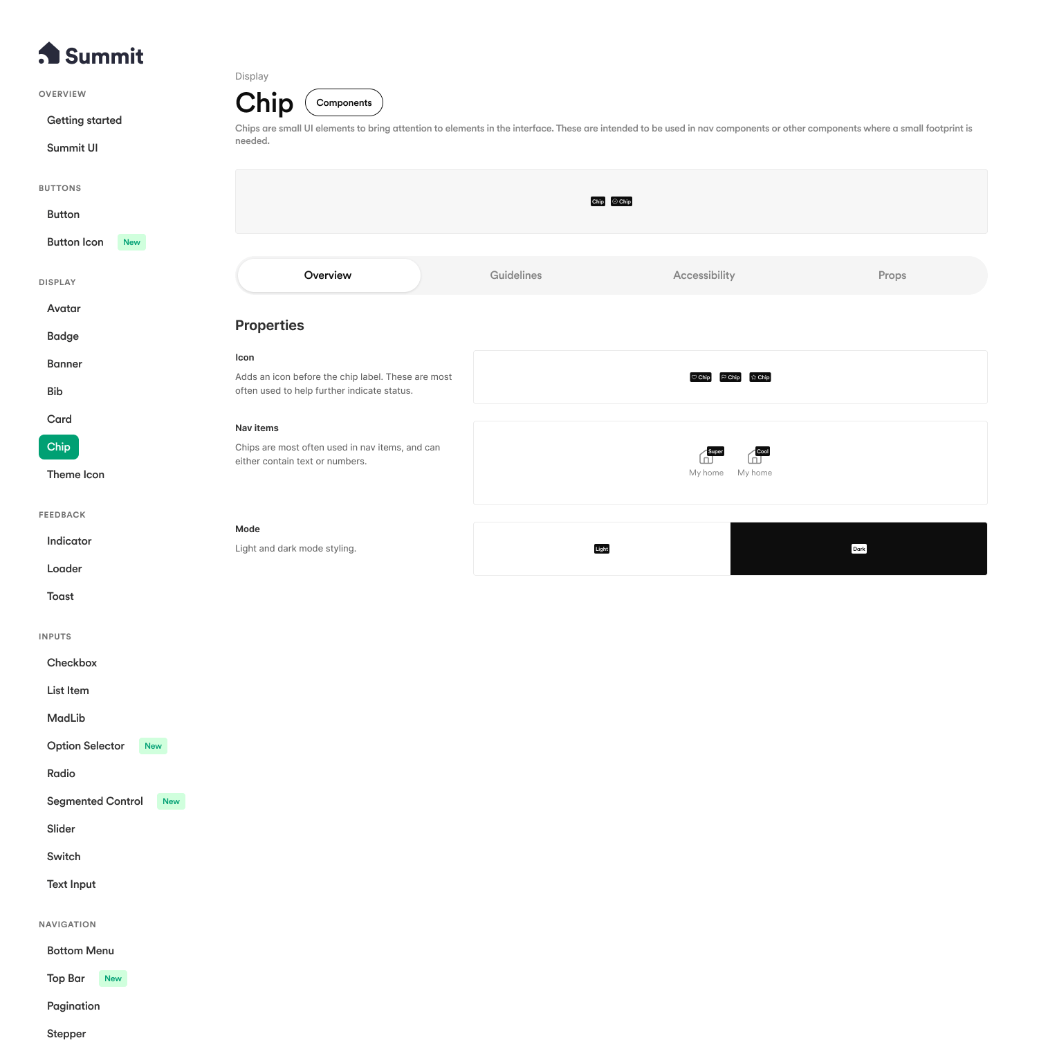
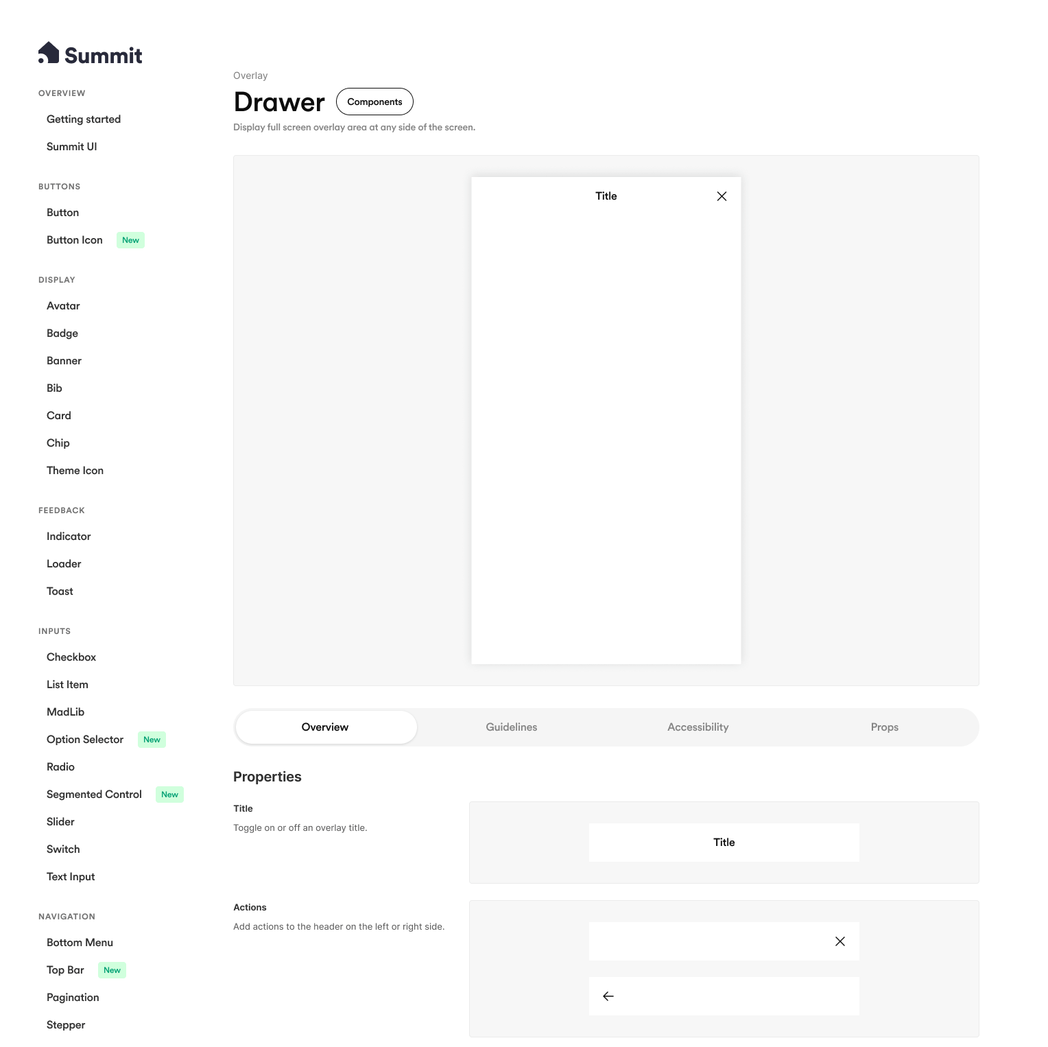
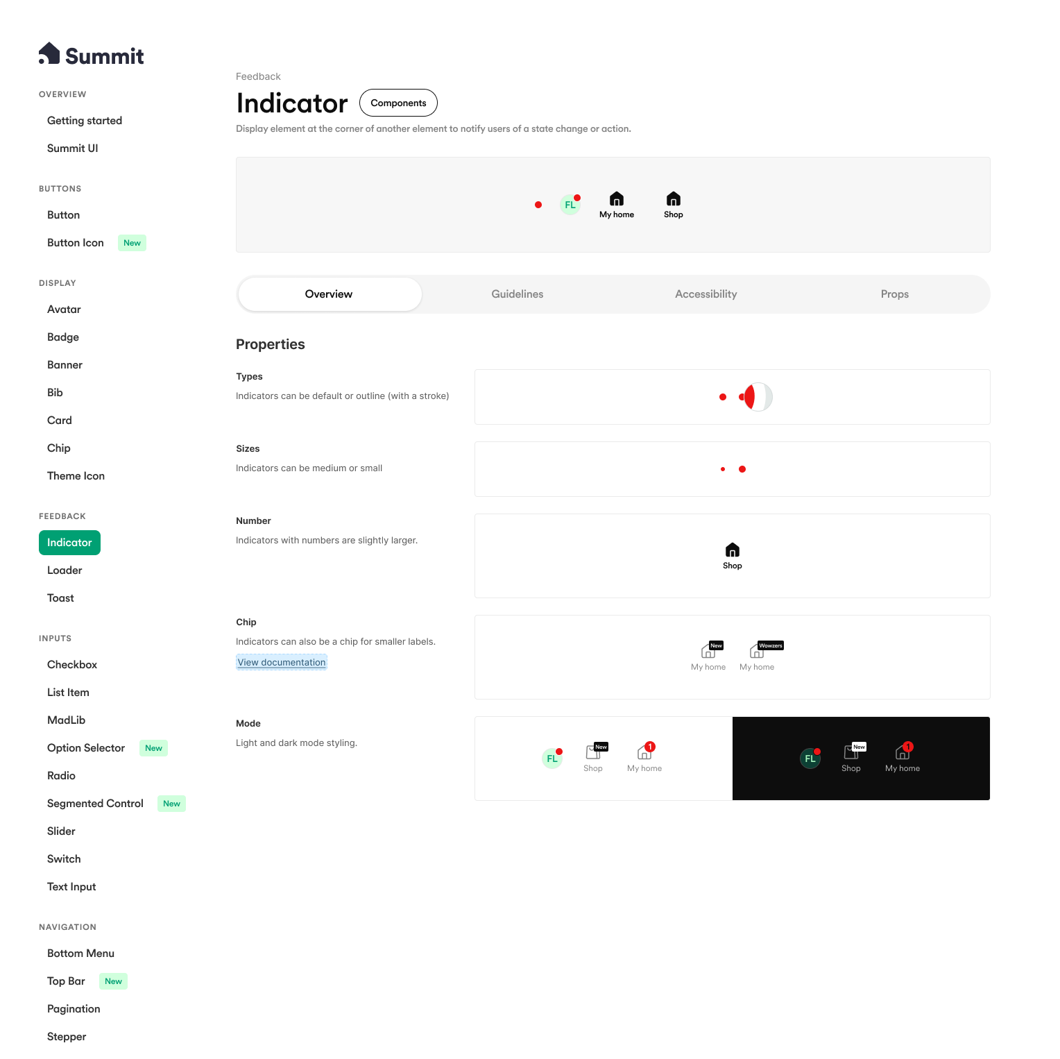
The atomic rebuild
I stepped in to stabilize the foundation, starting by rebuilding every single component from scratch. This was a "clean slate" approach that allowed me to strip away years of bloated references and buried layers. I standardized the architecture, implementing consistent spacing tokens, color tokens, and refined styles across the board.
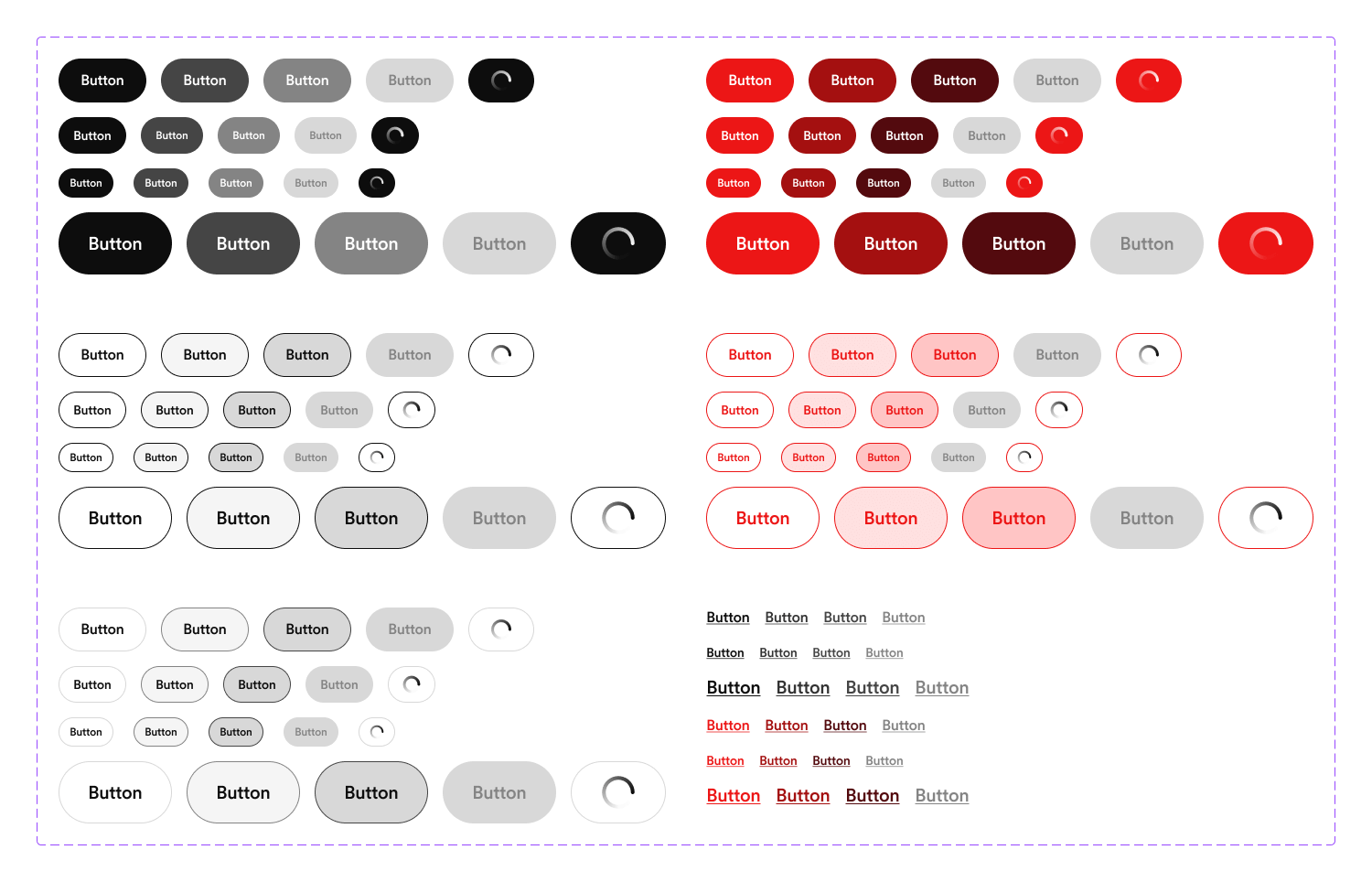
Crucially, I fixed the logic of the components themselves. Props became consistent and intuitive, and variant switching was non-destructive—preserving values when a designer toggled between states. By simplifying the component construction, I made the system predictable. Designers could finally trust that dragging a component onto the canvas would result in a stable, usable element rather than a broken instance.

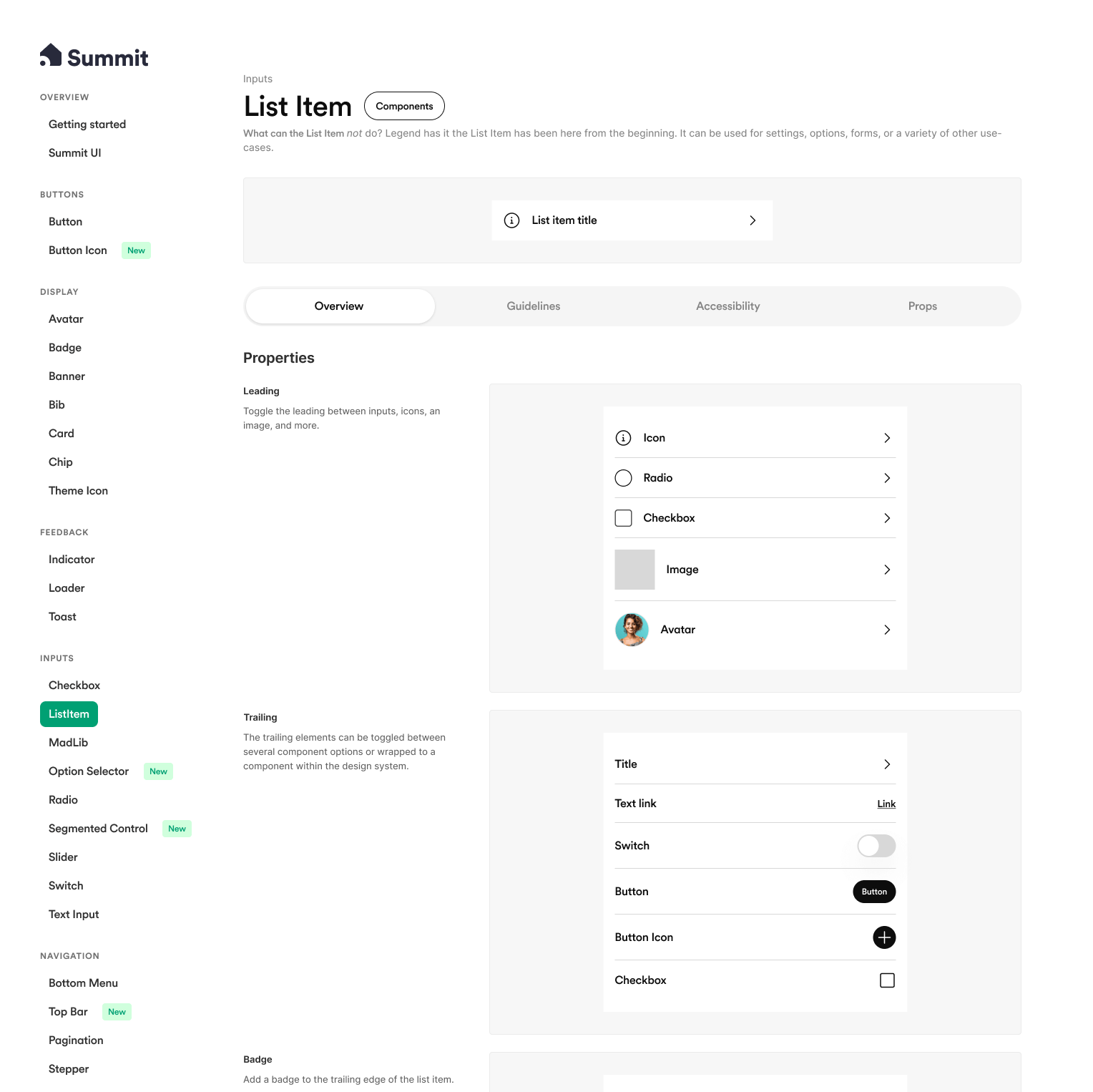
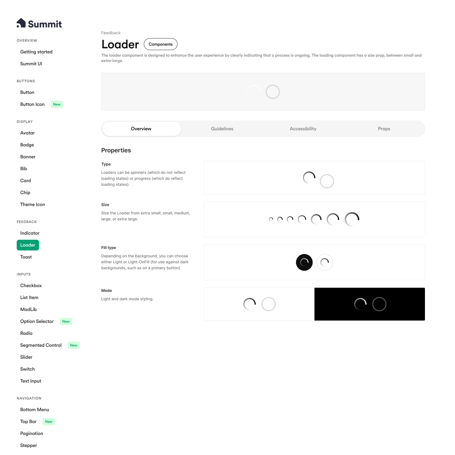
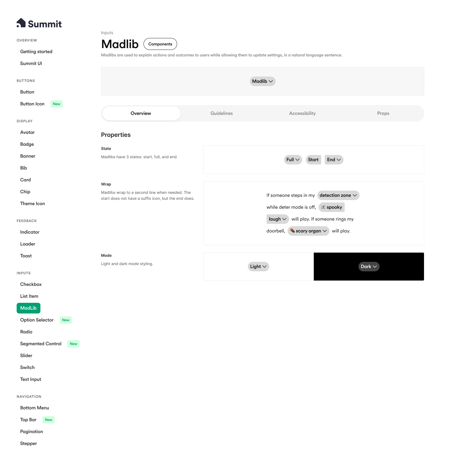
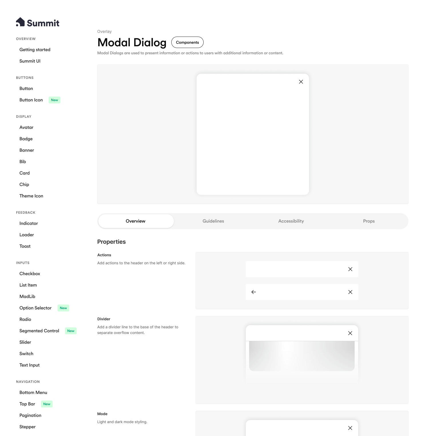
System architecture & the UI kit
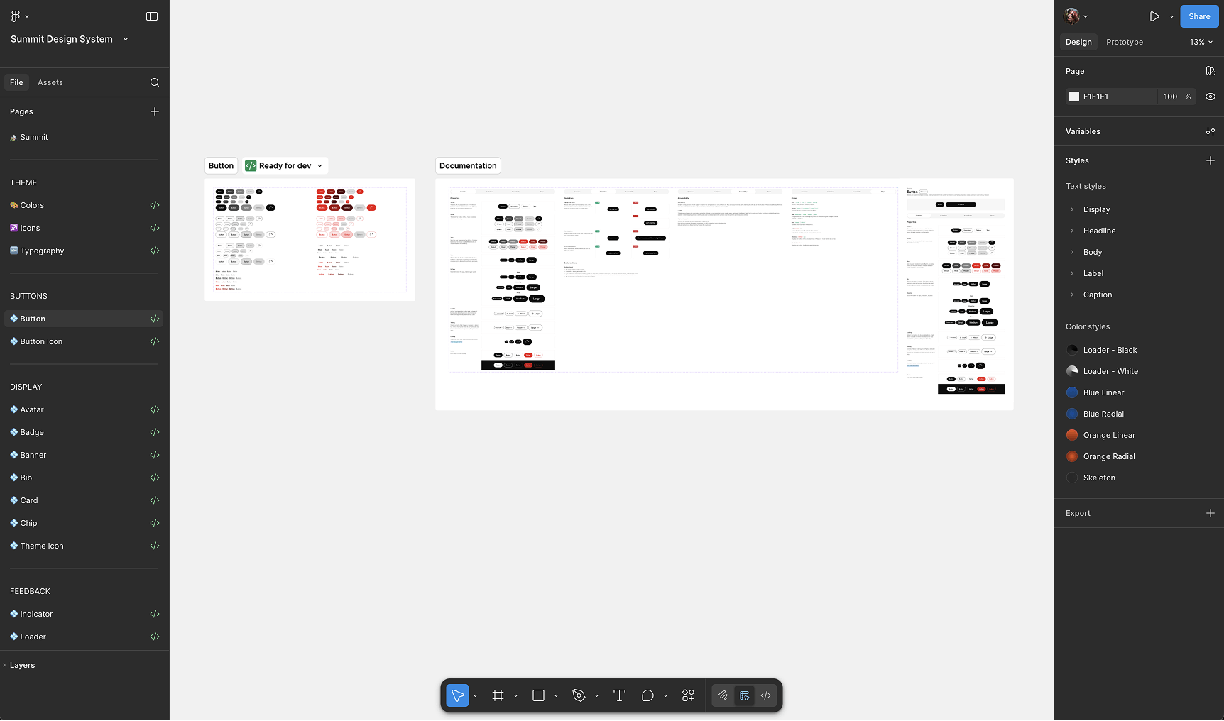
To solve the bloating issue, I restructured the entire ecosystem. The previous approach attempted to cram every possible layout into the core system, resulting in an unwieldy mess. I introduced a clear separation of concerns: an Atomic Design System for core elements (buttons, badges, inputs) and a separate UI Kit for complex, composed patterns.
This shift clarified the contribution model. The Atomic System was locked down, requiring a formal proposal to update, ensuring stability. The UI Kit, however, was open for contribution, inviting designers from across the company to add patterns and share work. This distinction helped the team understand the system’s purpose and gave them a practical way to be involved without compromising the integrity of the core library.
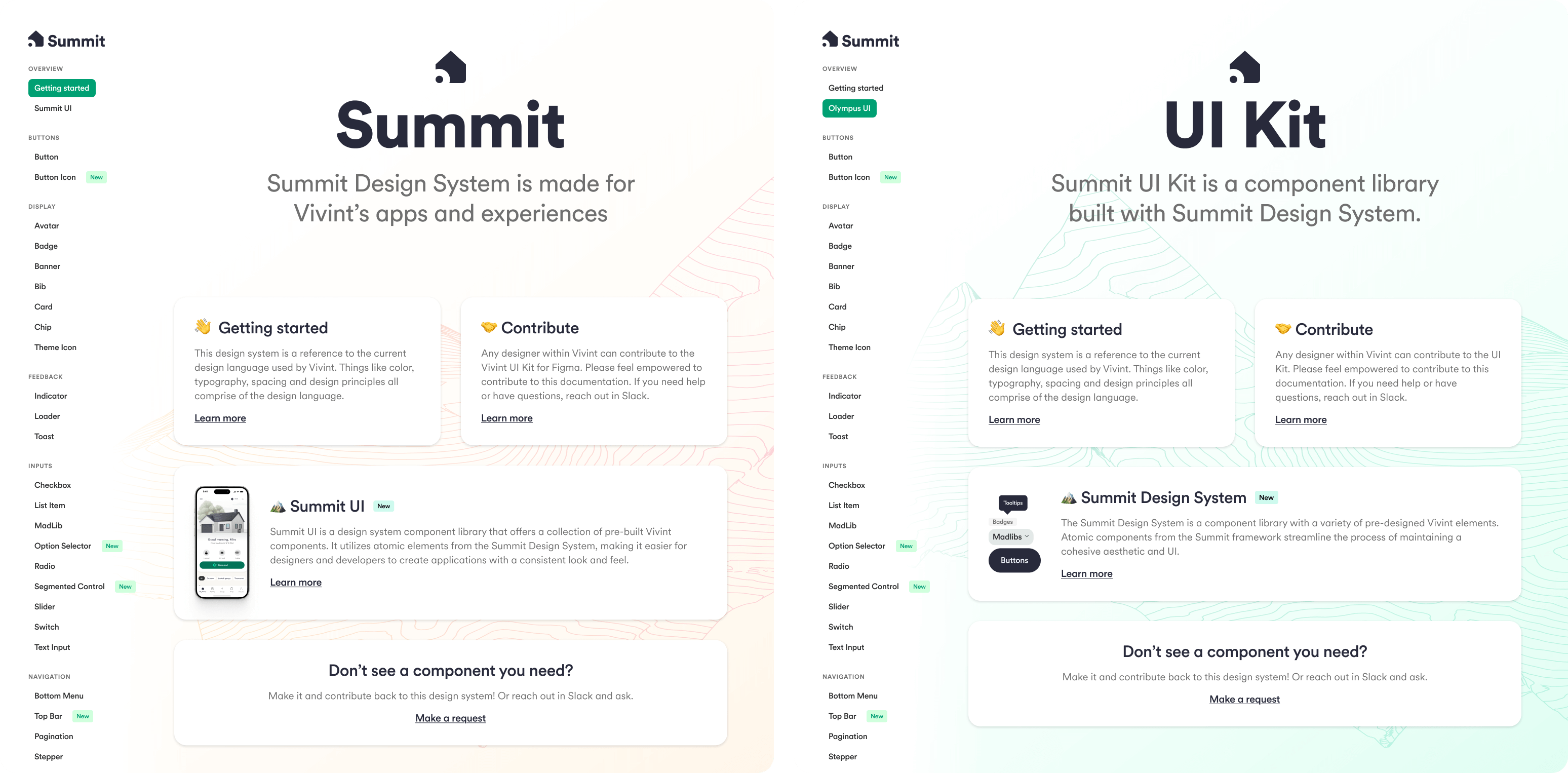
I introduced the name 'Summit' as a symbolic nod to reaching the peak of the previous 'Olympus' era. Practically, this rebrand was essential for discoverability; with so many deprecated 'Olympus' versions cluttering Figma, a simple 'v5' release would have been lost in the noise. 'Summit' created a clear, searchable distinction for the new source of truth.
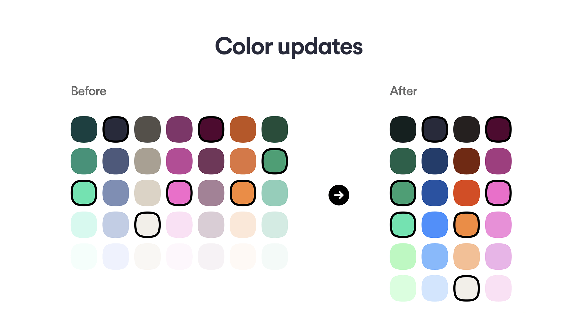
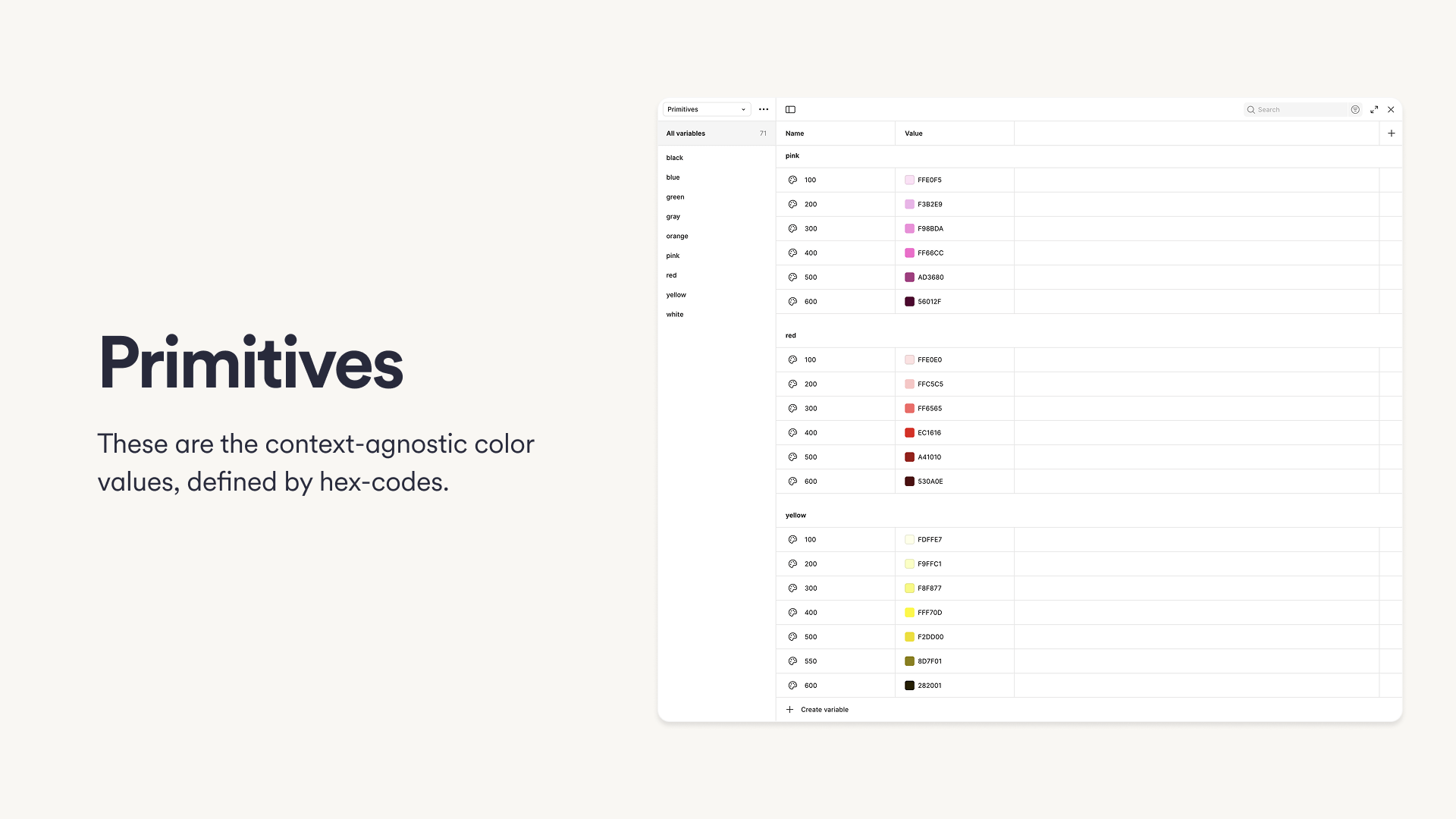
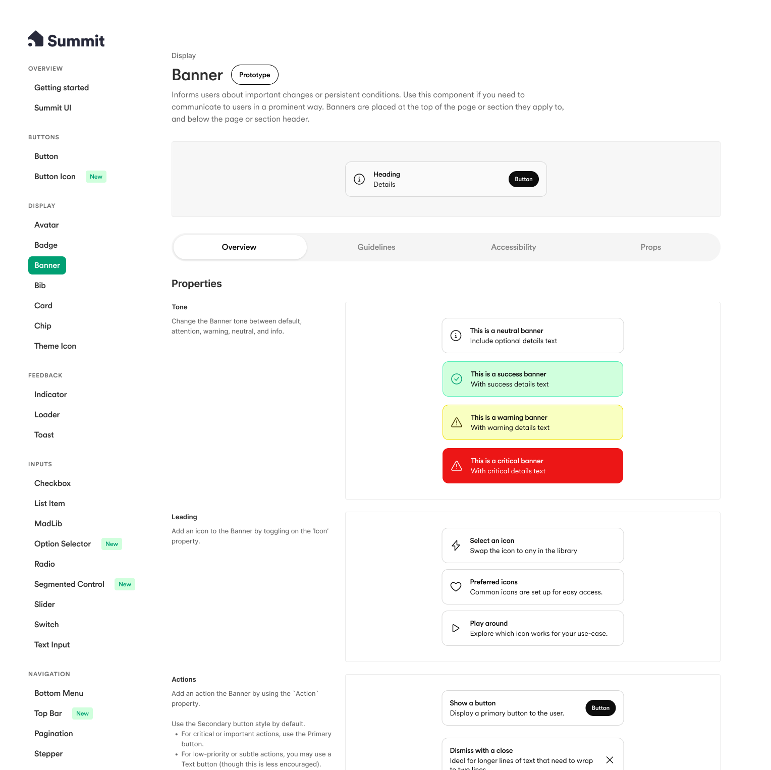
Rearchitecting colors
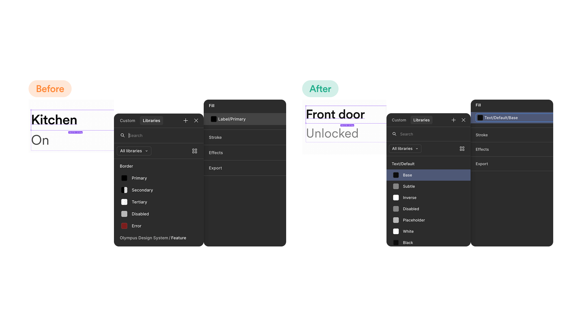
After stabilizing the components, I tackled the most fractured part of the system: color. The legacy color model was based on rigid inverses—Orange1 (light) mapped to Orange3 (dark)—rather than semantic needs. This often resulted in broken contrast ratios in dark mode and forced designers to guess which hex code to use, leading to inconsistent implementation. To make matters worse, these colors weren't tokenized within the components, meaning every color update broke the entire library. Small details compounded the chaos. Simple disconnects, like labeling 'gray' as 'grey,' actively hindered the team's ability to find and use core styles.
The Designer experience
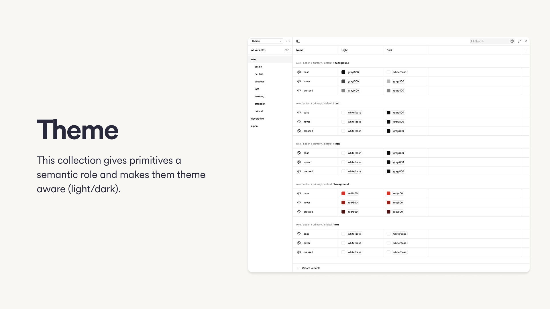
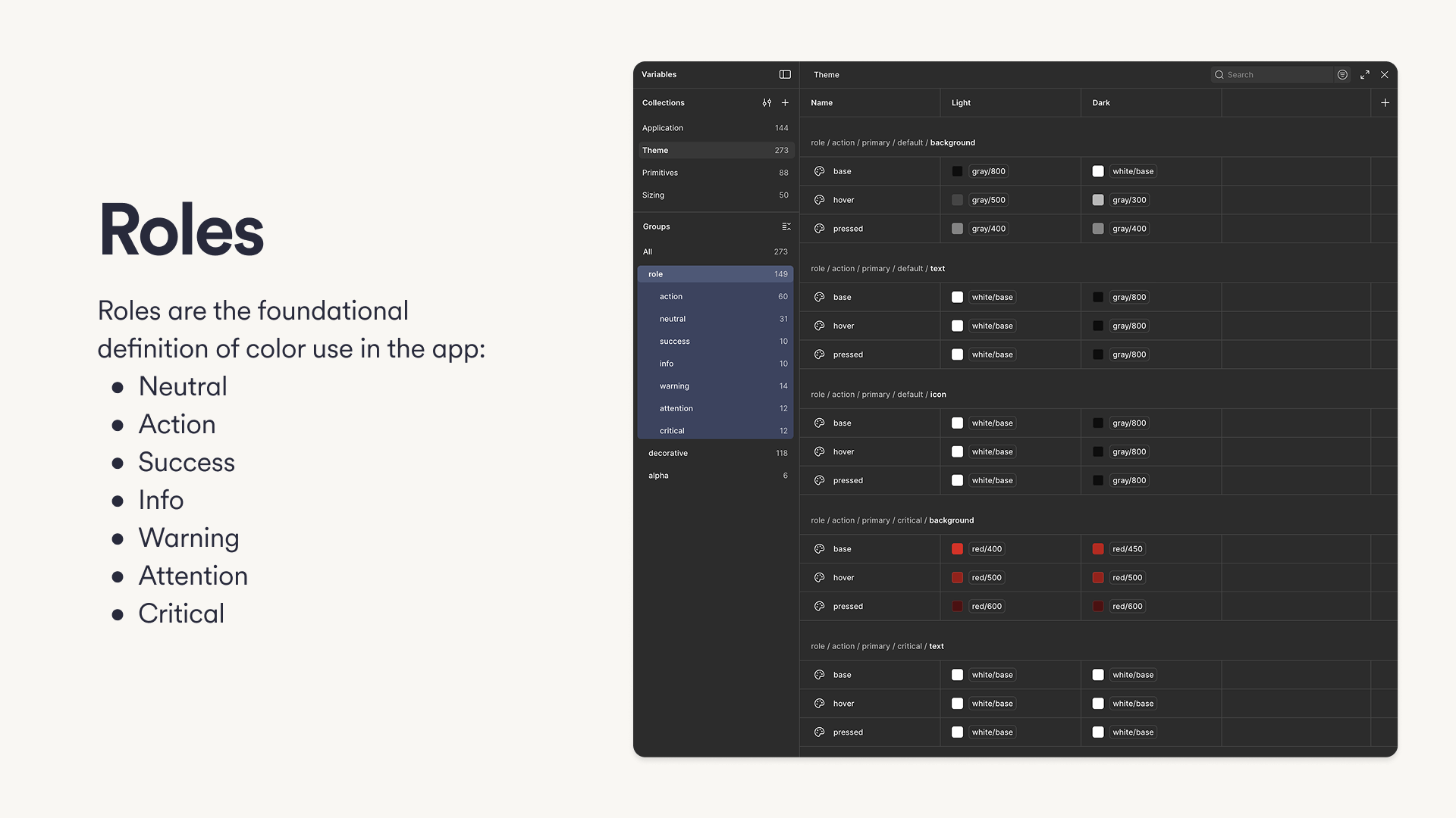
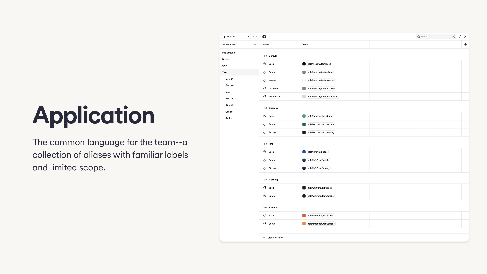
I pivoted the strategy to focus on the designer experience first. I interviewed engineering teams to understand their handoff pain points, but ultimately decided that if the tool wasn't usable for designers, it would never reach engineers correctly. I introduced a semantic "Role-based" architecture. We moved away from raw hex names to semantic roles (e.g., Action, Critical, Success) and "Application" tokens that designers could easily recognize. This decoupled the specific color values from their usage, allowing us to tweak themes without breaking the system. The goal is to create a customizable, scalable, and maintainable system that empowers our teams to build consistent, beautiful, and accessible products and experiences.
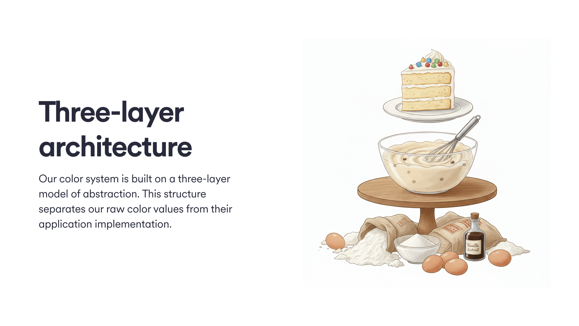
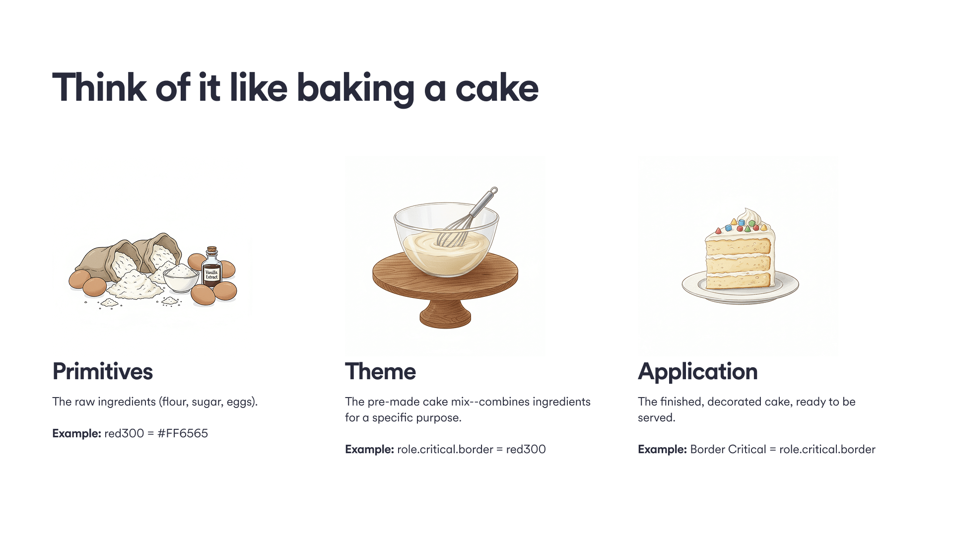
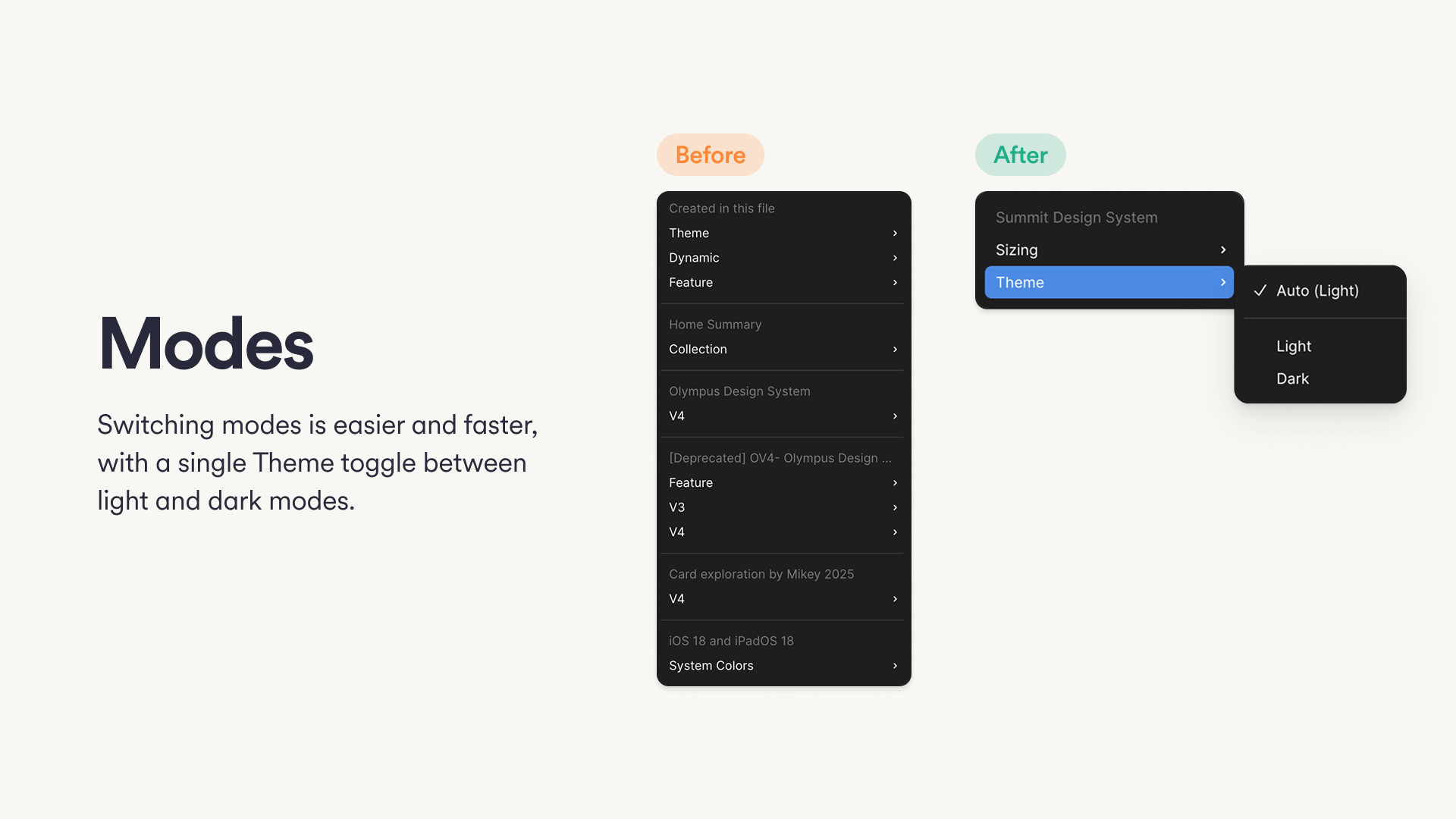
Smart tokens & dark mode
The new color system unlocked significant efficiency gains. Previously, "Dark Mode" was handled by creating duplicate variants for every component, doubling the maintenance burden. With semantic tokens, I defined the light/dark mappings at the variable level.
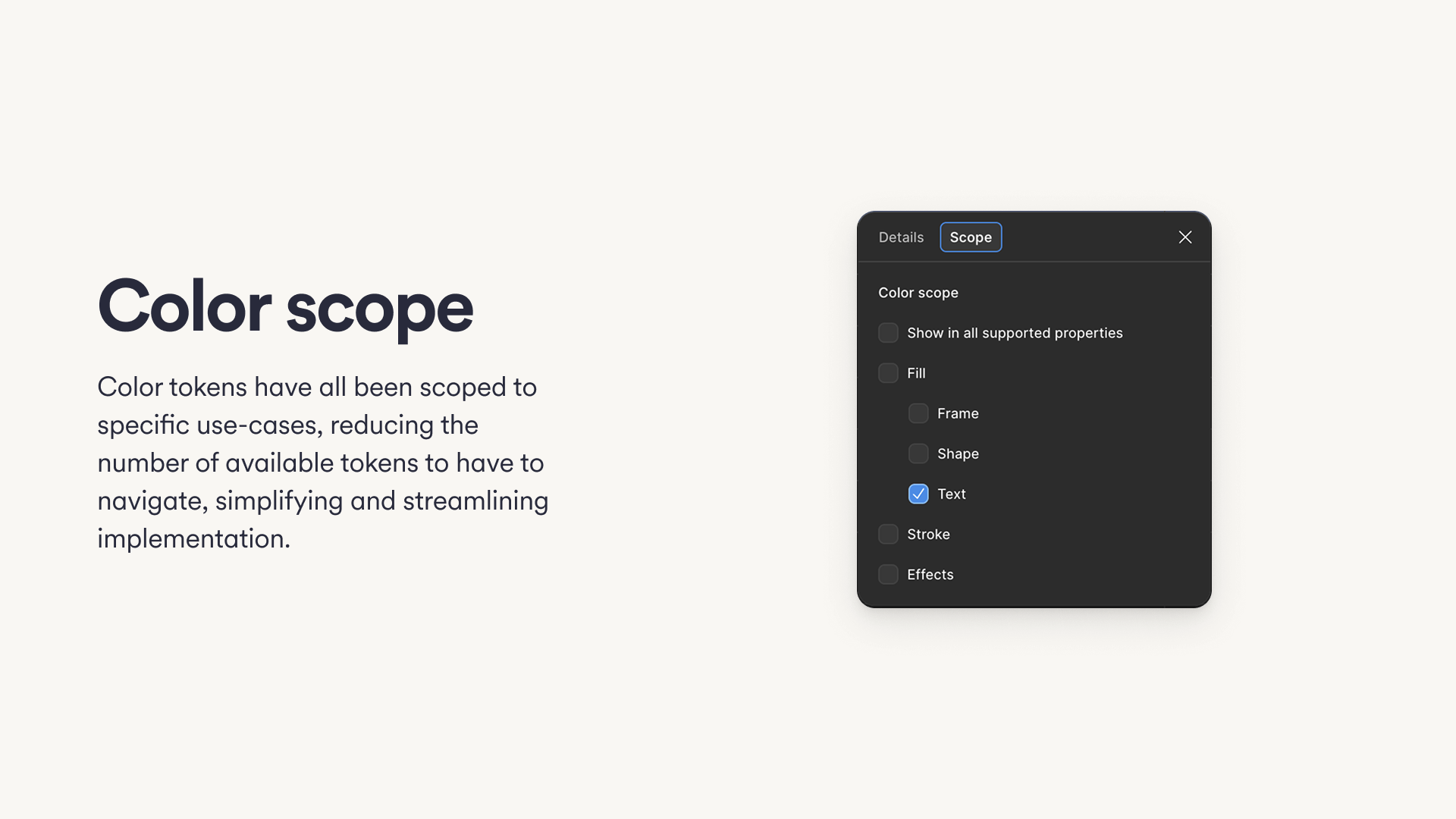
I also implemented "Token Scoping," ensuring that text color tokens only appeared in the text property panel, and background tokens only in the fill panel. This significantly reduced clutter and cognitive load. Now, switching between light and dark modes happens at the canvas level, not the component level. We deleted the duplicate dark mode variants, slashing the file size and maintenance overhead in half while ensuring 100% consistency across themes.
Unifying the ecosystem
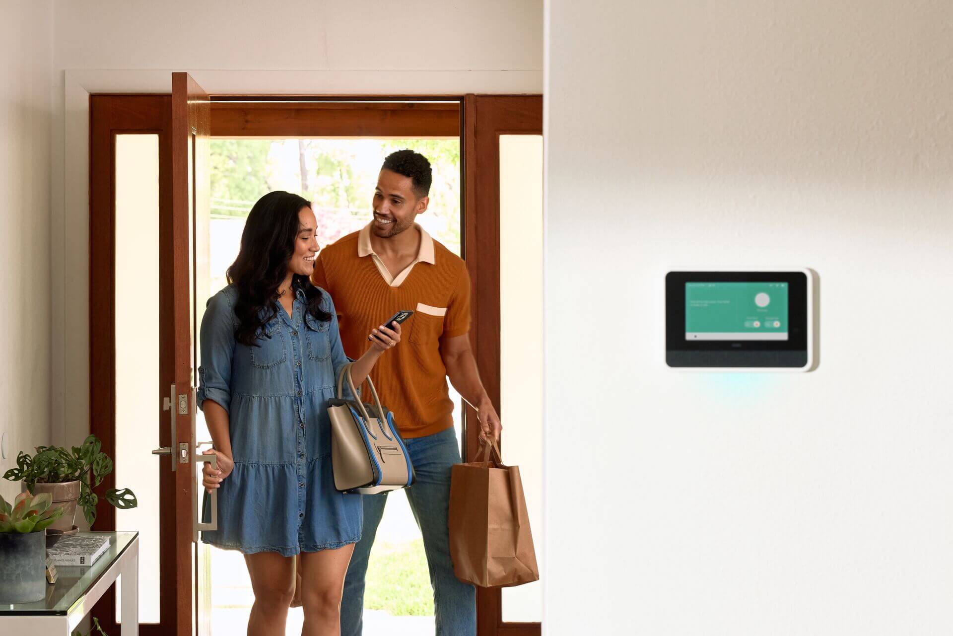
The legacy system had a critical blind spot: it was built exclusively for mobile apps, leaving Vivint's physical hardware interfaces—like the Smart Hub Panel and Thermostat— stranded with divergent designs. This fragmentation broke the continuity of the user experience as they moved from their phone to their wall.
Summit was architected to be platform-agnostic. By leveraging primitive tokens and flexible component definitions, we extended the system to support not just iOS and Android, but also the embedded environments of our IoT devices. Now, whether a user is adjusting the temperature on their wall or disarming their system from the Panel, the interaction patterns and visual language remain seamless and familiar.
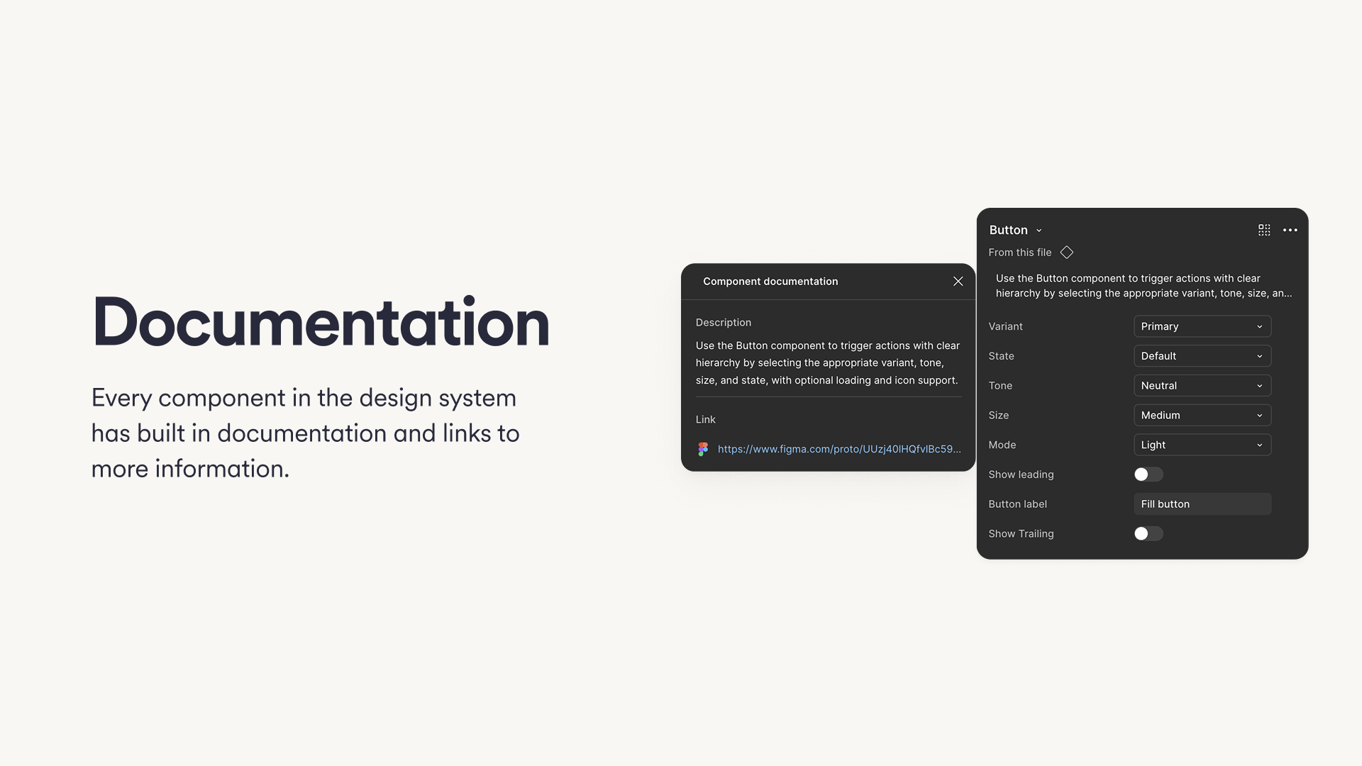
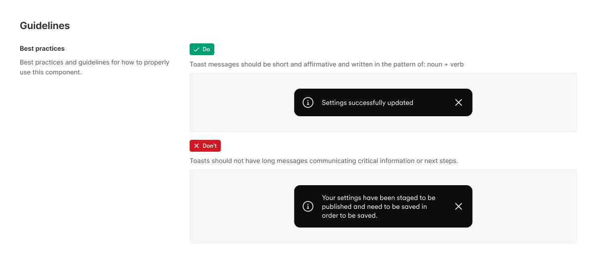
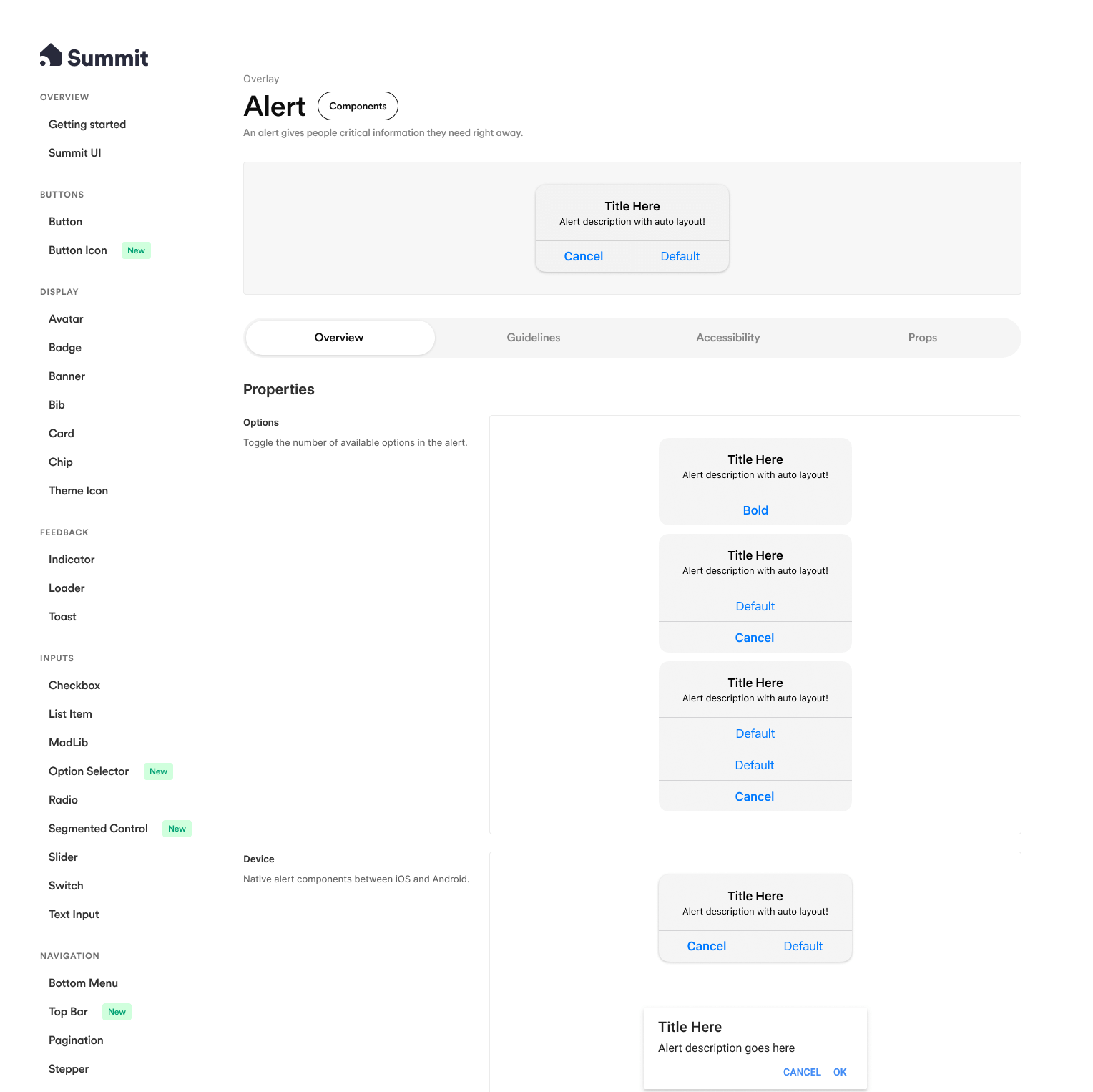
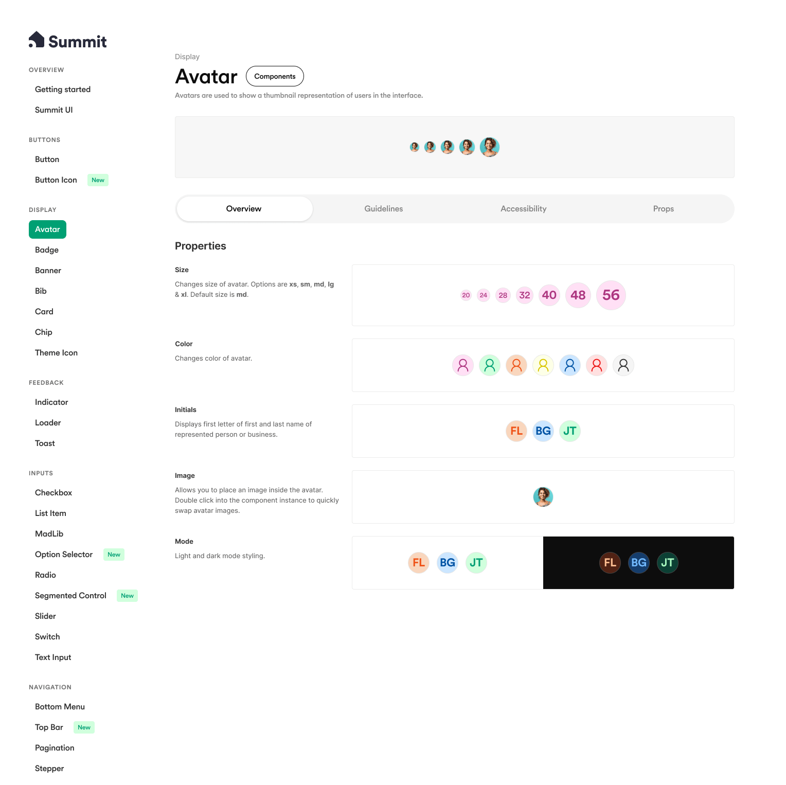
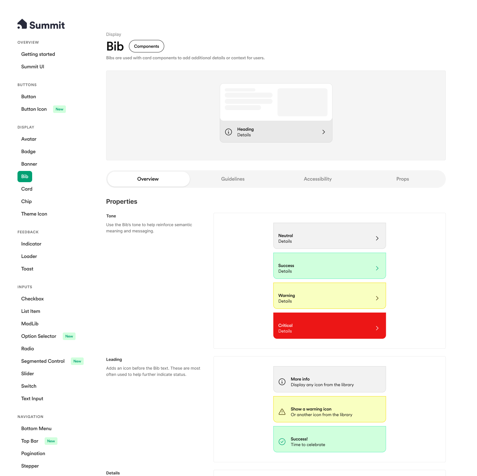
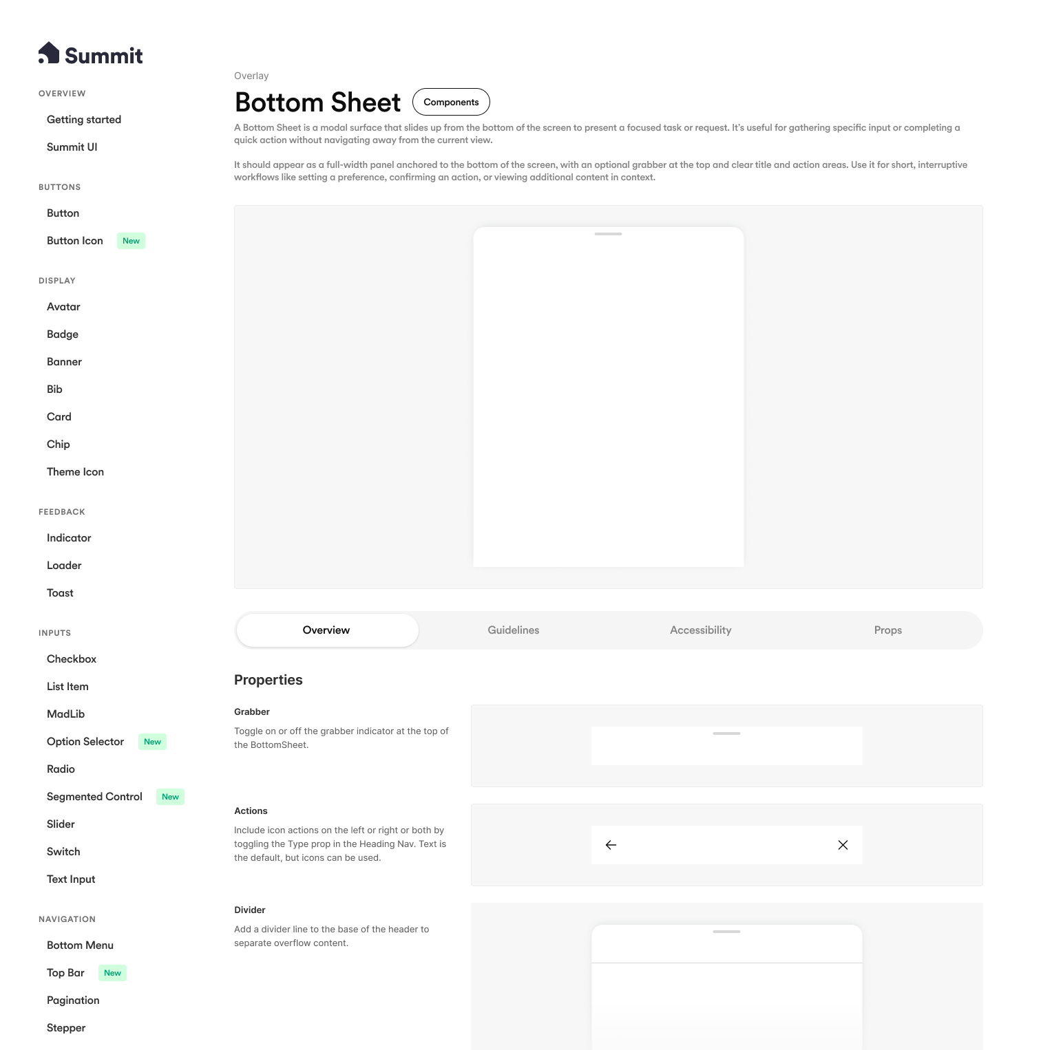
Documentation & catalog
To ensure long-term adoption, I moved away from the chaotic sticker sheet and built a web-like prototype catalog. Every atomic component was given its own dedicated page containing the component itself, a quick overview of its use cases, specific "Do's and Don'ts," and accessibility guidelines.
This resource became the single source of truth for both designers and engineers. It bridged the gap between the visual tool and the code implementation, ensuring that the rigorous work done to fix the system was clearly communicated and easy to follow.


A new level of velocity
This overhaul did more than just clean up files; it fundamentally changed how the team operates. We moved from a culture of hesitation—where the system was viewed as a liability—to one where it is a trusted strategic asset.
By eliminating the massive technical and visual debt that had accumulated, I established a reliable backbone for the product. This shift not only restored trust between design and engineering but also unlocked a new level of velocity, empowering the entire team to build with speed, consistency, and confidence.
This foundation was immediately put to the test—and proved its value—by enabling the rapid design and development of the new Energy experience.
In the span of two months, I took a system that had been floundering for four years and transformed it into a stable, scalable product for every Vivint product team.
Skills & competencies
Key areas of expertise and methodologies applied during this project.