Vivint • Lead Designer • 2026
Integrating energy into the smart home
I led the design for Energy Insights, a top-priority initiative transforming the Vivint experience by integrating comprehensive power management into the smart home. Evolving the product from an early MVP to mature version 1 and version 2 releases, I am now defining the version 3 vision to fully embed energy intelligence across the core application.
Listen to case study
Loading case study audio...
Problem
While the MVP displayed raw data, it lacked a coherent vision for user value. The interface was dense and unintuitive, failing to translate complex power usage into actionable insights. Users could see their energy, but the design offered no clear path to manage it within their existing smart home flow.
Proposal
Redefine the product vision to focus on actionable intelligence rather than raw reporting. Overhaul the UX to prioritize clarity and context, creating a scalable framework where energy insights drive automation and behavioral changes throughout the entire Vivint experience.
Impact & outcomes
Replacing unreliable QR code scanning with automated mDNS connectivity eliminated critical user friction points, providing real-time visibility into firmware updates and cutting setup time by more than half.
Feature adoption
+300%
Increase in daily active users engaging with energy insights compared to the legacy MVP.
User retention
+20%
Energy monitoring became a primary driver for daily app opens, second only to security.

A strategic pivot
As a critical strategic initiative to merge smart home automation with energy management, I led the design evolution of "Energy Insights." This project represented a fundamental shift in Vivint's product strategy: transforming energy data from a passive report into an active driver of the smart home experience. My role was to take the product from a post-MVP state through its successful v1.0 and v2.0 releases, while defining the long-term vision for v3.0.
The goal was not just to display graphs, but to deeply weave energy intelligence and power management into the core app experience and broader ecosystem strategy. By evolving the product architecture, we moved energy monitoring from a niche utility to a primary reason for user engagement.
Initial direction
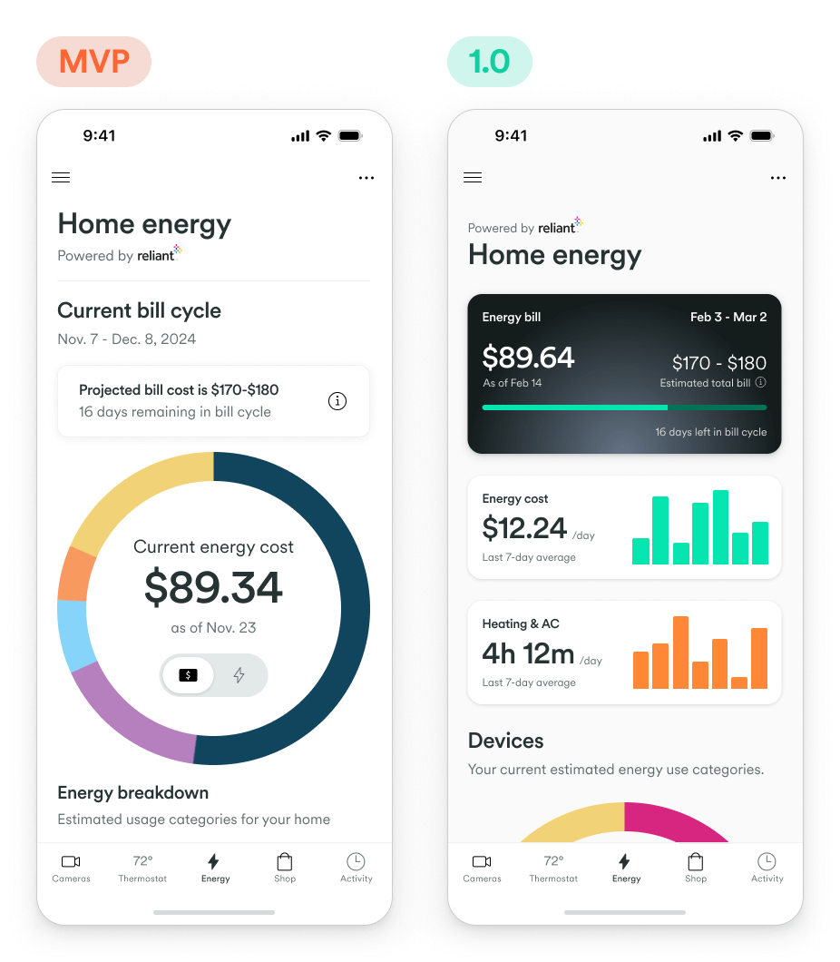
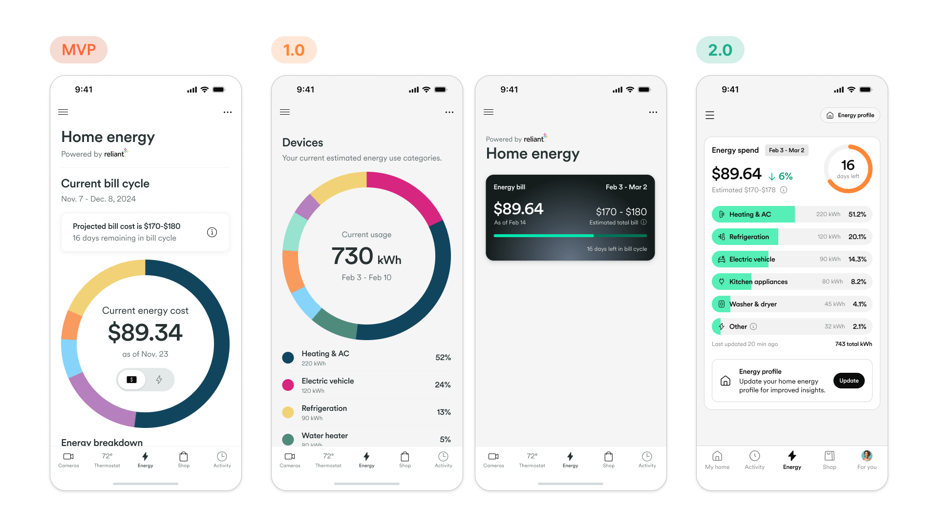
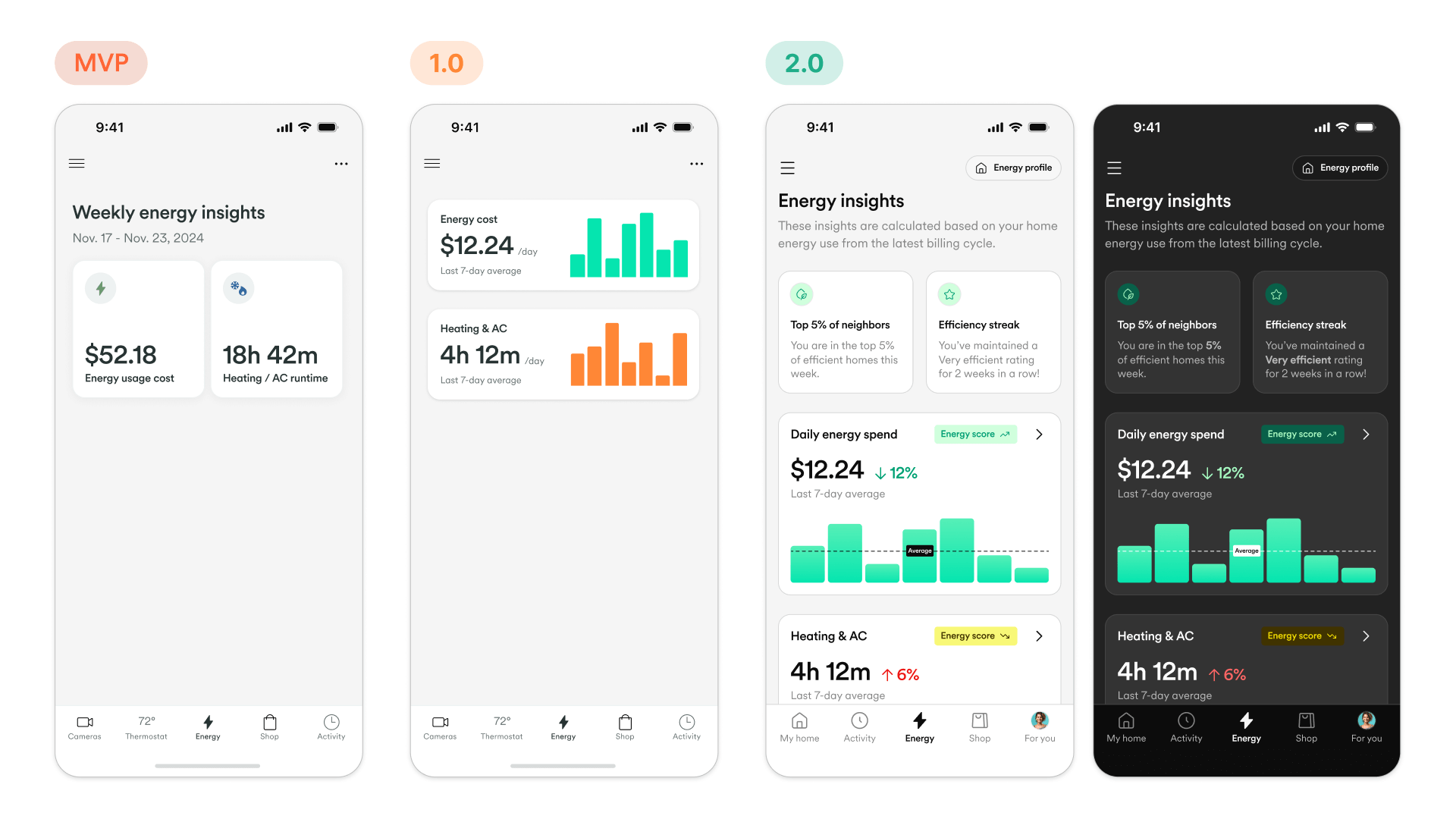
When I joined the project, the initial MVP had been established as a proof-of-concept. While it succeeded in displaying raw data, the design suffered from a lack of strategic direction. It functioned more like a complex spreadsheet than a consumer-facing smart home feature, utilizing a spread out visual style that monopolized screen real estate.


The modularity problem
The legacy design was "heavy"—both visually and structurally. This density created a significant barrier to scalability; because the interface required so much space to display simple metrics, it was impossible to integrate these insights modularly into other parts of the Vivint app. The feature was siloed in its own tab, requiring users to actively dig for data rather than having insights surfaced contextually.

Design principals
To transform technical energy data into a seamless part of the smart home experience, the team and I established core design principles. These guide every decision, ensuring the product moves beyond a utility bill and becomes a proactive, value-driven feature for the everyday homeowner.
Approachable
Present energy information in an approachable and human way, offering visuals and explanations to users.
Engaging
Give users engaging experiences around their energy usage, directly integrated into their Vivint smart home.
Trustworthy
Deliver reliable data on usage patterns, bill totals and estimates, disaggregation models, insights, and more.
Market validation and stabilization
The immediate priority for v1.0 was to stabilize the user experience and ship a usable product to validate the market hypothesis. I focused on resolving "low-hanging fruit" usability issues within the existing constraints of the MVP codebase. This release was about cleaning up the information architecture and ensuring that the data visualization was accurate and understandable for the average homeowner.
Learning from the launch
Following the v1.0 release, user feedback highlighted a critical friction point: users found the raw data (kWh, voltage, amperage) confusing and actionable only in retrospect. They wanted to know how to save money, not just what they spent. These insights, combined with the technical limitations of the legacy code, set the stage for a comprehensive rethink of the product strategy.
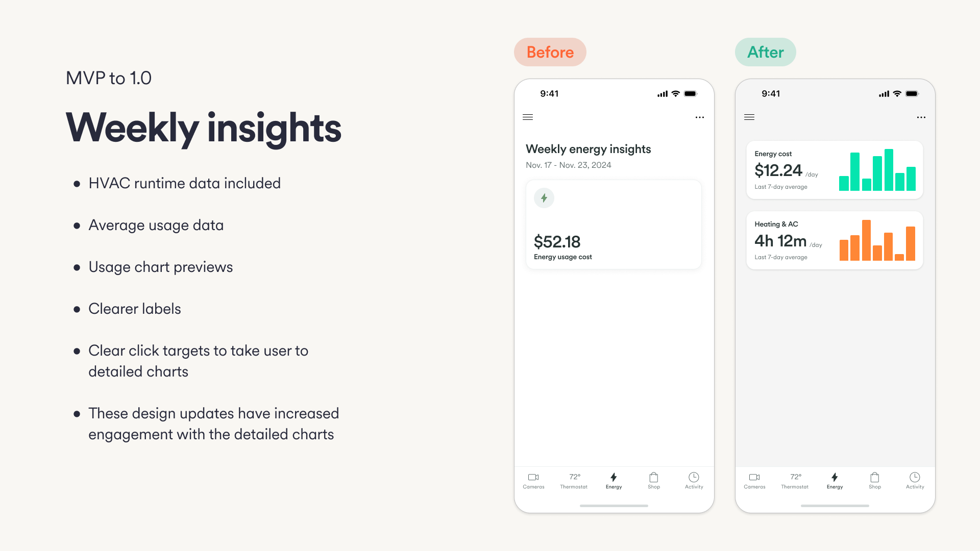
From dashboard to ecosystem
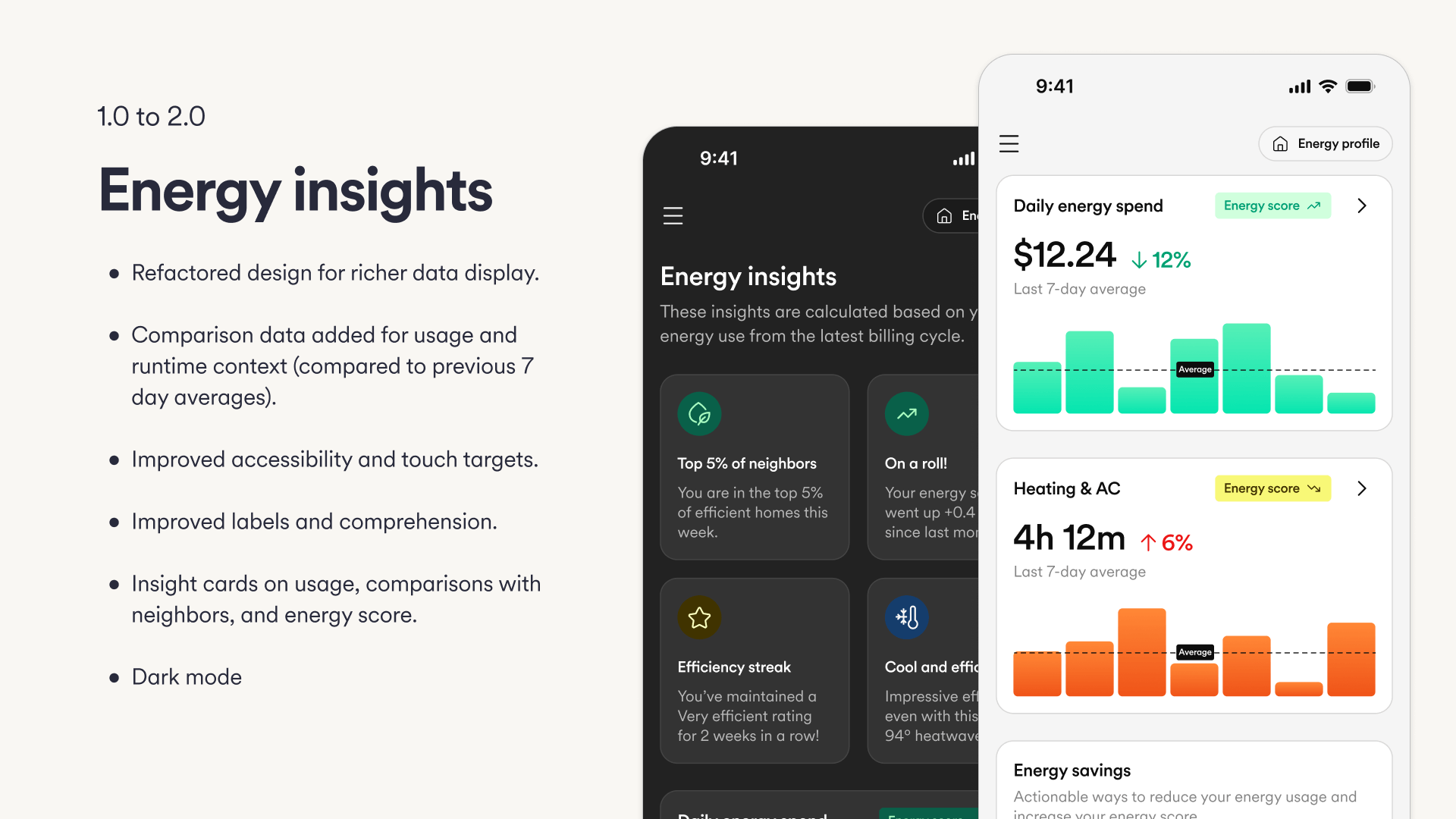
For v2.0, I proposed and executed a complete redesign centered on modularity. We shifted away from the monolithic dashboard approach to a flexible widget-based architecture. This strategy focused on reducing the visual footprint of the feature while actually increasing data fidelity—transforming complex graphs into "glanceable" insights.
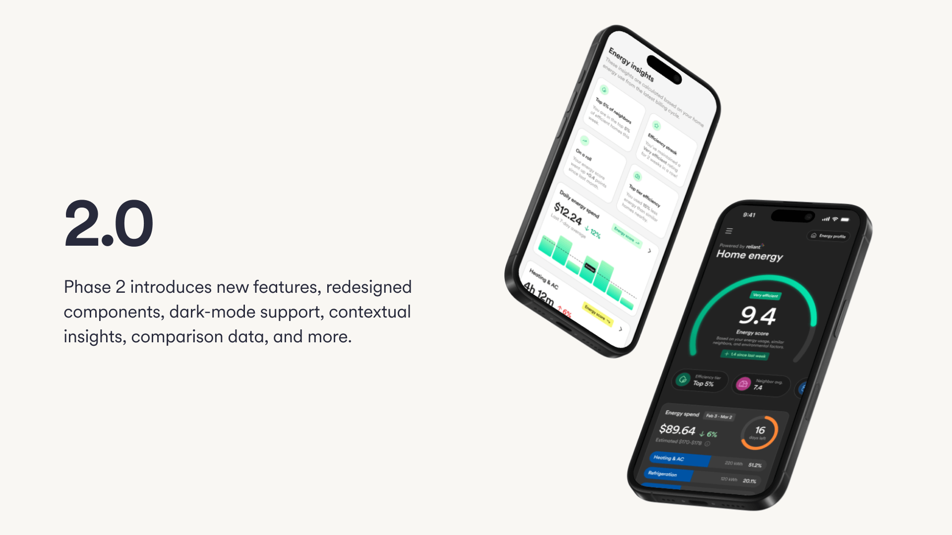
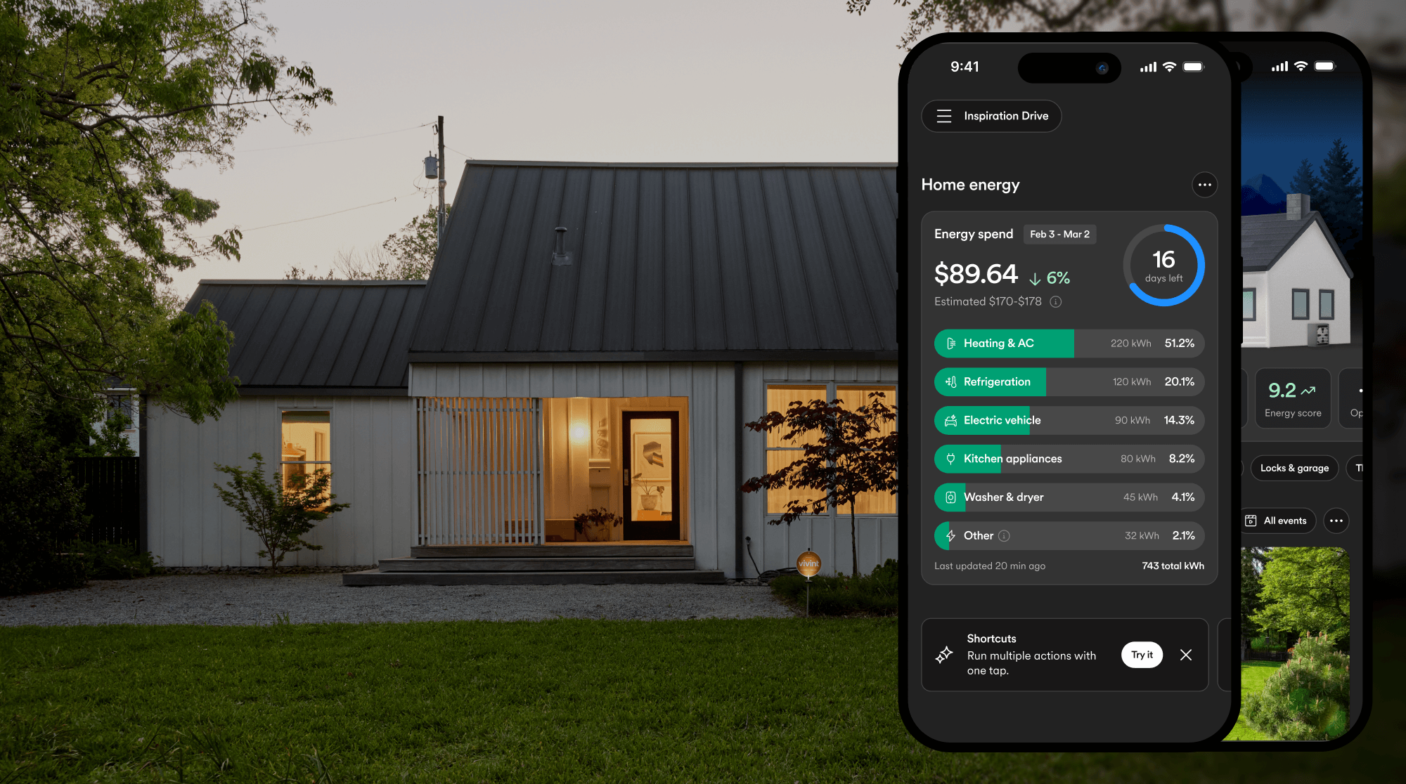
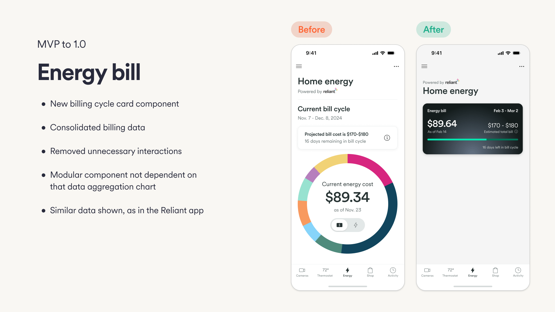
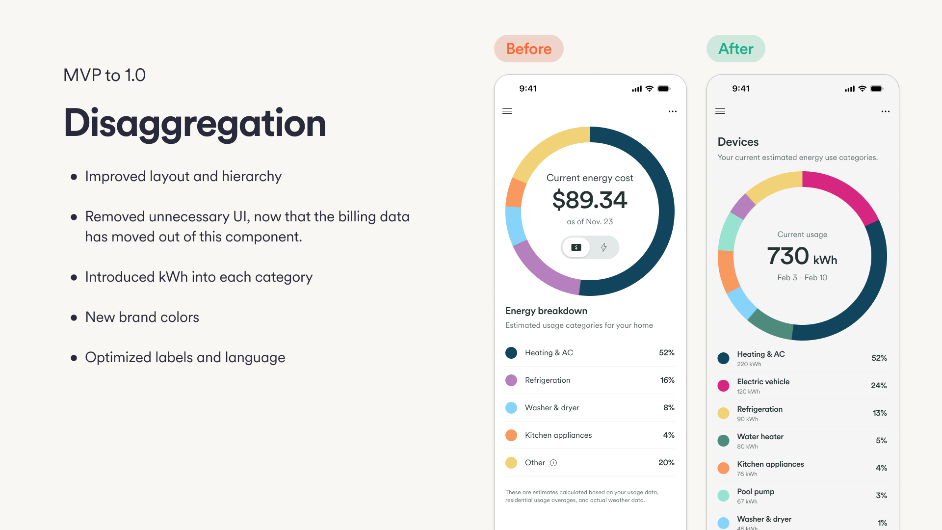
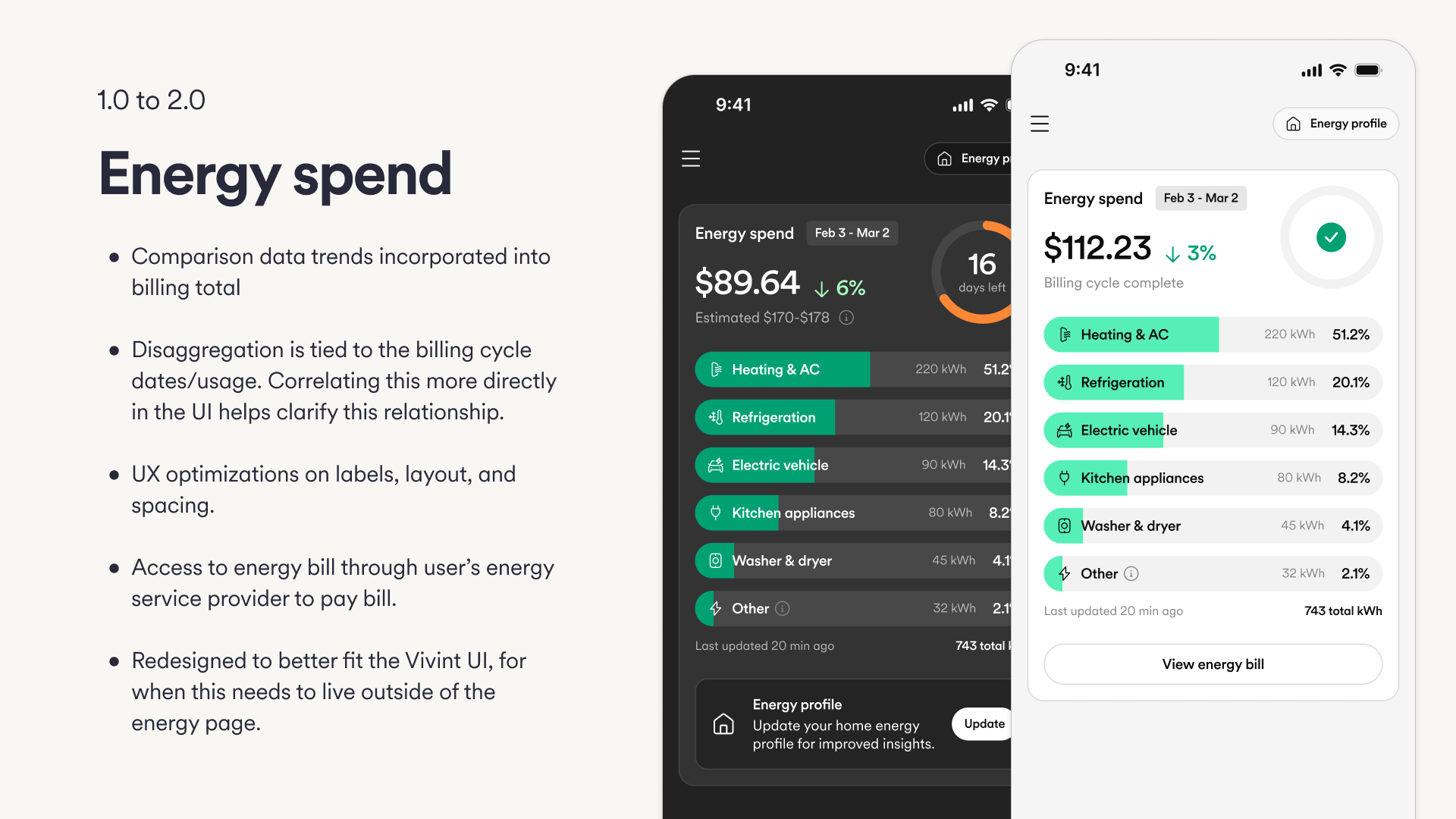
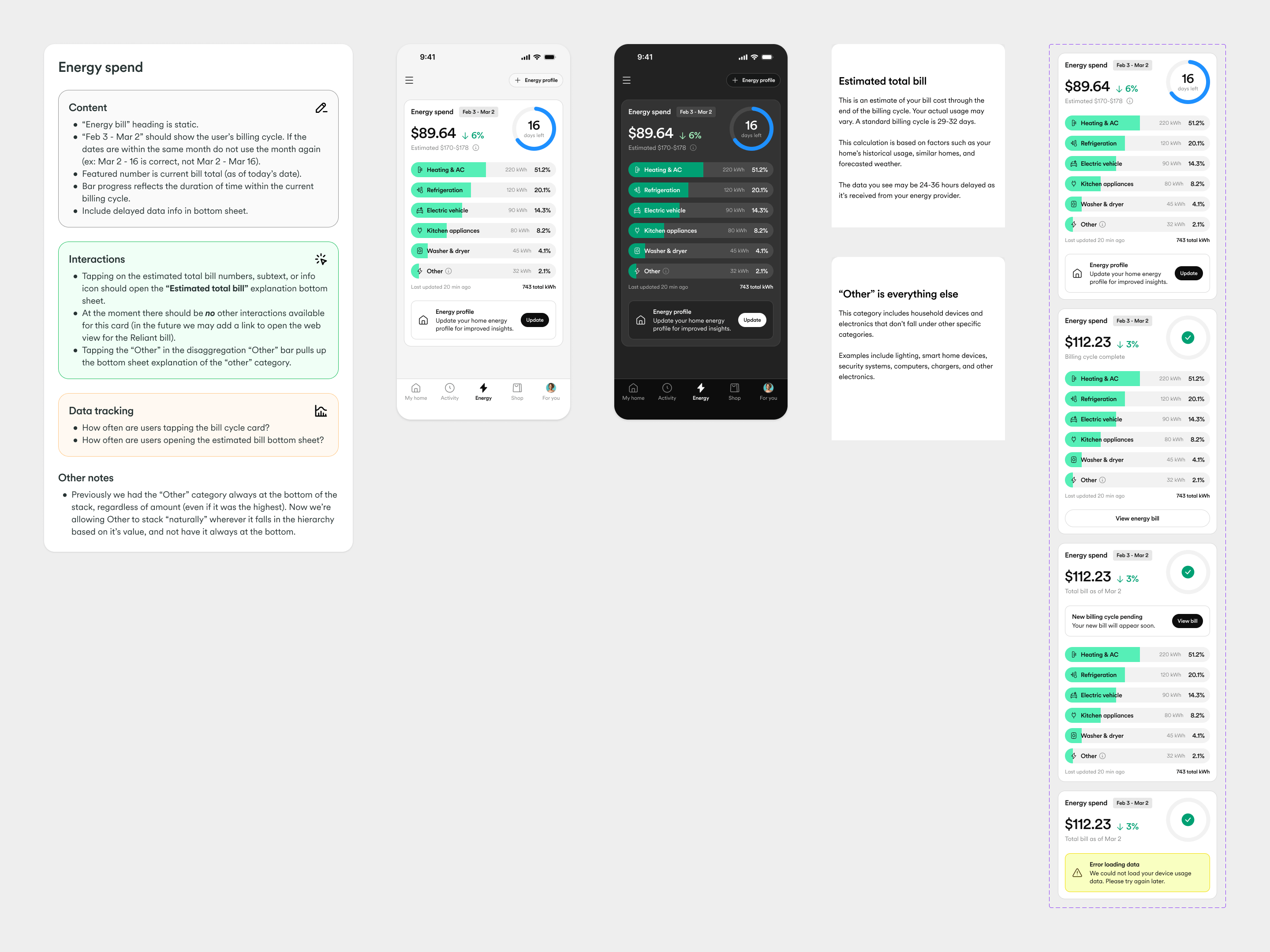
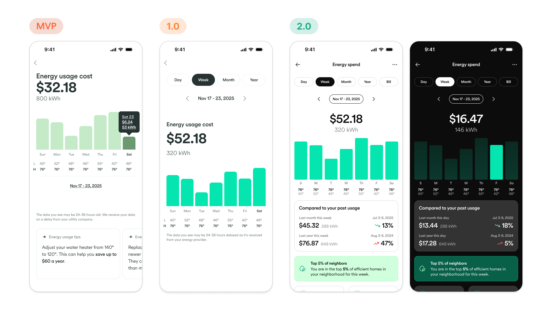
Clarifying cost with disaggregation
In the MVP, cost data was presented in a large, abstract doughnut chart that took up valuable screen real estate without offering specific answers. For v2.0, we pivoted to a linear breakdown tied directly to the user's billing cycle.
We introduced trend indicators (green for savings, red for overage) to help users instantly understand if they were on track. By structuring disaggregation as a list, we clarified the relationship between specific appliances and the total bill, creating a module flexible enough to live outside the Energy tab.
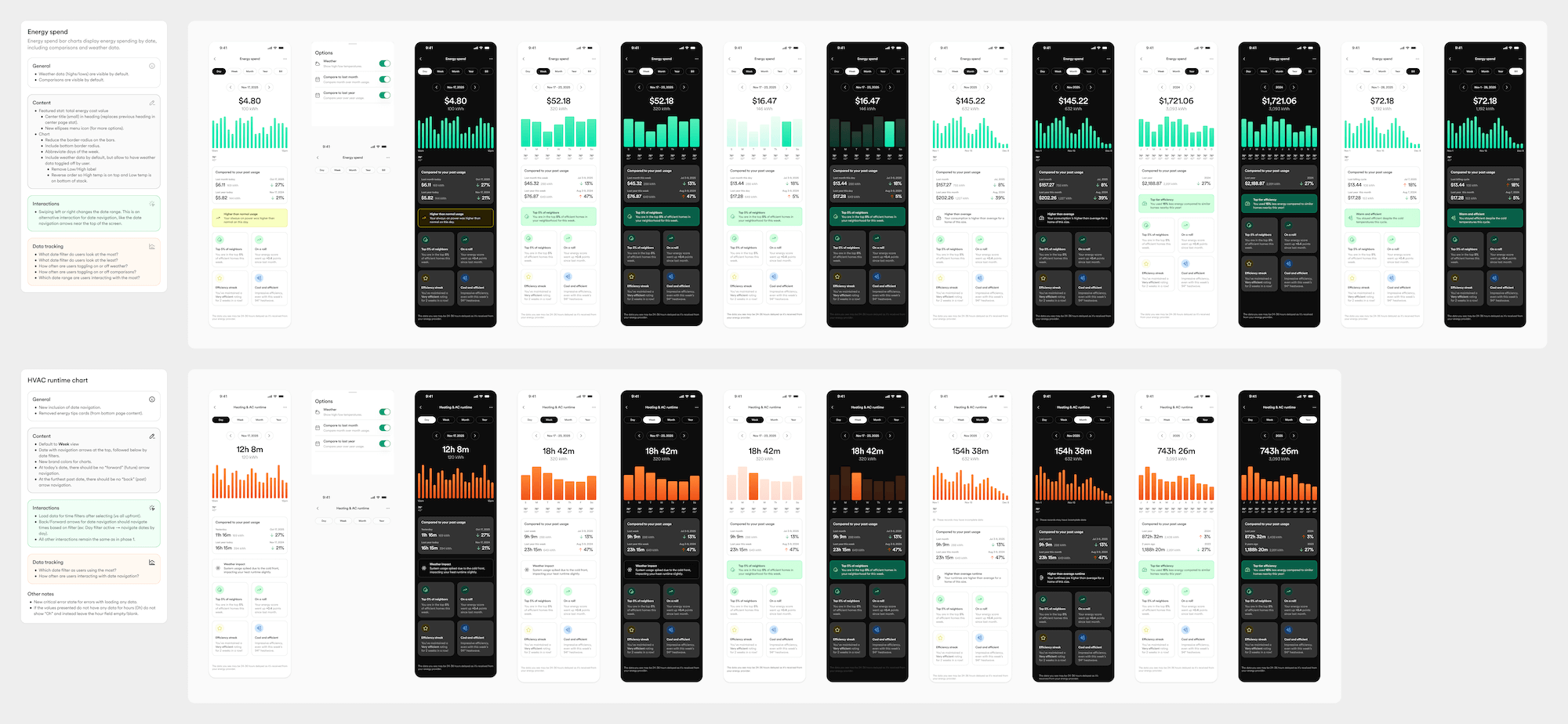
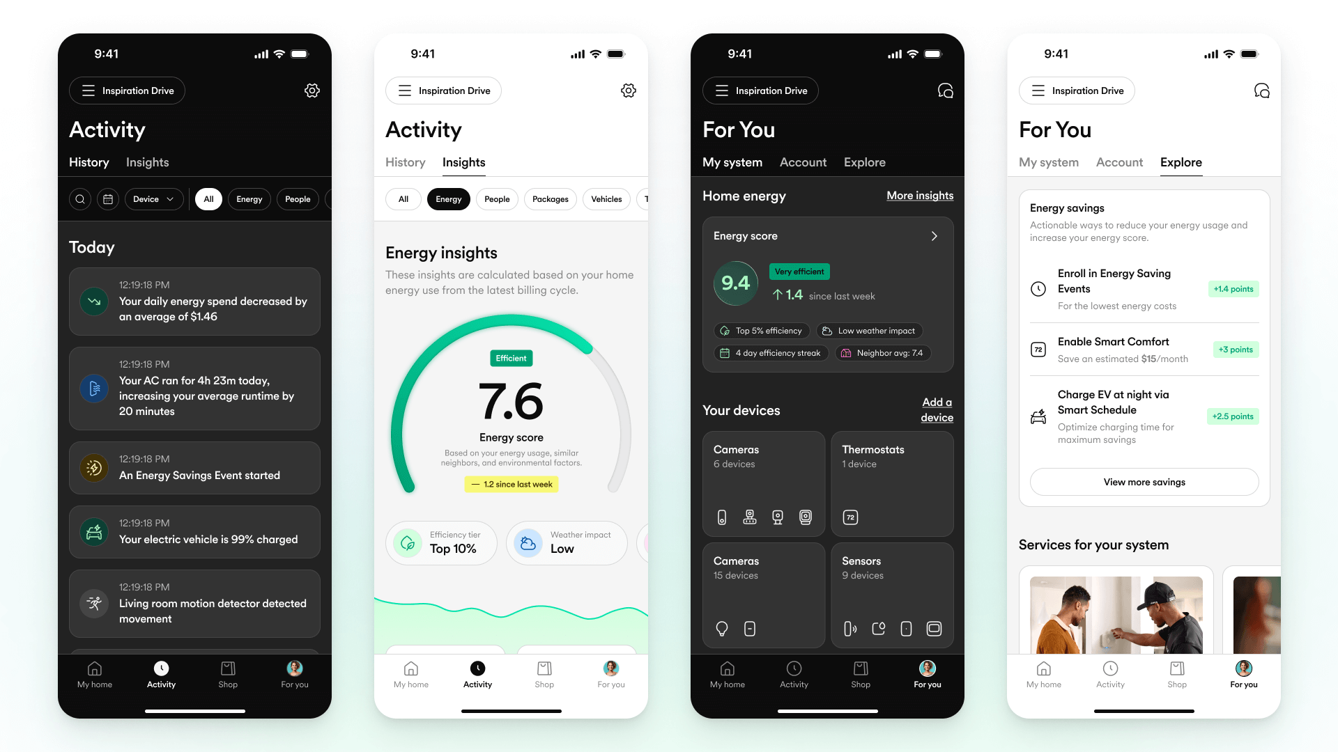
Contextual intelligence
Raw data is often meaningless without context. We refactored the "Insights" section from static numbers into a rich data display featuring rolling 7-day averages. This allows users to see their usage and runtime in the context of their immediate history rather than as isolated integers.
To drive engagement, we introduced social benchmarks and gamification. Cards like "Top 5% of neighbors" and "Efficiency streaks" utilize behavioral psychology to encourage better energy habits, transforming the app from a utility monitor into a competitive tool for efficiency.
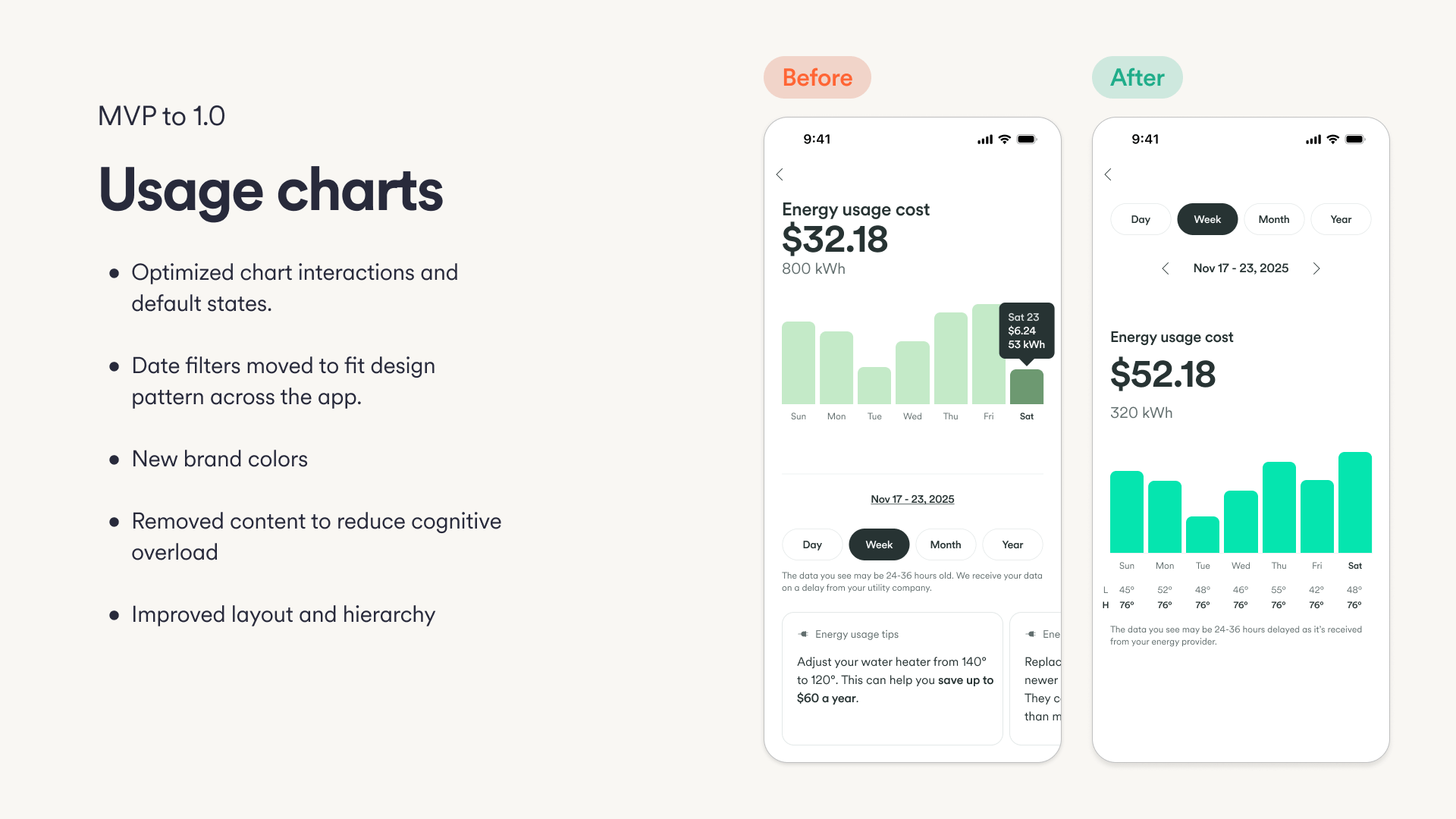
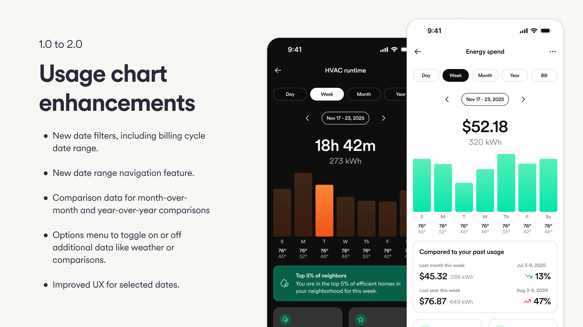
Granularity meets clarity
The updated usage charts were designed to answer the "Why?" behind a bill. We added granular controls, including billing cycle date ranges and toggles for weather data. Users can now overlay temperature highs and lows onto their usage bars, revealing the direct correlation between weather events and HVAC costs.
We also introduced historical comparisons, allowing users to benchmark their current performance against the previous month or year. This richer data visualization helps users distinguish between seasonal variances and actual behavior changes.
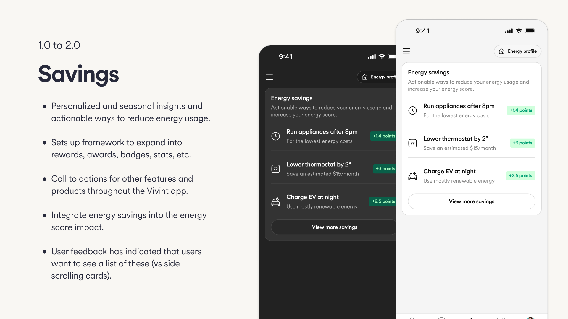
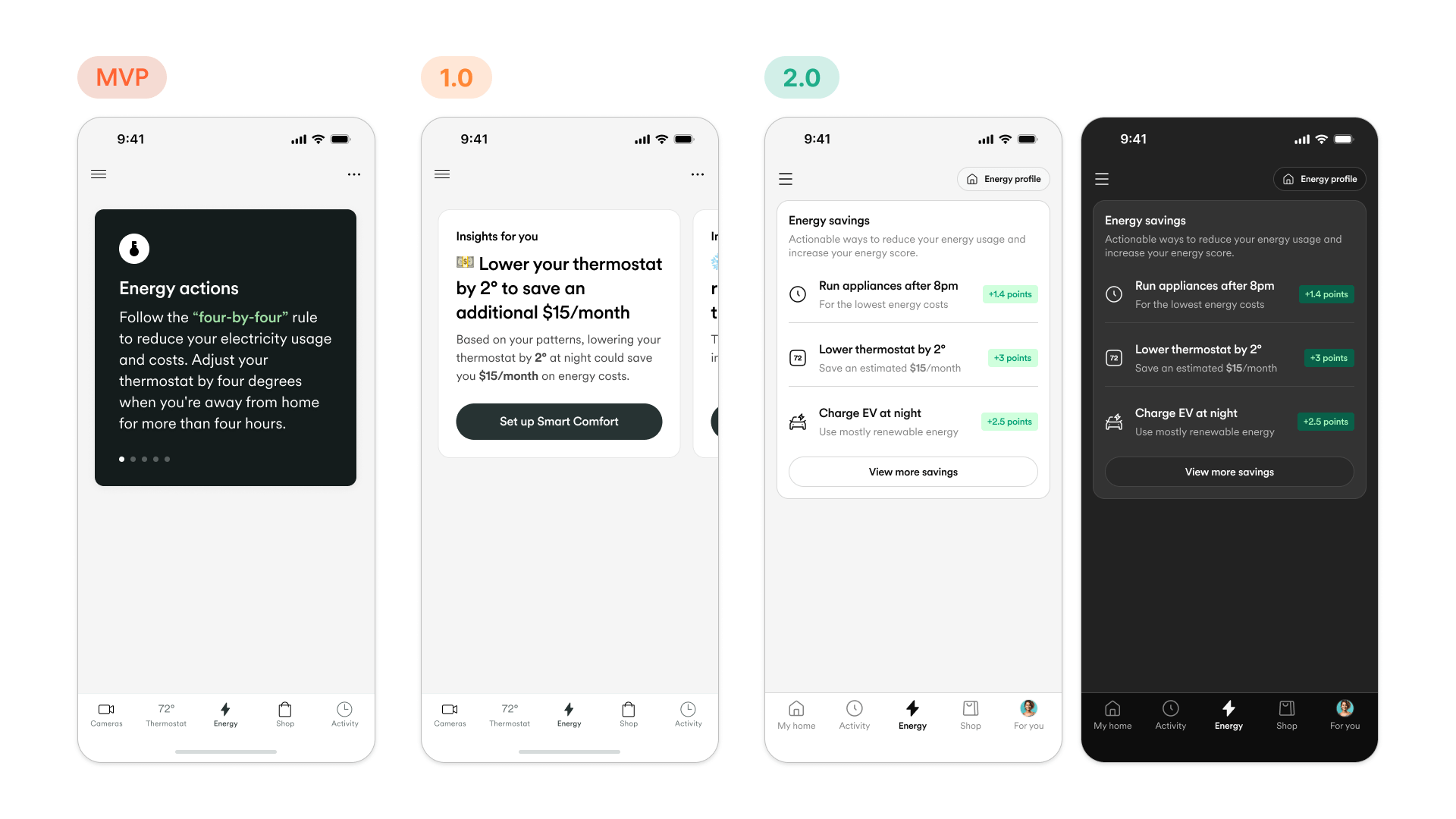
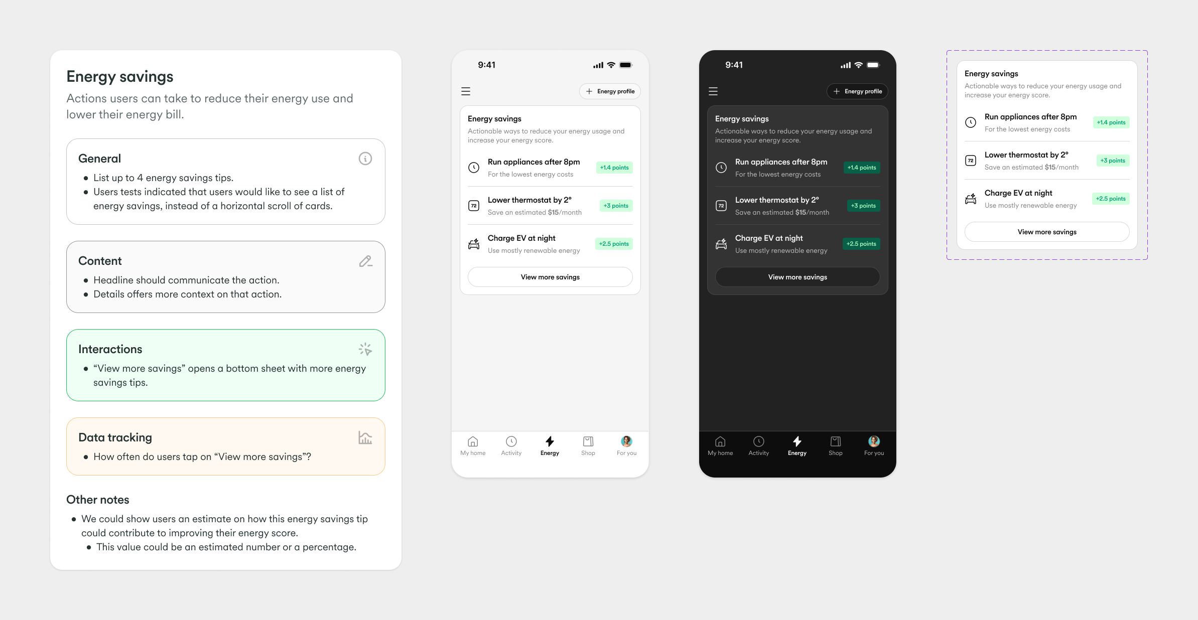
Actionable savings & gamification
User research indicated that the horizontal scrolling cards in the MVP hid valuable information. For v2.0, we pivoted to a prioritized vertical list, making it easier for users to scan for high-impact actions.
Crucially, we tied these actions directly to the Energy Score. By assigning point values to specific behaviors—like running appliances off-peak or adjusting the thermostat—we transformed passive tips into a gamified checklist that provides immediate positive feedback.
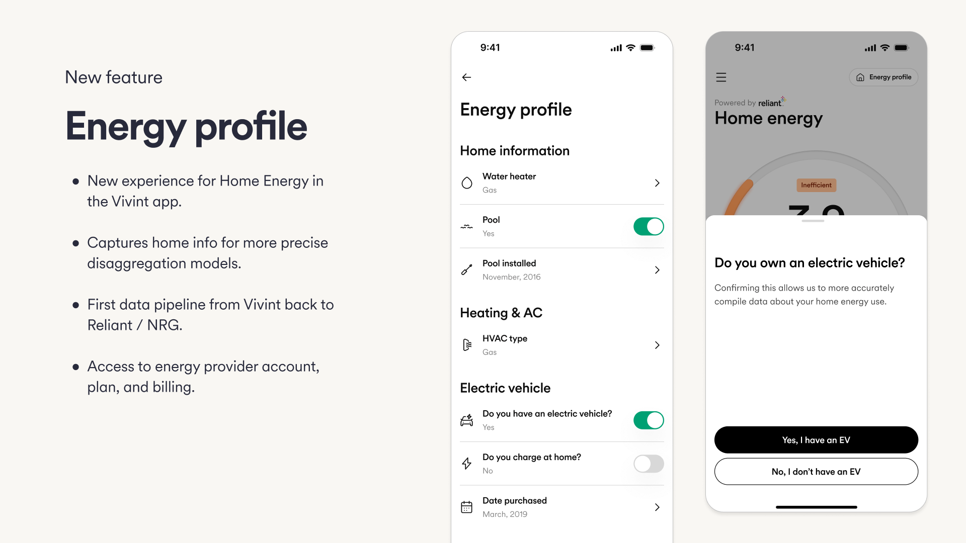
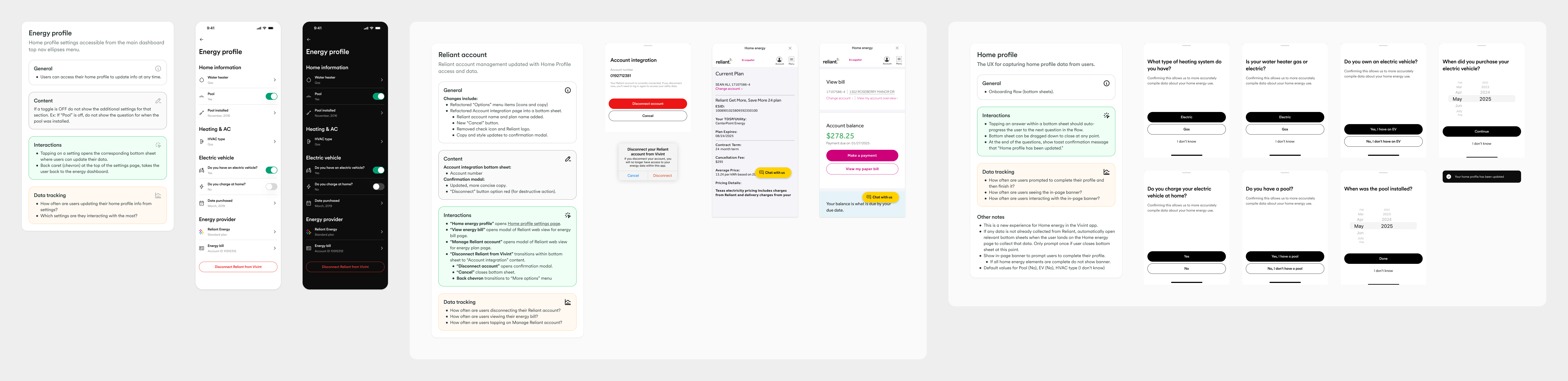
Home Energy Profile
To improve model fidelity, we introduced the Home Energy Profile, enabling users to fine-tune their data by inputting specific device details, such as EV charging habits. This feature marked a significant technical milestone: it established the first reverse data pipeline from Vivint back to NRG. This bi-directional flow allowed user inputs to retrospectively update historical disaggregation models, resulting in significantly more accurate insights."
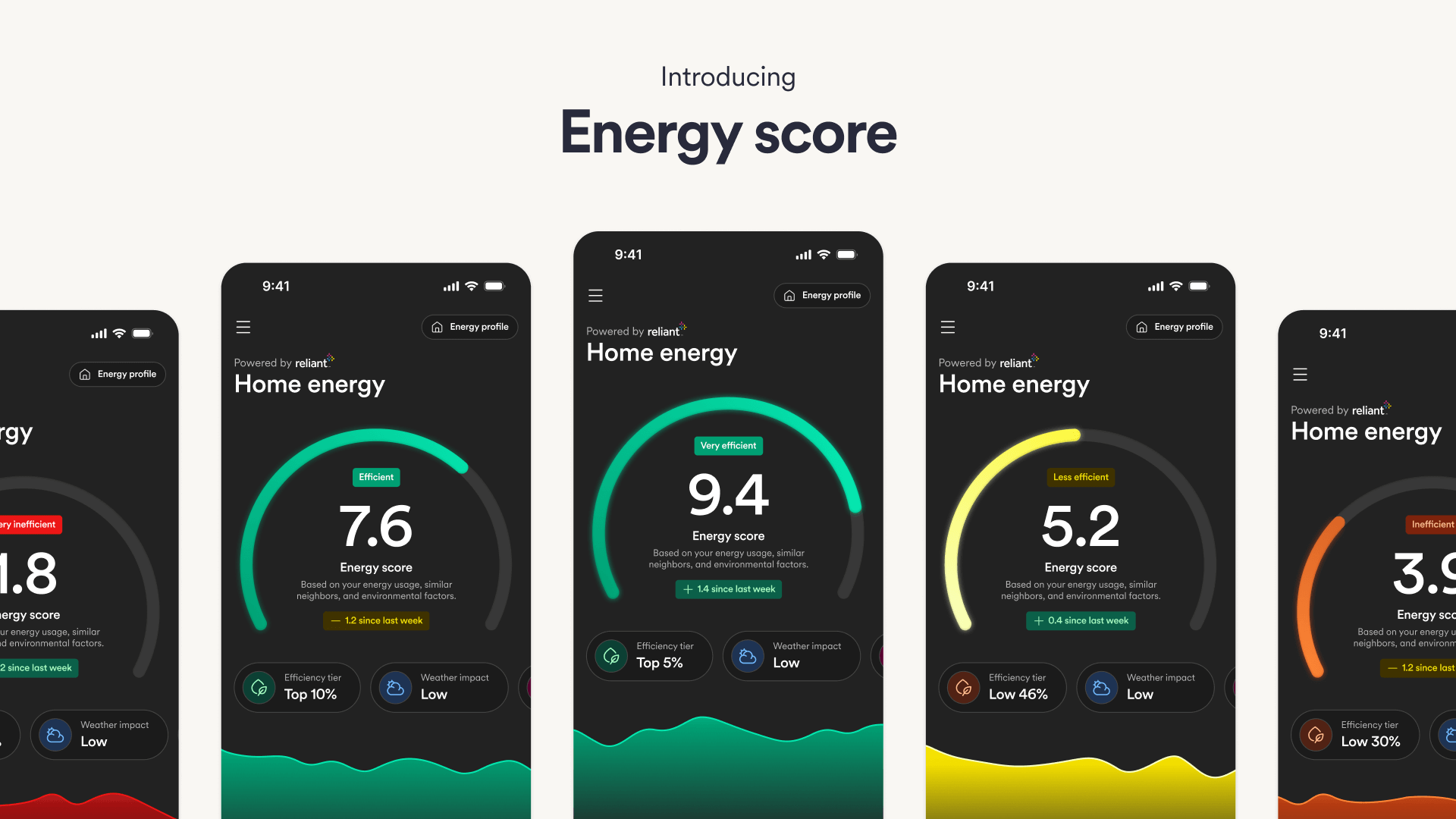
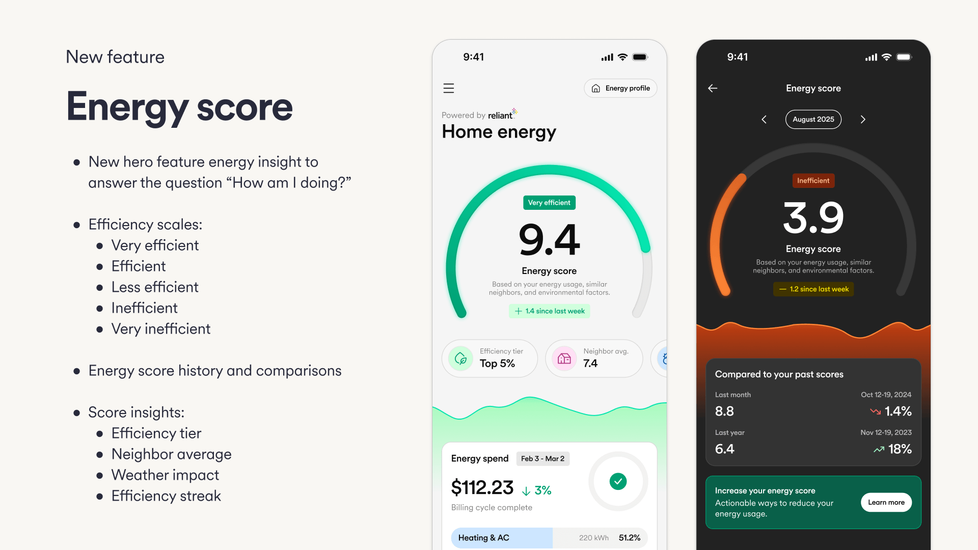
A single, intuitive metric
Energy Score turns complex usage data into a clear 1–10 score, making performance easy to understand at a glance. Abstract, universal format enables personalized nudges, gamification, and progress tracking. Provides clear context and benchmarks, removing the guesswork from interpreting raw kWh or dollar amounts.
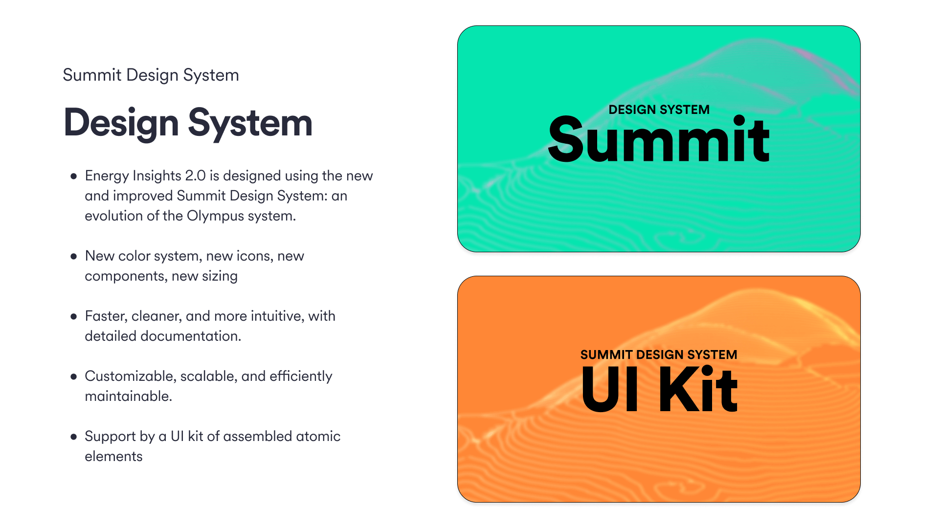
Laying the groundwork for scale
To unblock the energy project, I spearheaded a parallel initiative to completely recreate the company's design system and color logic. By establishing a new, accessible, and flexible foundation, we unlocked the ability to design high-fidelity data visualizations that remained legible even at small scales. This infrastructure work was the key enabler for the v2.0 modular strategy.
As we approached the v2.0 redesign, it became clear that the company's existing design system and color palette were insufficient for the "lightweight" and modular future we envisioned. The legacy colors were too heavy, and the component library lacked the flexibility needed for compact widgets.
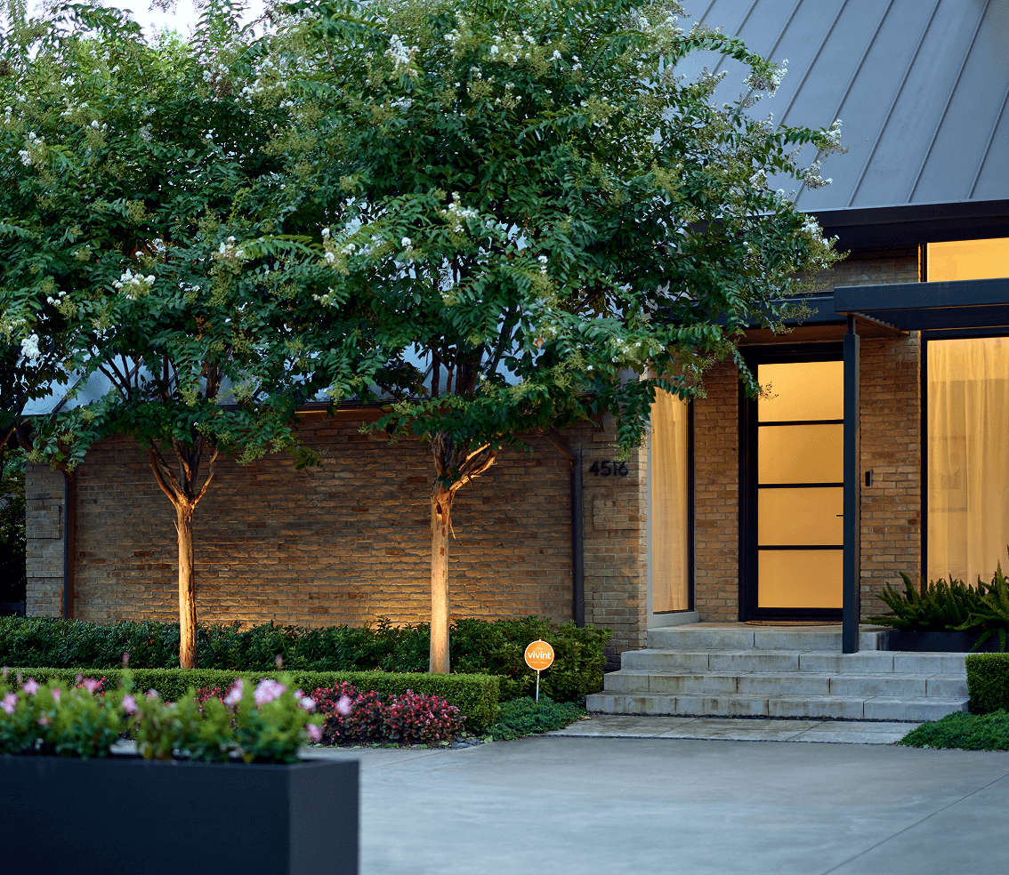
Driving adoption through integration
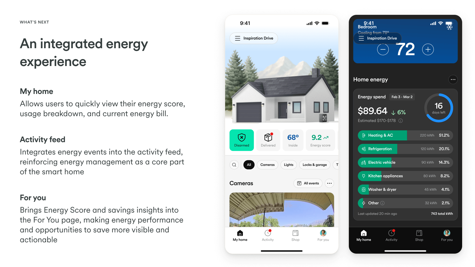
The redesign reduced the interface density by approximately 40%, allowing energy components to leave the "Energy Tab" and live on the high-traffic Home Screen. By surfacing simplified status updates—such as "Solar producing" or "Grid usage high"—alongside security controls, we drove a massive increase in feature adoption and made energy awareness a passive, seamless part of the user's daily routine.
With a modular system in place, the vision for v3.0 moves from "observation" to "automation." The strategy is to embed energy intelligence into the operating system layer of the home. Instead of just showing users that energy rates are high, the system will proactively offer to adjust the thermostat or delay running major appliances.
A unified smart home
The ultimate vision connects the dots between disparate hardware. In v3.0, energy data becomes a trigger for security and comfort workflows—using solar production data to optimize cooling, or battery levels to determine security camera recording quality during an outage. This evolution fulfills the promise of the unified smart home, where the house doesn't just protect you; it powers itself intelligently.
Skills & competencies
Key areas of expertise and methodologies applied during this project.