
University Federal Credit Union • Design Proposal • 2023
Redesigning mobile banking
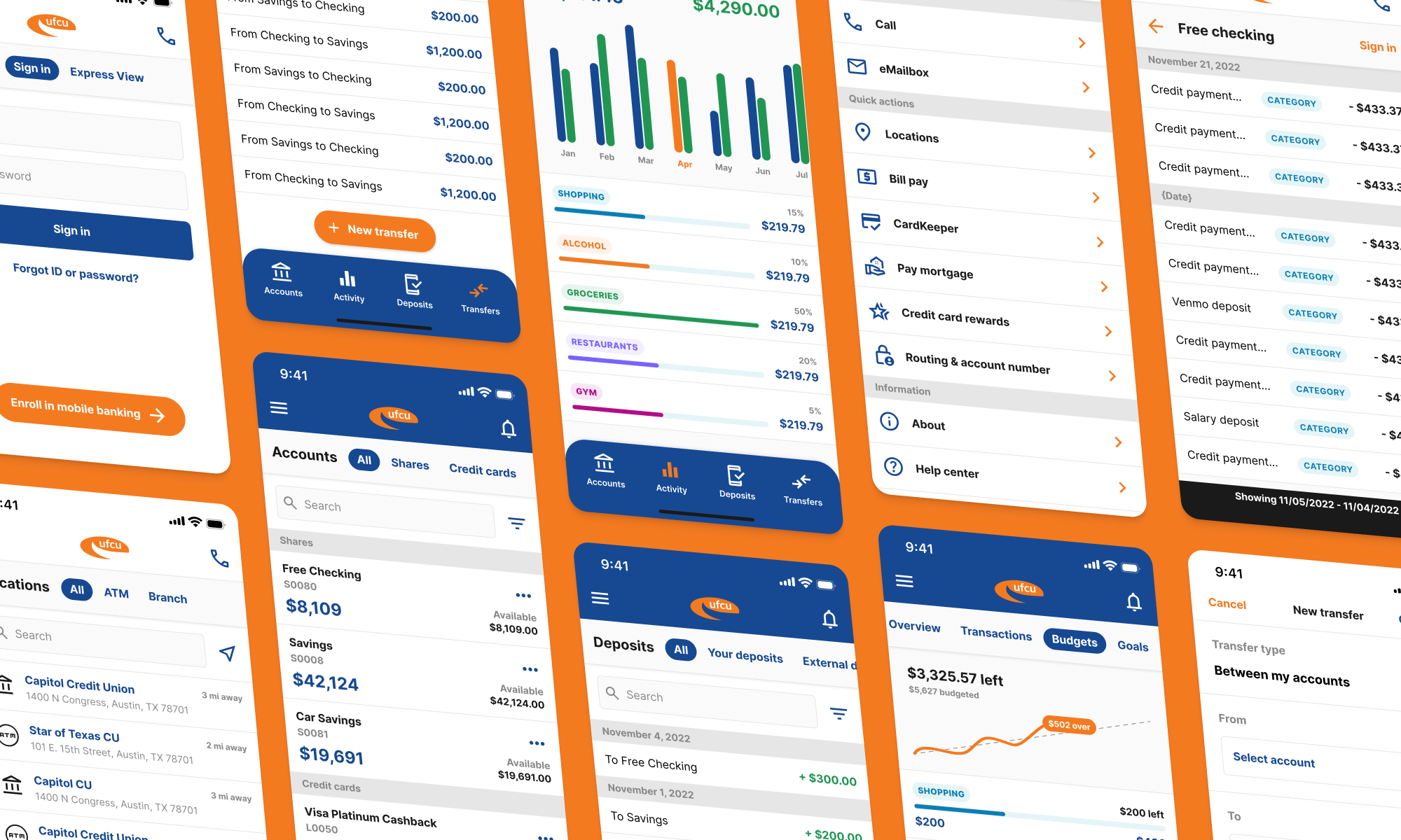
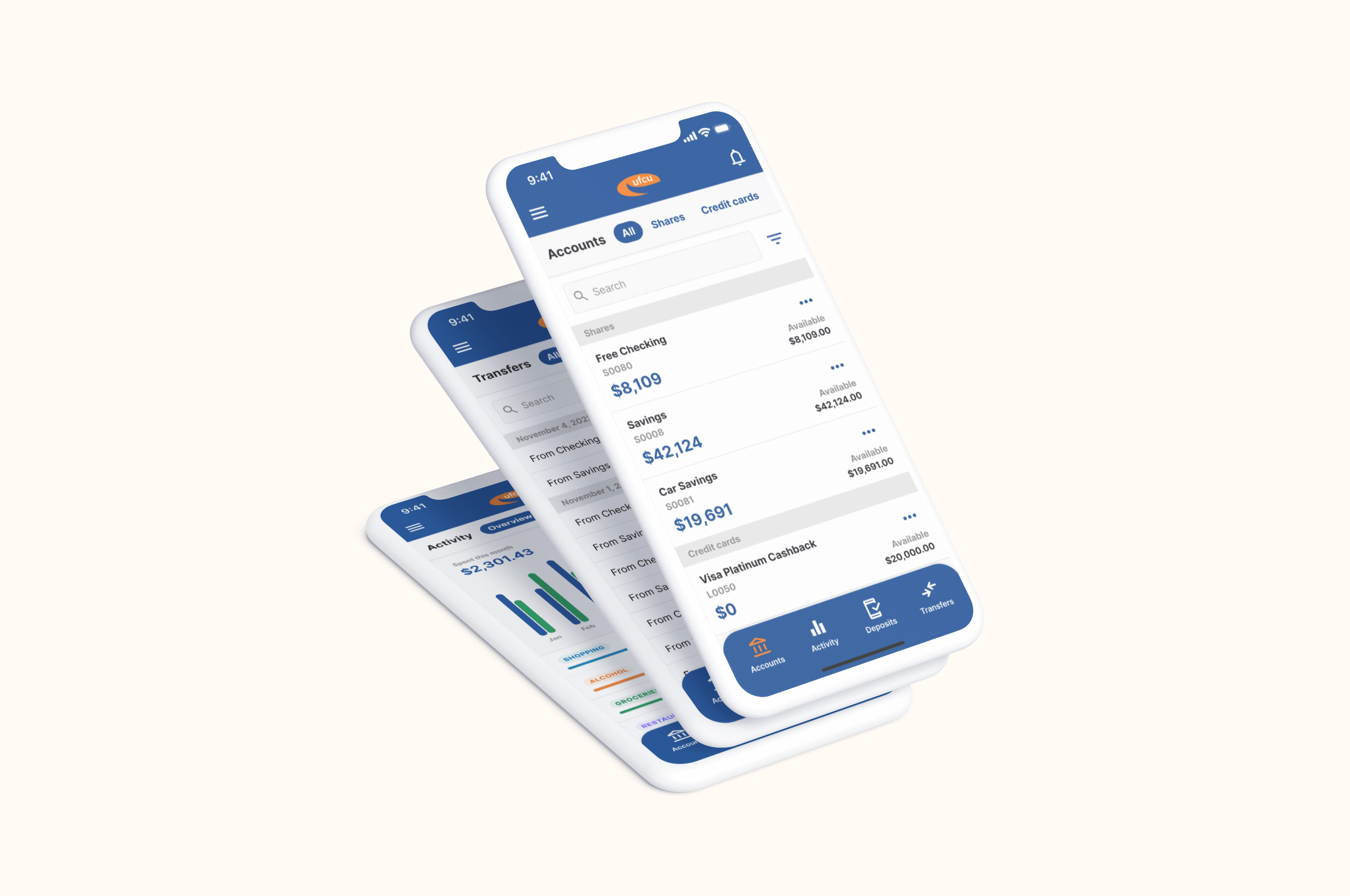
The University Federal Credit Union mobile app was released a few years ago, and while the functionality is okay, the user experience has a lot of room for improvement. In an effort to improve the app for myself and others, I completely redesigned the mobile app from the ground up. One of the goals of this redesign was to maintain the data, just display it better and design a cleaner, more streamlined user experience.
0:00 / 0:00
Problem
The user experience is confusing, difficult to use, and broken in certain areas of the product. The app is slow and the interface is not accessible, as the buttons are small and the text is challenging to read.
Proposal
Redesign the mobile interface and user experience to deliver a comprehensive suite of financial tools for UFCU members. This redesign needs to maintain, improve, and add features, while also improving accessibility and usability.
Impact & outcomes
Key performance indicators and outcomes achieved through this project.
Accessibility improvements
Through higher contrast ratios, larger font sizes, and a better information architecture, the app is much more accessible to all users, especially the visually impaired.
A better user experience
Consistency across all user interactions and the interface improves the user experience, from viewing account balances and transactions to making deposits.
Lightweight design system
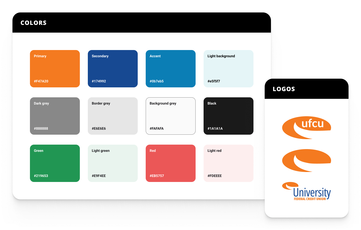
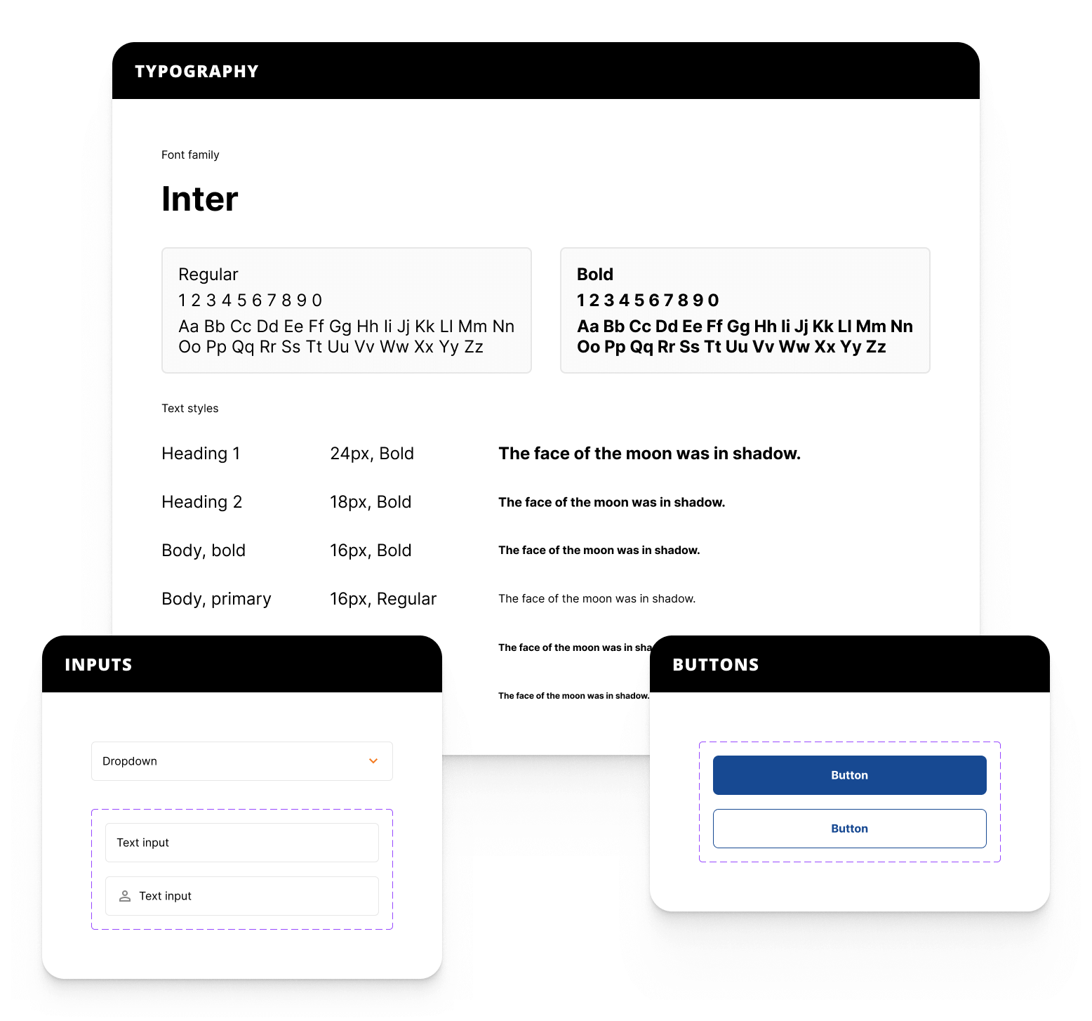
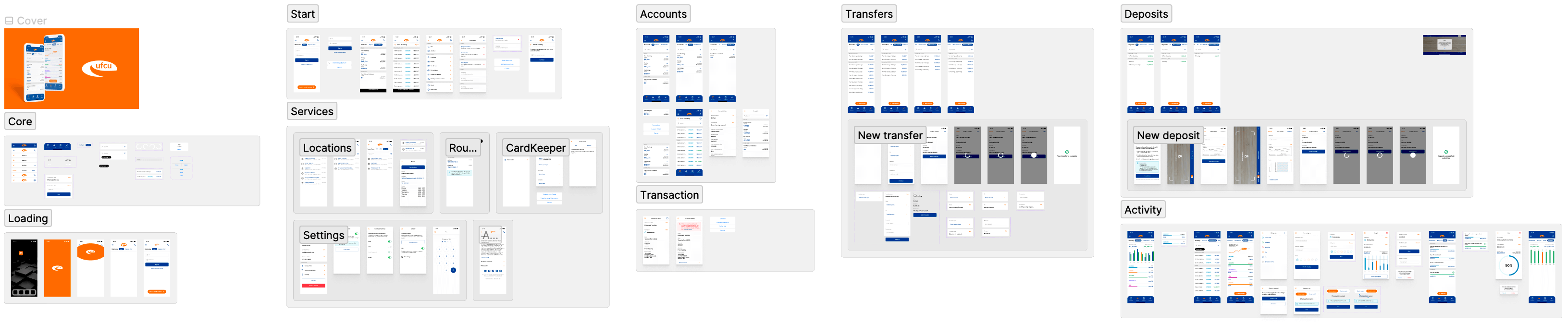
Defining color tokens, typography styles, and components is key to iterating and managing a design file as it scales. For example, if a color needs to change, you can simply update the base color token and all instances where that token was used are updated. The example below is what I consider a "lightweight" design system, which is another way of saying the baseline fundamentals of what's needed to work faster and scale easier.
Redesigning the mobile experience
The mobile app needed a range of important updates to the user interface and the user experience. Certain areas of the product left the user with no way to navigate back once there, buttons and links were way too small to easily use on a mobile device, the layout was inefficient, and the information architecture was confusing.
My focus with the redesign was to maintain all of the current app's data sources and work on improving the user interface, the user experience, and the information architecture.
Login and Express View
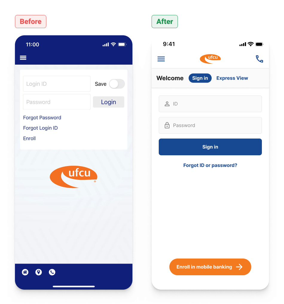
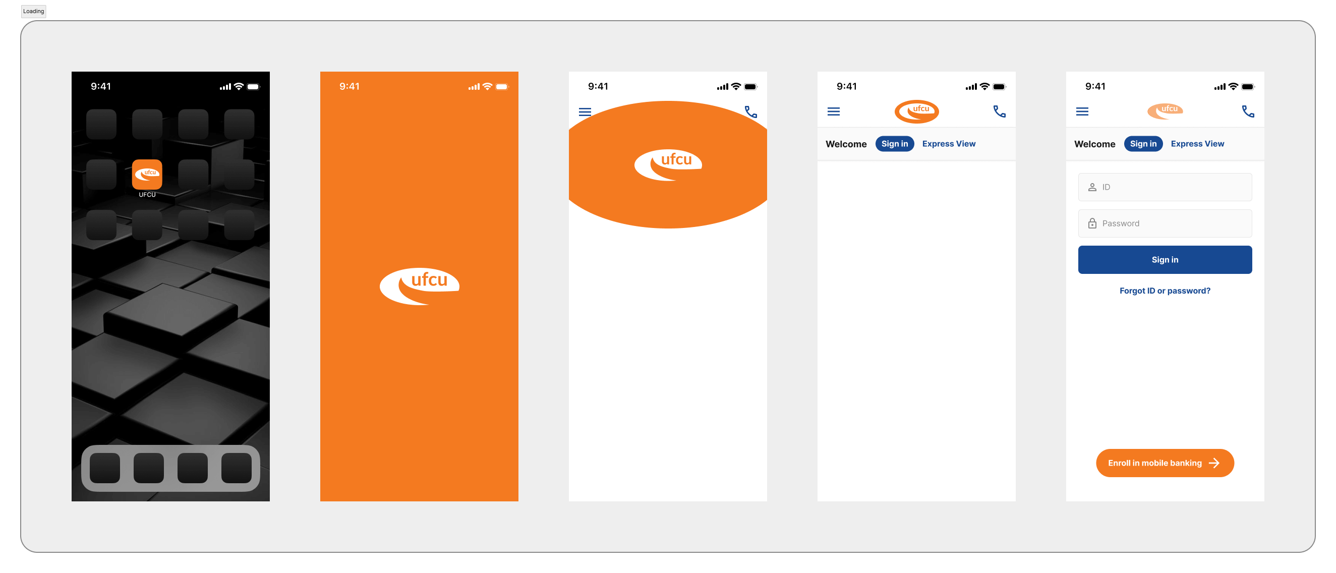
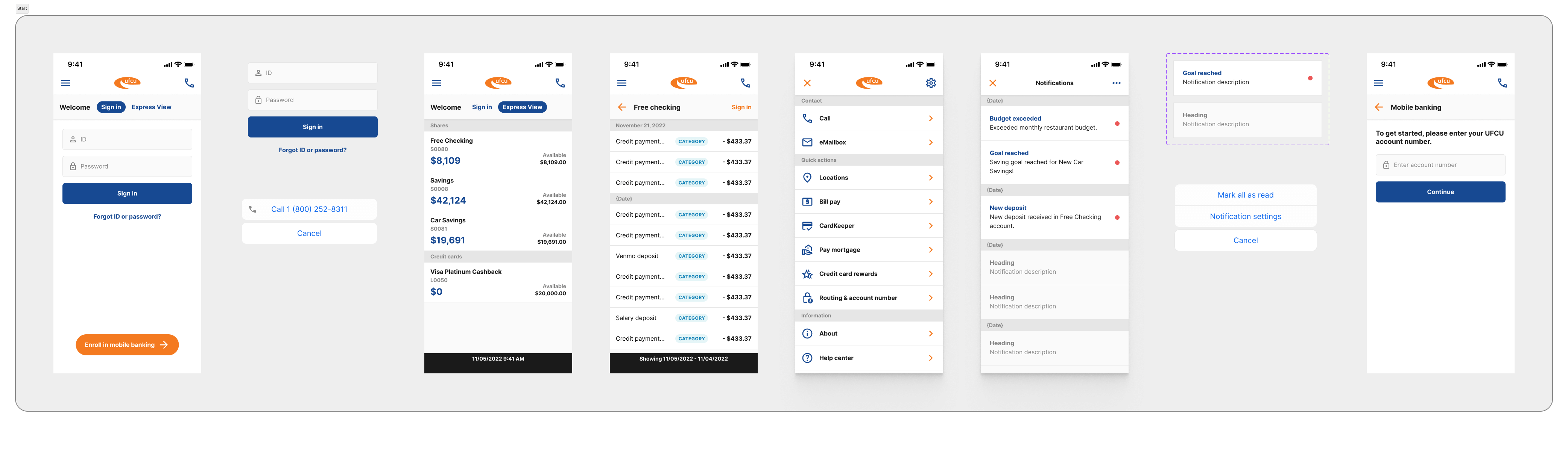
The improvements to the login page are to make the interface more accessible, by increasing the size and space for all of the interactive elements on the page, as well as presenting a clearer visual language to the user. Other improvements are to consolidate the two "forget password" and "forget login ID" into a single link, move the "Enroll" button to the bottom of the screen (since this is not a primary user action), include a more accessible phone link in the top navigation, and give the user access to Express View.
Express View is a quick snapshot of a user's account balances and recent transactions, without needing to log in. In the previous app design, Express View opens once the app is launched--if the user leaves Express View there is no way back to this view without closing the app and opening it again. The redesign introduces a section nav, which includes the section heading and a tabbed navigation for each subsection. These sections can also be navigated with a side swipe.
Main menu and settings
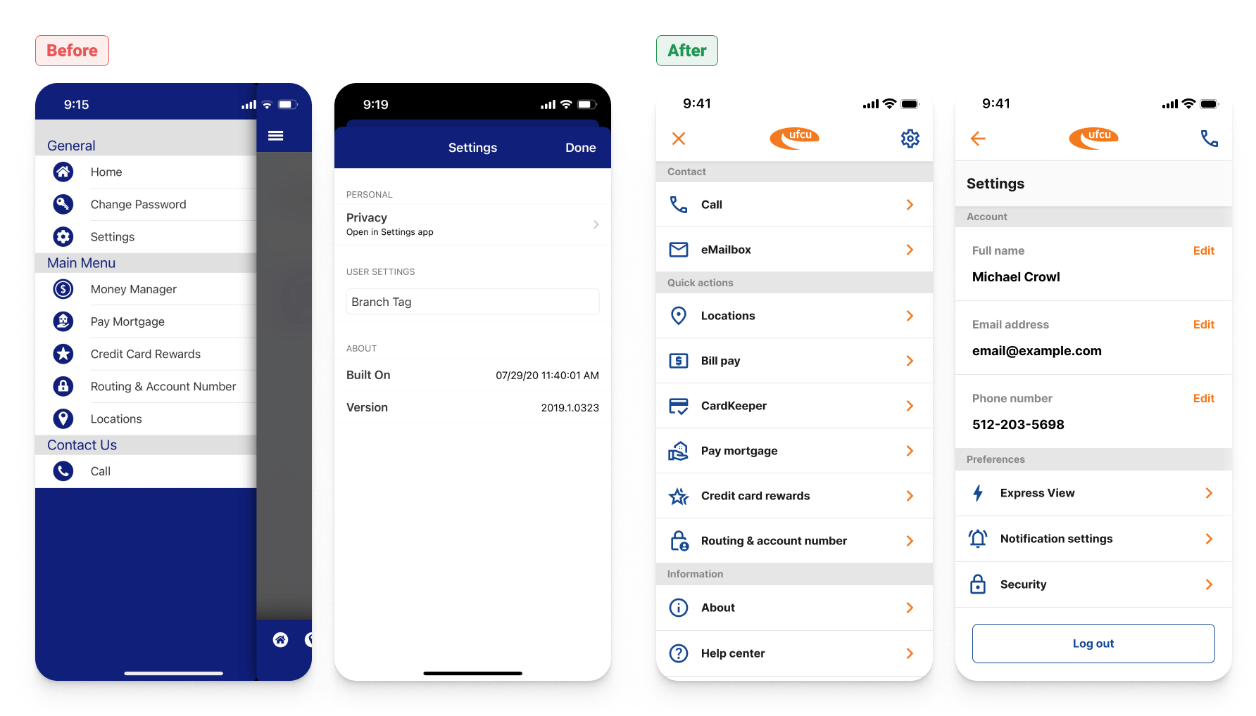
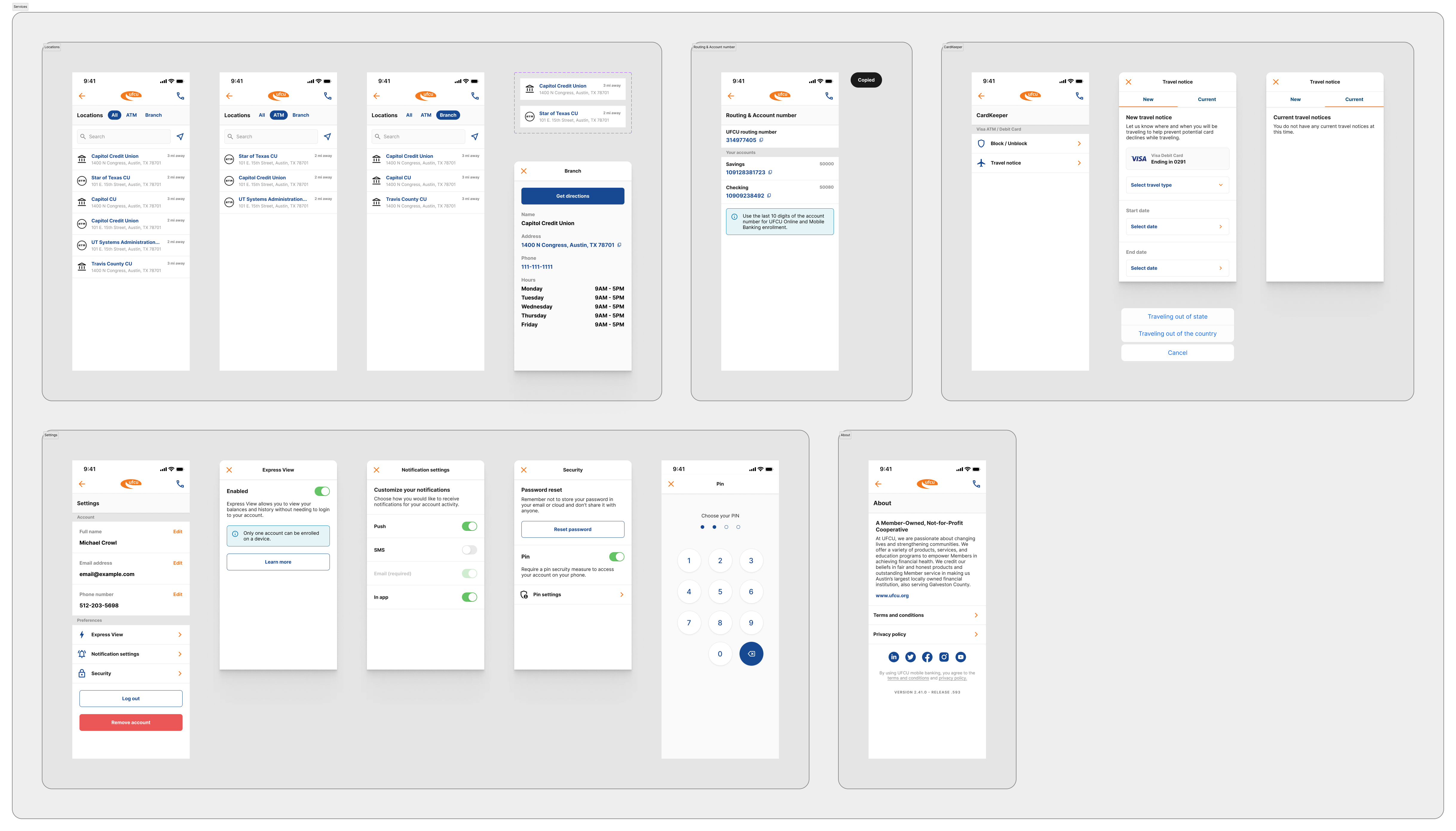
The order of the menu items in the main nav have been rearranged to position higher priority elements at the top (like contact info), and the interface takes up the full screen width, allowing more room for icons, labels, and interactions. Settings has been completely overhauled to include editable profile information, and settings associated with features in the app, like Express View and notification settings. A security section has also been introduced for the possibility of including a pin number to login to the app, etc. In the previous app, users did not have an option to log out of their account, so a "log out" button has also been added.
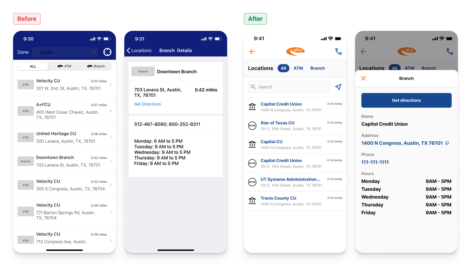
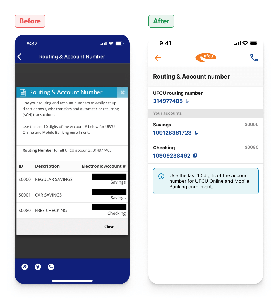
Each subsection from the main menu has been redesigned to improve user interactions, functionality, accessibility, and information architecture.
Accounts
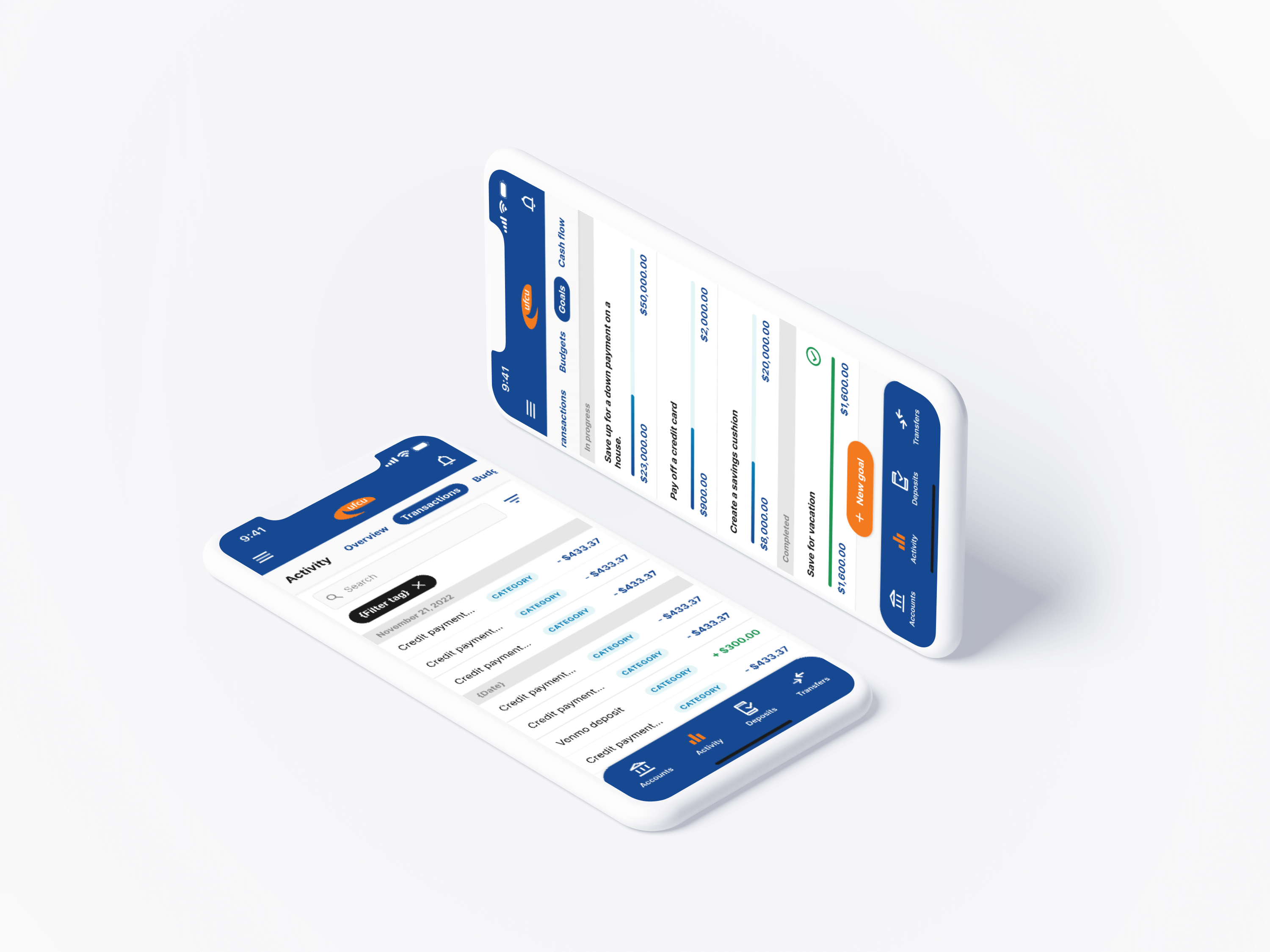
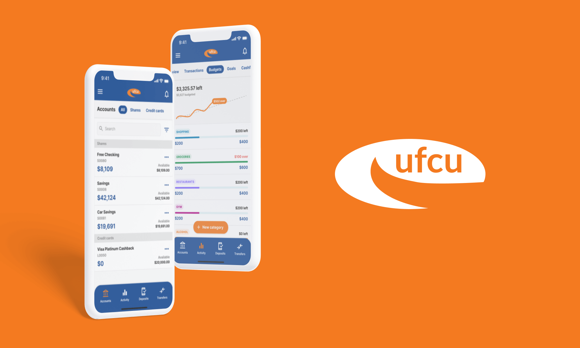
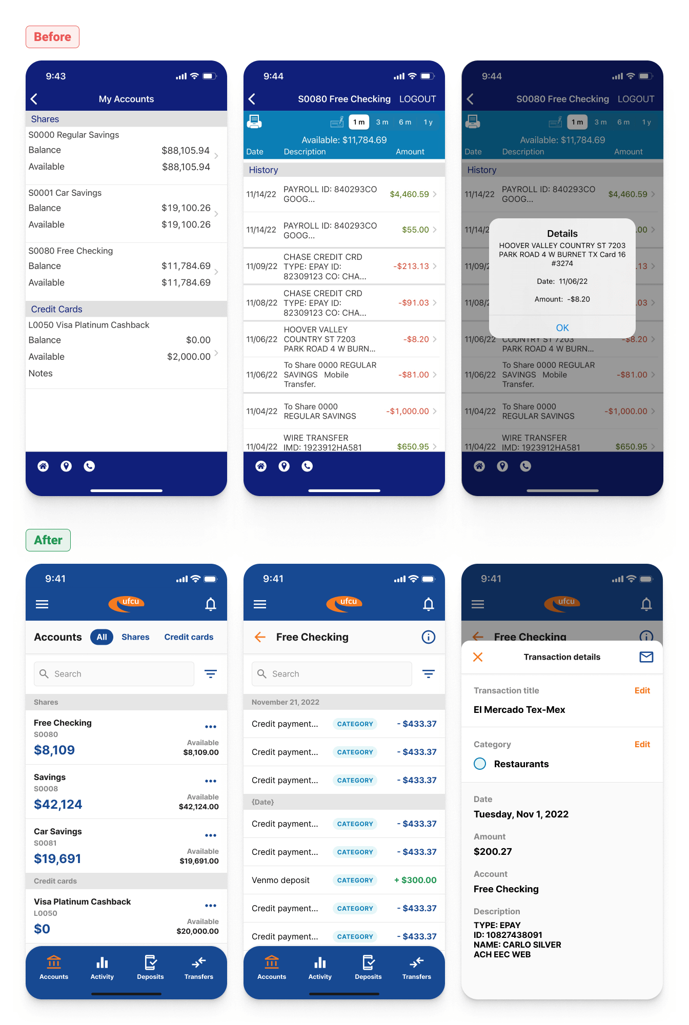
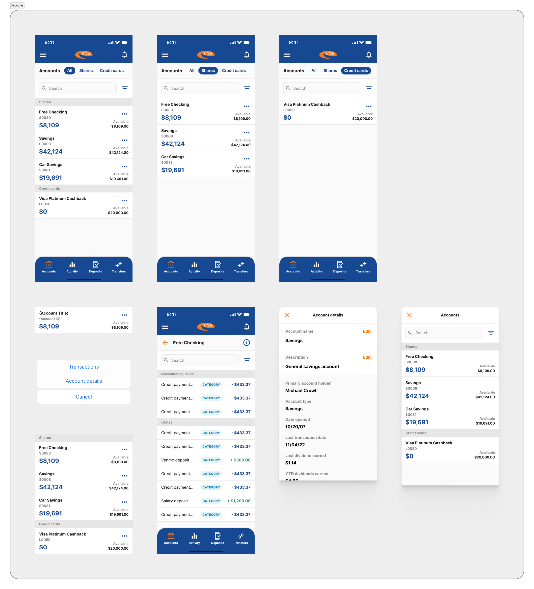
The redesign focused on bringing clarity to account balances and transactions. This was accomplished by increasing the size of the account balance number and improving the layout to more easily parse the information. Transactions are now grouped by date, which provides room to include transaction categories for each record. The search and filter features are consolidated and setup within overlays to allow more screen space and reduce cognitive overload. Transaction details have been redesigned from a modal into a overlay, with additional functionality to change transaction title, category, and submit a transaction inquiry.
Transfers and deposits
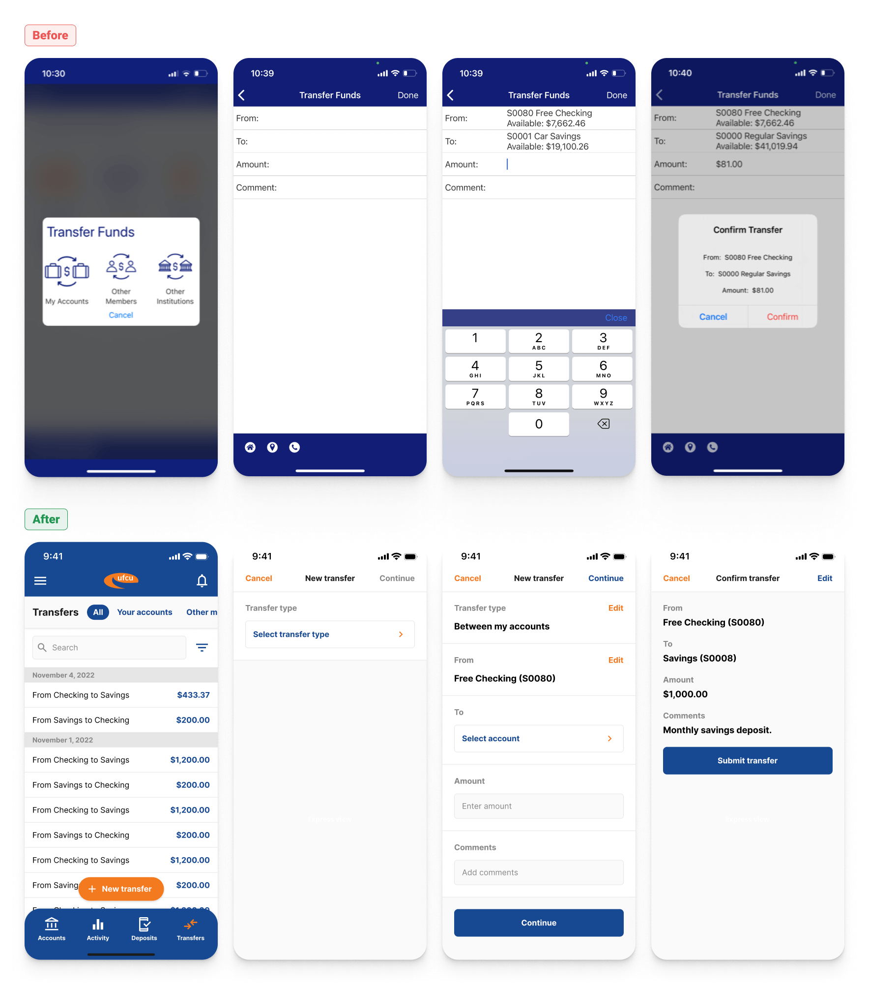
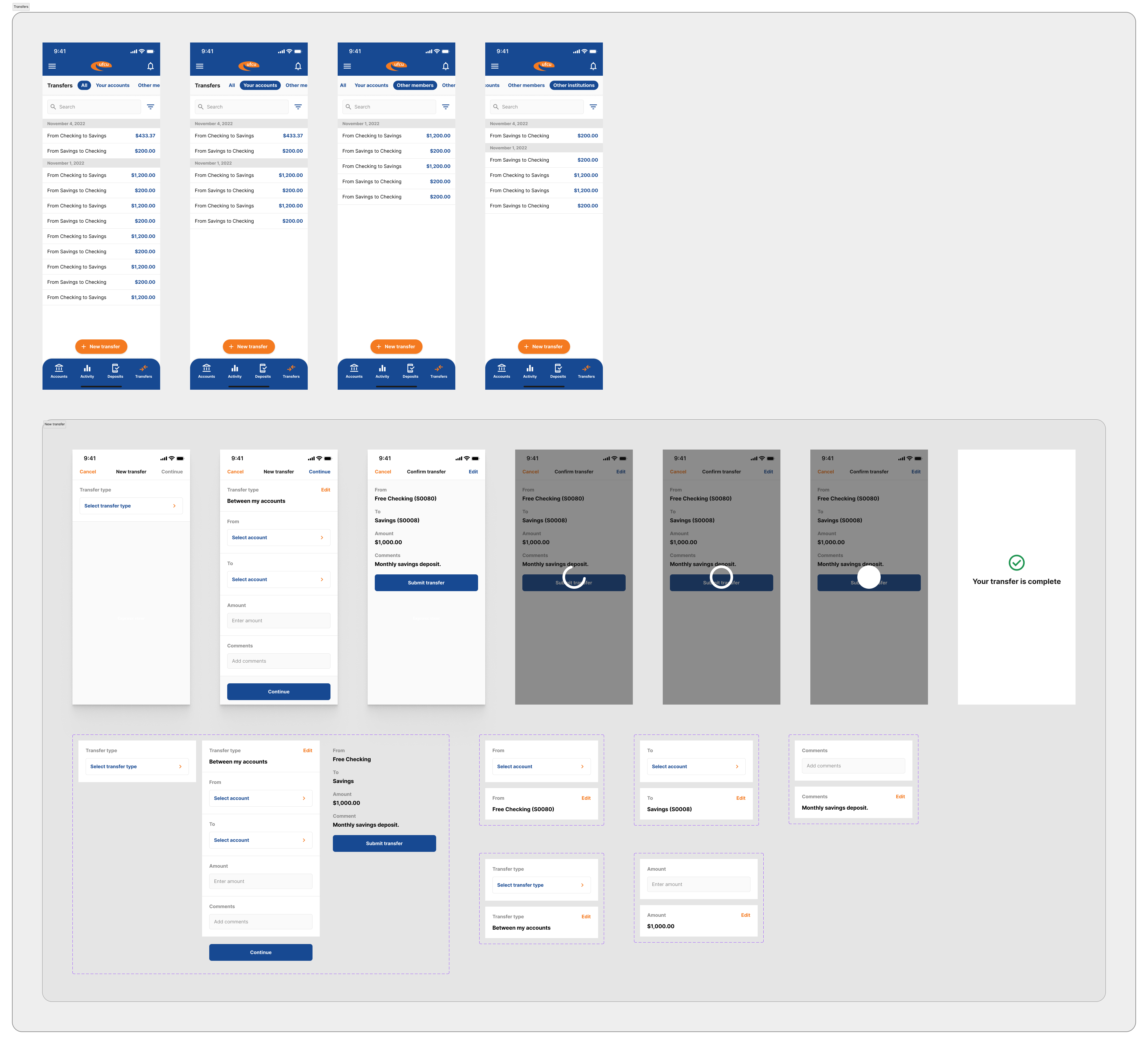
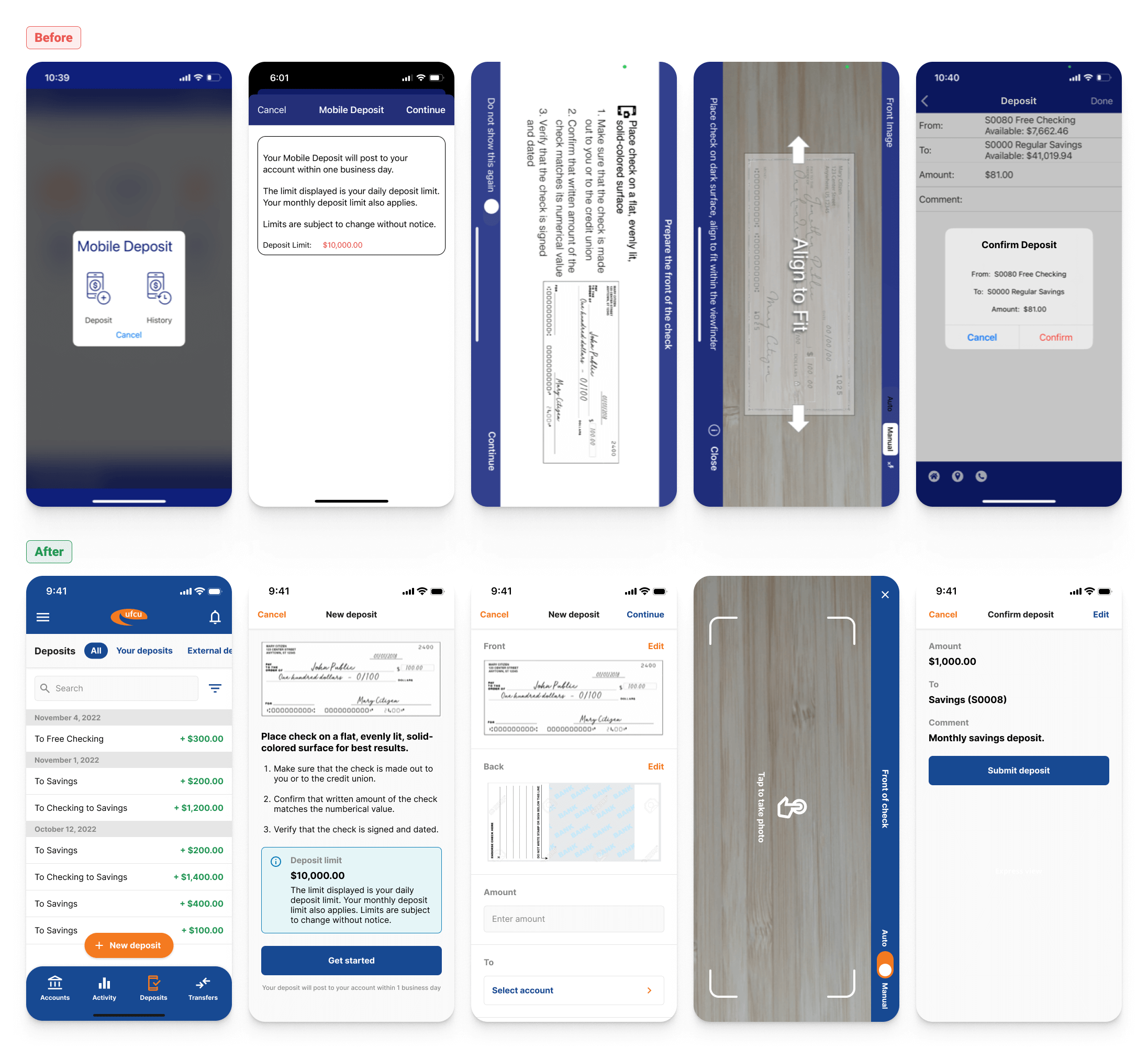
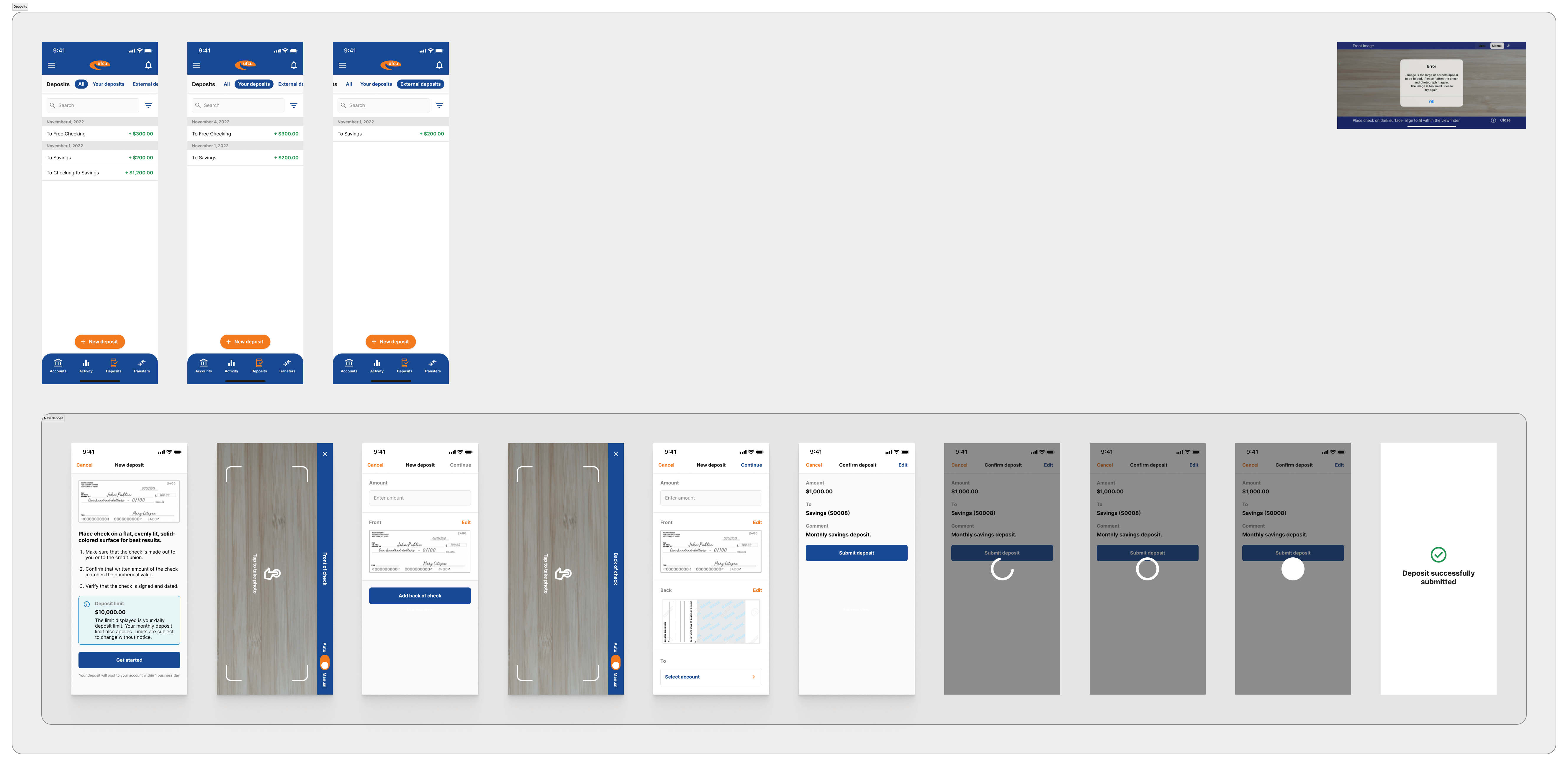
Transfers and deposits in the original app started with a modal that was not optimized for mobile: the buttons were too close together and the cancel button was difficult to tap. Additionally, users were not able to see a history of the transfers or deposits they made from these sections. The redesign presented a history of transfers and deposits, as well as a clearer transfer and deposit creation flow.
The redesign offers more accessible inputs and a clearer user experience.
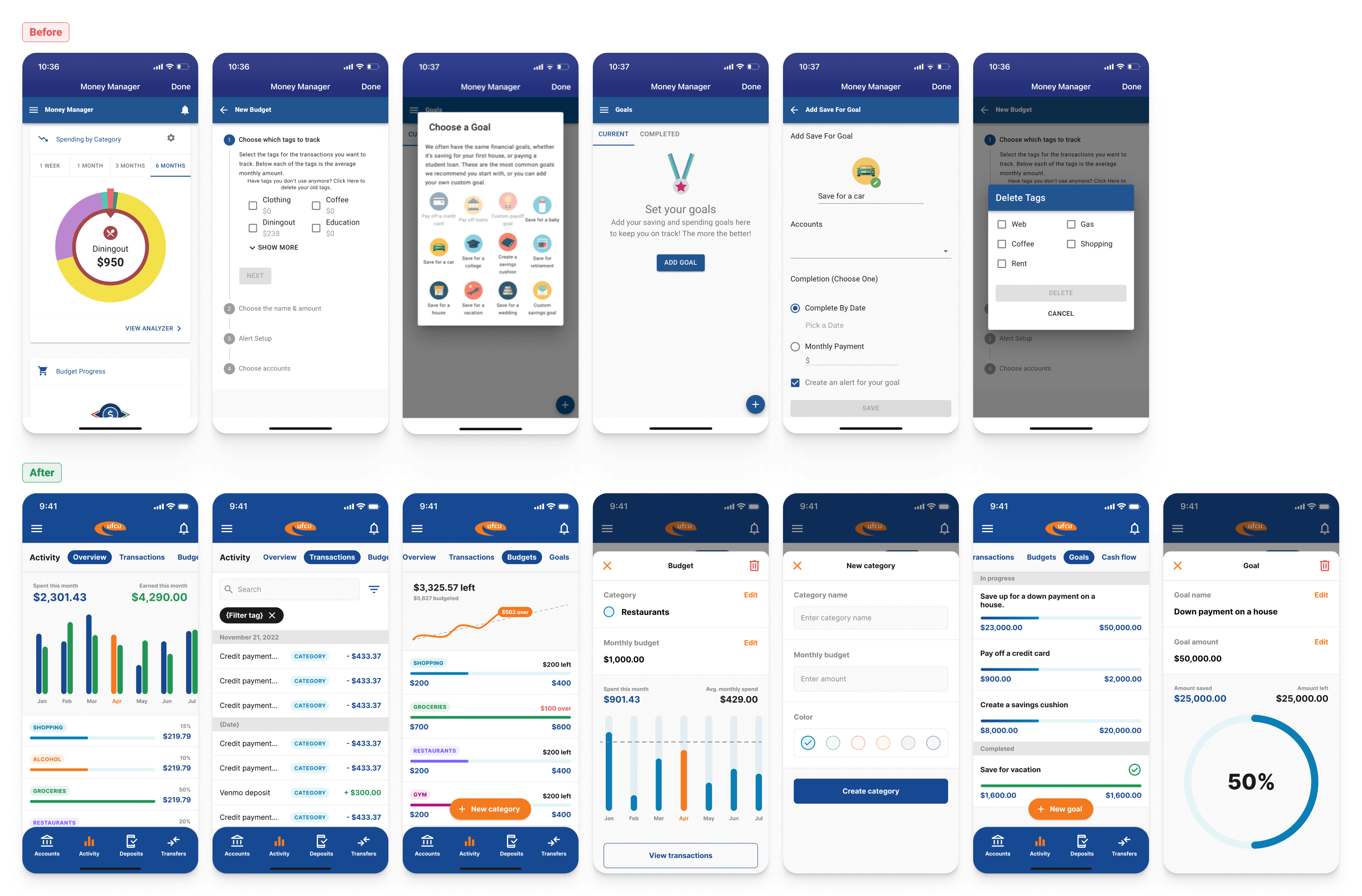
Spending and activity
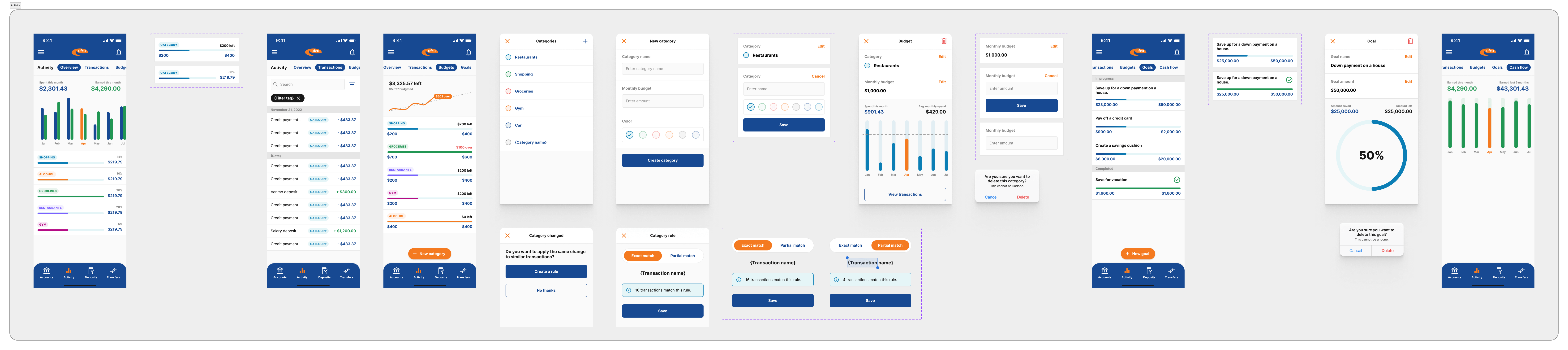
The activity section has been completely redesigned to be integrated into the product. The previous app was designed where transactions in the Account section were not managed the same as from the "Money Manager" section. The two remained separated, which meant maintaining two separate records of transactions, that were otherwise the same thing. I renamed this product space from "Money Manager" to Activity. Now users can manage transactions on an account level from Accounts, or on a transaction level from Activity. Activity allows the user to see all transactions by date, across accounts.
Skills & competencies
Key areas of expertise and methodologies applied during this project.