

Shopify • Lead Designer • 2022
Clarifying value for millions of merchants
Shopify's pricing page had not been worked on since 2019, aside from a few minor color updates. The user experience of the page was not great, especially on mobile, and it was difficult to understand how one plan was differentiated from another. The research team outlined a number of improvements to be made, from social proof elements (like logos) to a better feature table. I led the design on this project.
0:00 / 0:00
Problem
User research has revealed that users struggle to comprehend the unique value propositions and distinctions between each plan. Additionally, the interface is marked by confusion, featuring unexpected user interactions that have resulted in a decrease in sign-up conversions.
Proposal
Redesign the pricing page on Shopify.com to improve the user experience, match the rebrand, increase conversions, and more clearly explain the pricing plans and feature gaps between the plans.
Impact & outcomes
The strategic redesign clarified plan differentiation and streamlined the decision-making process, directly contributing to improved sign-up conversions and user confidence.
Monthly page views
50m
The pricing page is one of the most popular pages on the website with million of views.
Conversion rate optimizations
40+
Improvements to the information architecture and overall user experience.
Legacy design
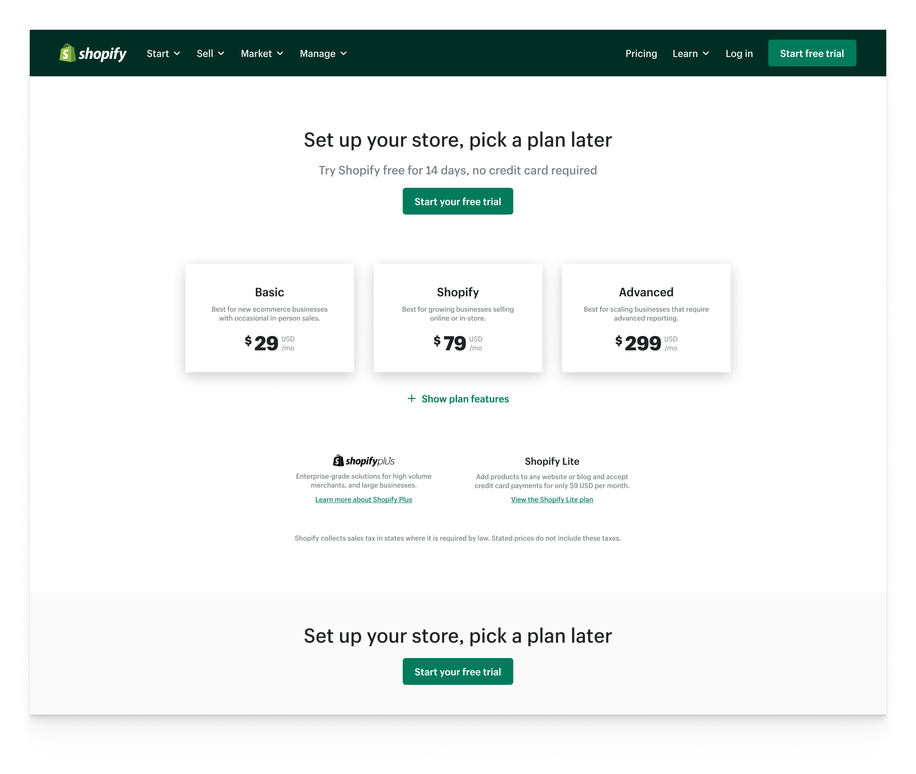
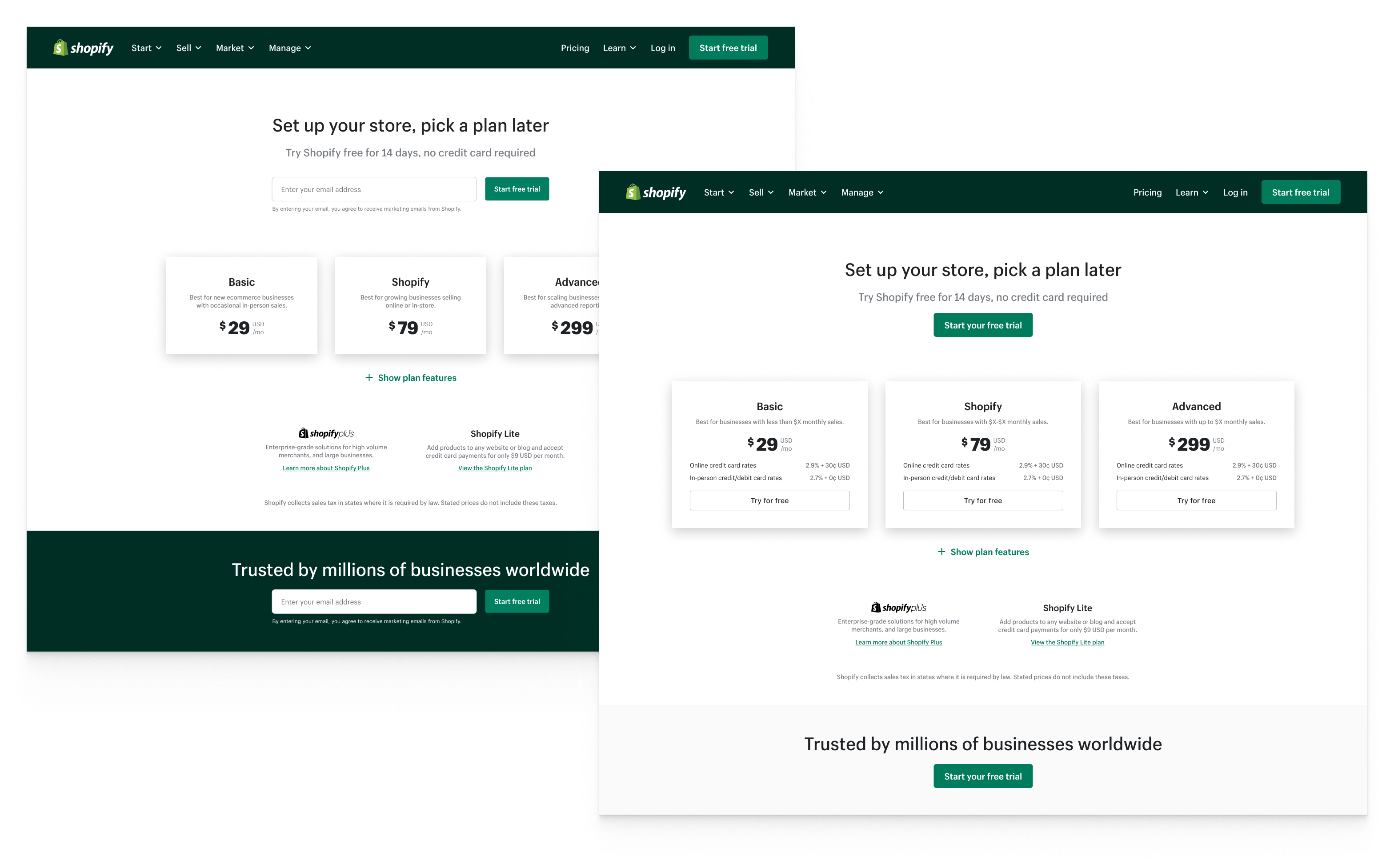
The legacy (current) design had not been worked on in nearly two years. The plans did not present the monthly/yearly discounts, high-level plan differentiation, and some of the features were vague and incorrect in the feature table. The CTA's were not prominent enough, and the plan cards themselves were not clickable. Additionally the feature table was hidden below the plan cards, so it was difficult to find where/how to compare plans.
2012 to 2020
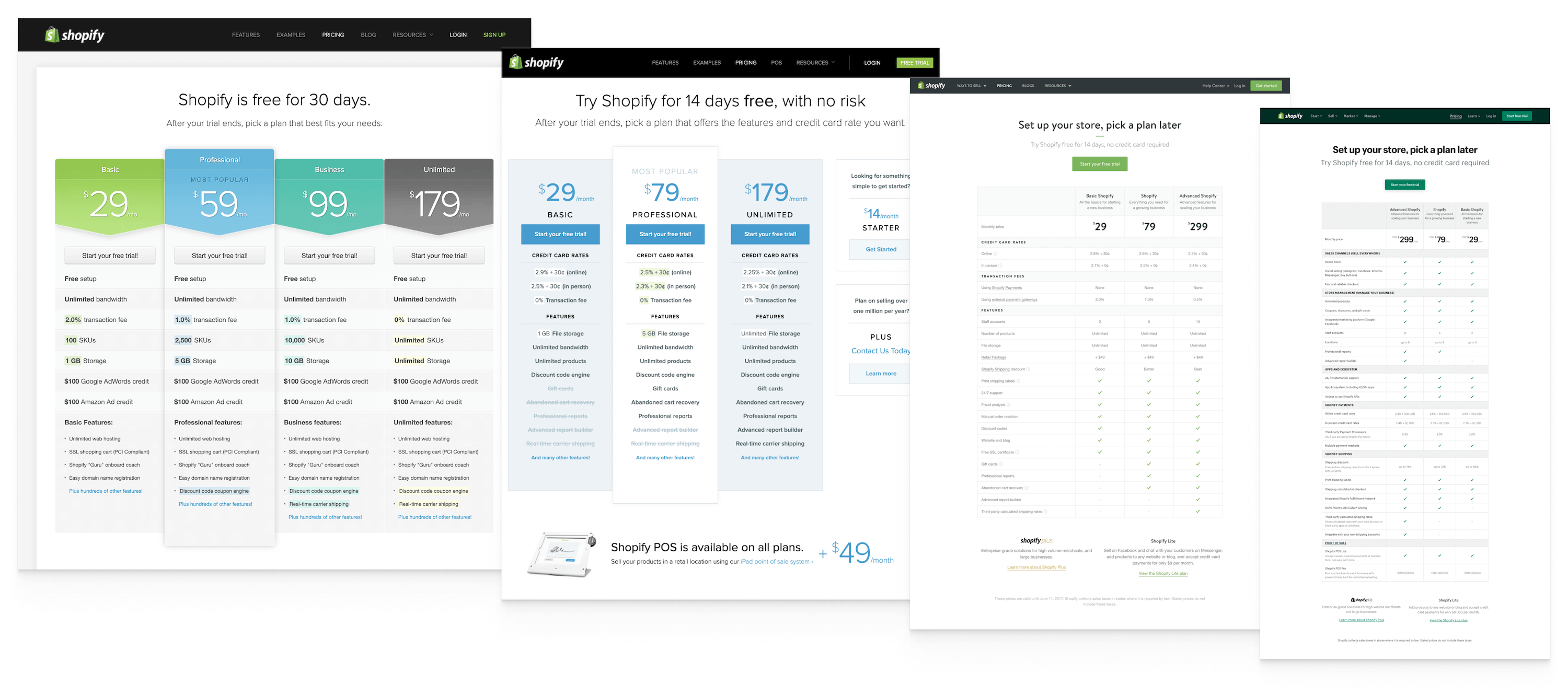
The evolution of Shopify's pricing page is interesting to analyze. The plan names themselves changed over time, as well as the price points. The layout of the page changed as well. Originally the plans were displayed in vertical cards, later replaced by a feature table, and then finally by 3 smaller plan cards with no features. I wanted to take the direction of the pricing page back to the earlier vertical plan card layout, but with the later feature table below.
User research & competitor analysis
The research team interviewed a number of users, leads, and volunteers across industries and demographics. One of the research questions was what each participant's expectation of a pricing page was, and what they wanted to get from this page. The majority expected to see the pricing (of course), but also the feature table, to be able to compare the plans relative to their price points. Additionally, participants expressed wanting some reassurance (social proof) to inspire confidence in the prices and features they were seeing. The research team also presented that users in international regions were not as familiar with industry terms we are accustomed to here in the United States, so including some definitions of some key terms would be helpful.
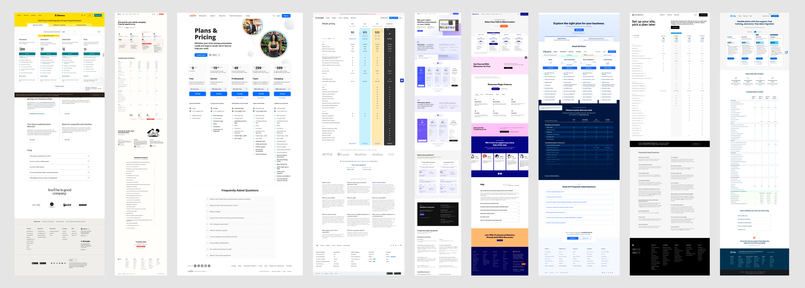
I did a review of a number of competitors pricing pages, from Zapier to Airtable to Mailchimp, etc. The monthly/yearly toggle (with discounts), feature table, column layout, CTA's in each plan card, and FAQ design and components were consistent across all designs, which helped further validate that direction.
Conversion rate optimizations
In order to validate certain user interface directions we ran several CRO tests with the United States audience. These tests included changing the "start your free trial" button to including an email field, adding credit card rates to the plan cards, adding a CTA to the plan cards, and including a high-contrast CTA section below the plans. These tests all performed much better than the control, and helped guide the redesign.
One of the primary goals of the pricing page redesign was to communicate more clearly and effectively with users. This page is a resource page, as well as a marketing page.
Redesign
The audience for this page is vast, spanning casual shoppers, new leads, competitors, and even current paying customers looking to see if they should upgrade or downgrade. We needed to do a better job explaining what was included in each plan, and how these different features influenced the price.
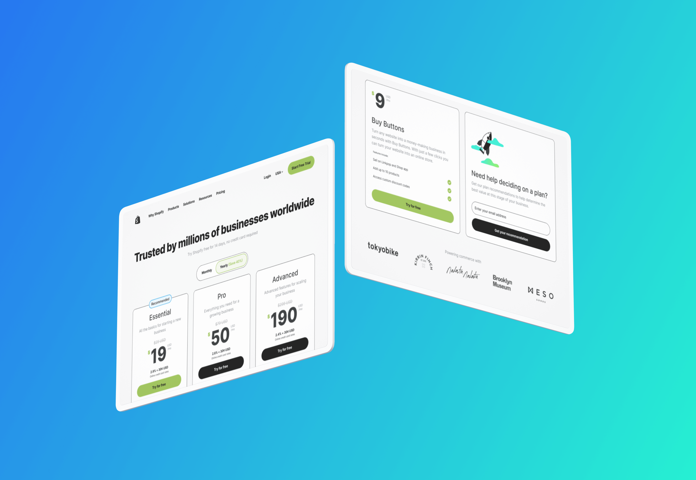
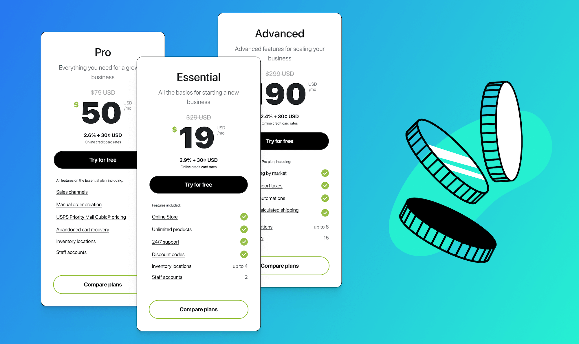
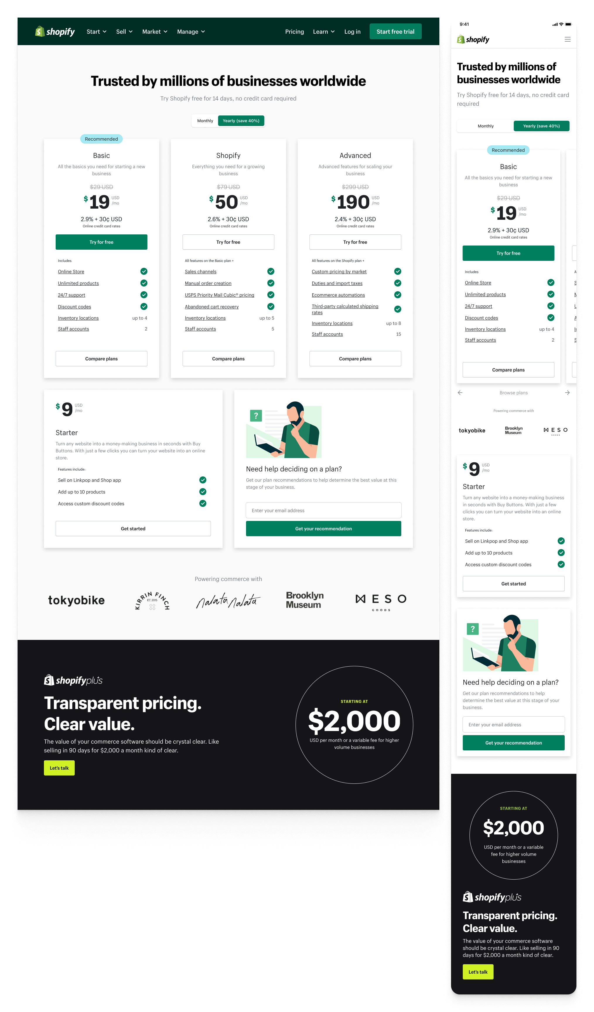
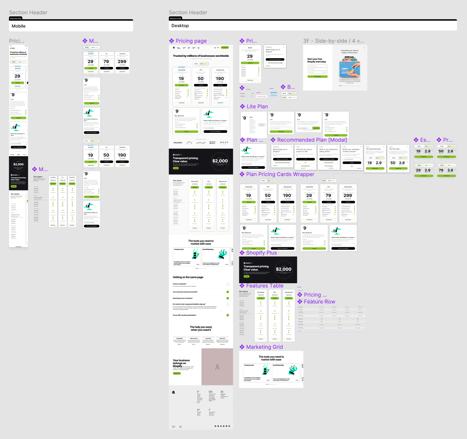
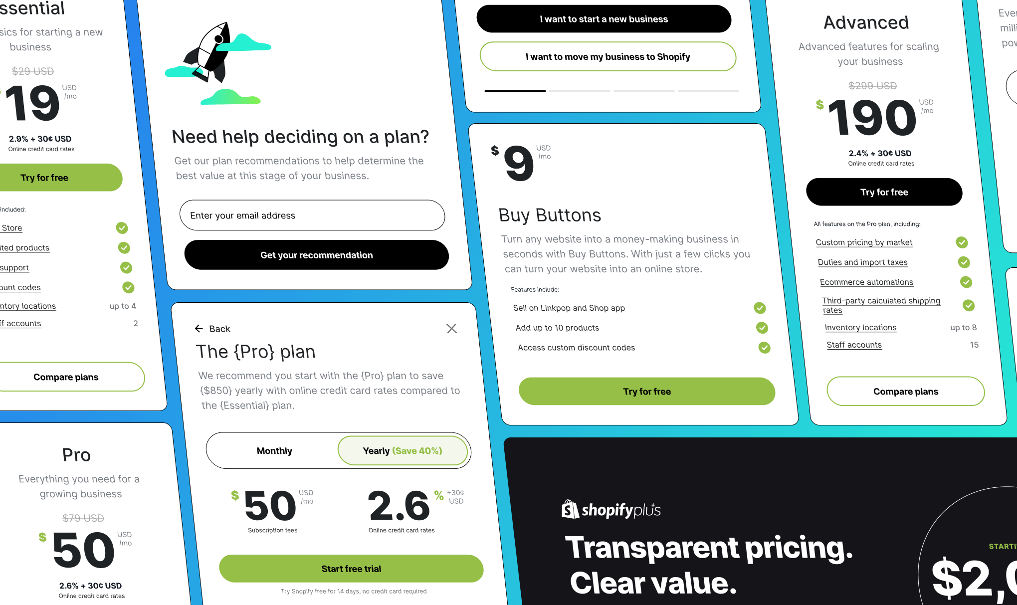
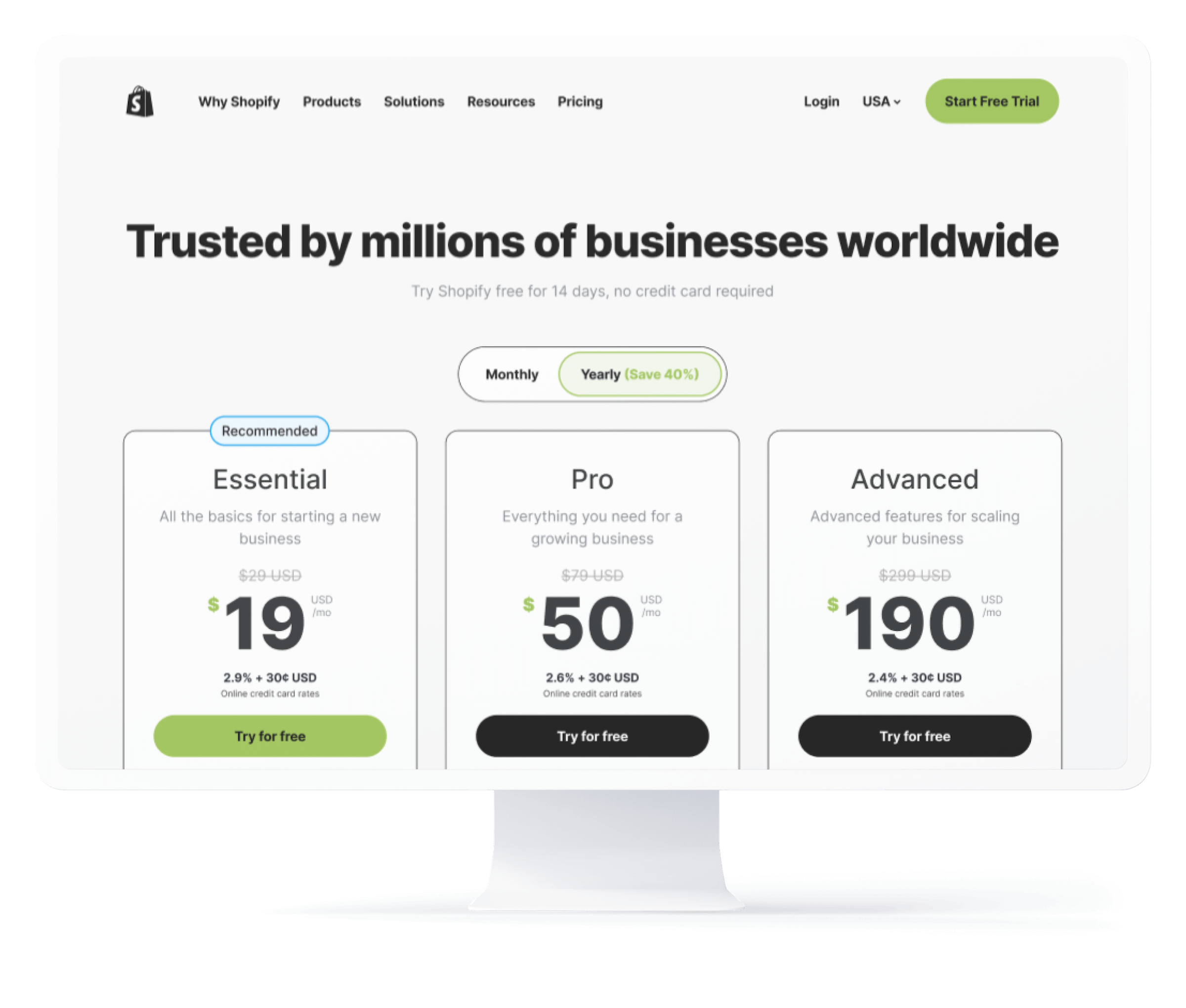
Following up on the CRO experiments, the redesign introduced credit card rates in the plan cards, free trial CTA's for each plan, a "compare plan" button to navigate the user halfway down the page to the feature table, the main features for each plan (in each plan card), tooltip definitions for key terms, a monthly/yearly toggle and discounted rates, more prominent plan cards, social proof logo garden, a recommended badge, a more bold headline, and a better user experience on both desktop and mobile.
Shopify Plus was made as a full-width section on the page, further differentiating that plan from the others (since it's at a significantly higher price point), as well as featuring it more boldly and prominently.
Rebrand design updates
The layout of the pricing page was explored and validated with the existing (legacy) branding, so the rebrand was a simple matter of "reskinning" the pricing page components with the new style. In general the new brand is bigger and more bold, so heavier font weights, no drop-shadows, more border-radius, new green, etc. The biggest changes came with the addition of new content blocks, that the research team presented would help, including a higher-level feature block, a support section to showcase all of those resources, and a footer CTA section (before the actual footer). With this work done, this page is ready to be launched with Shopify's new branding!
Skills & competencies
Key areas of expertise and methodologies applied during this project.