Shopify • Lead Designer • 2022
Streamlining the admin checkout experience
The checkout flow for choosing a plan in the Shopify admin required a redesign to accommodate changes in the product and the onboarding process for new users. Furthermore, several user experience enhancements were necessary to be implemented as fixes to further enhance the lead-to-customer acquisition ratio.
Listen to case study
Loading case study audio...
Problem
The user interface is causing confusion and frustration among users, resulting in low conversion rates to paid customers. Users encounter difficulties understanding the specific plan they are signing up for. Internally, the payment components are outdated and do not accommodate all international payment methods across different regions. Each regional payment component is managed by a separate team, which is inefficient and difficult to maintain.
Proposal
The objective is to enhance the user experience and improve the conversion rate of the Shopify admin checkout for both new and existing users managing their subscription accounts. To achieve this, a redesign of the checkout components is necessary to ensure they can be easily integrated across the platform, from sign up to failed billing to core settings. Additionally, this redesign will include user experience optimizations as fixes to further boost lead-to-customer acquisition rate.
Impact & outcomes
By redesigning the checkout experience, we improved clarity and usability, resulting in higher conversion rates and better user satisfaction.
Lead to customer
+24%
UX optimizations led to an increase in customer acquisition.
Cross-functional teams
6
Coordinated design across billing, retention, activation, plans & pricing, and core teams.

UX goals
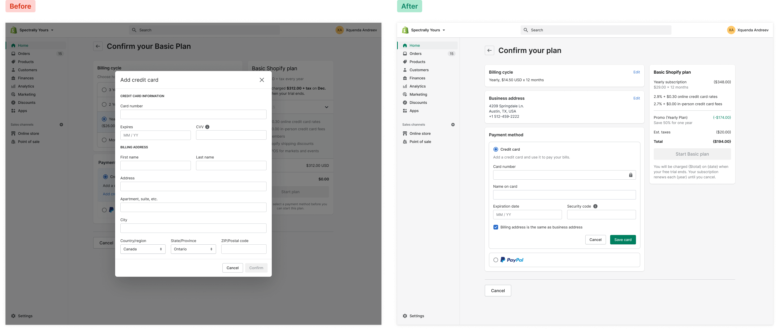
The main focus of this project was to enhance the user experience by revamping the user interface. The objective was to provide users with a clearer understanding of the plan options they were choosing. The existing interface lacked a confirmation prompt for users before initiating their selected plan, leading to a significant volume of support inquiries and customer turnover. As part of the improvements, the team aimed to eliminate the separate credit card input popup and integrate it seamlessly within the interface. Furthermore, the project included enhancing usability through consistent typography, streamlined layouts, and clarified content presentation.

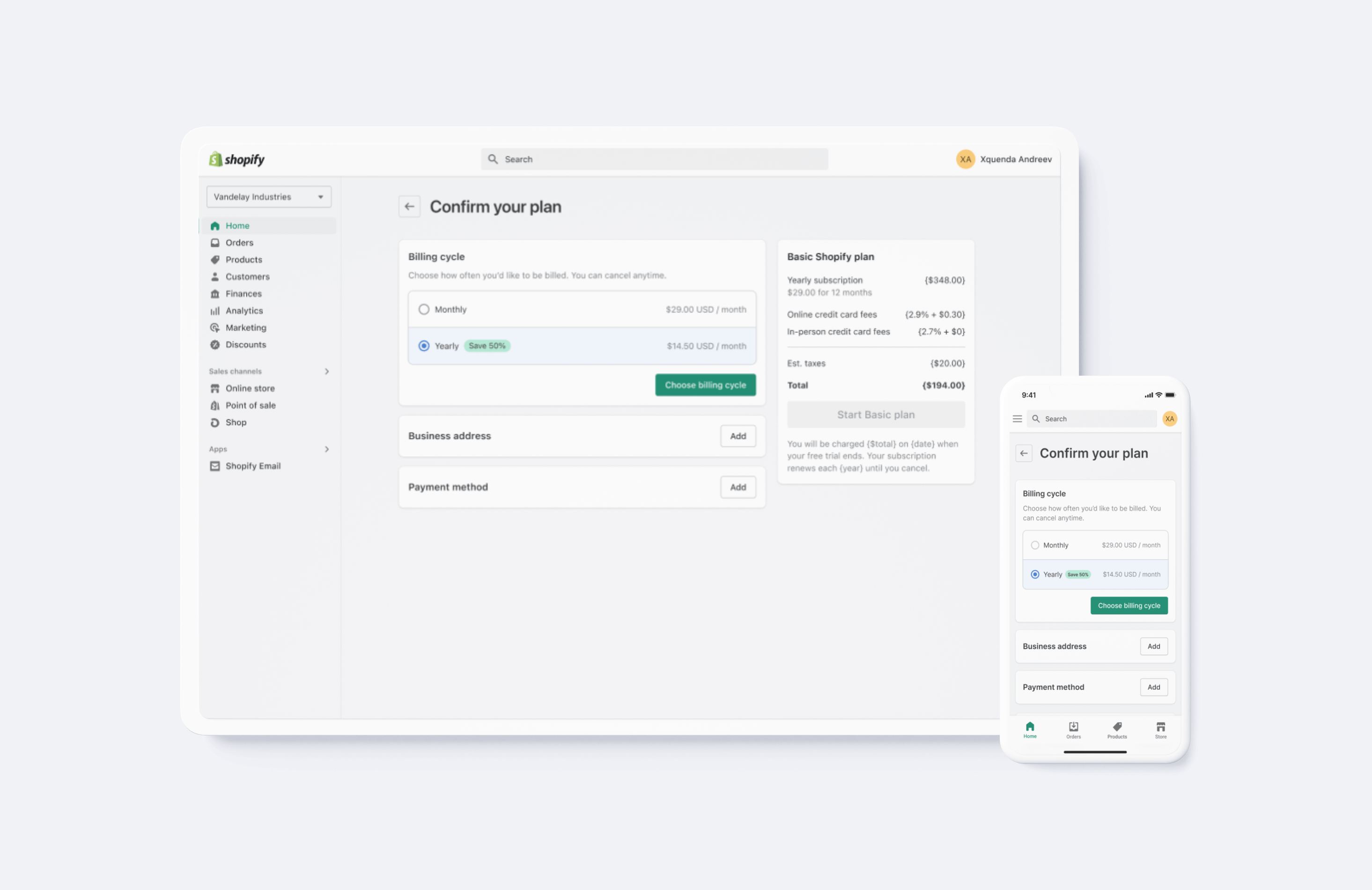
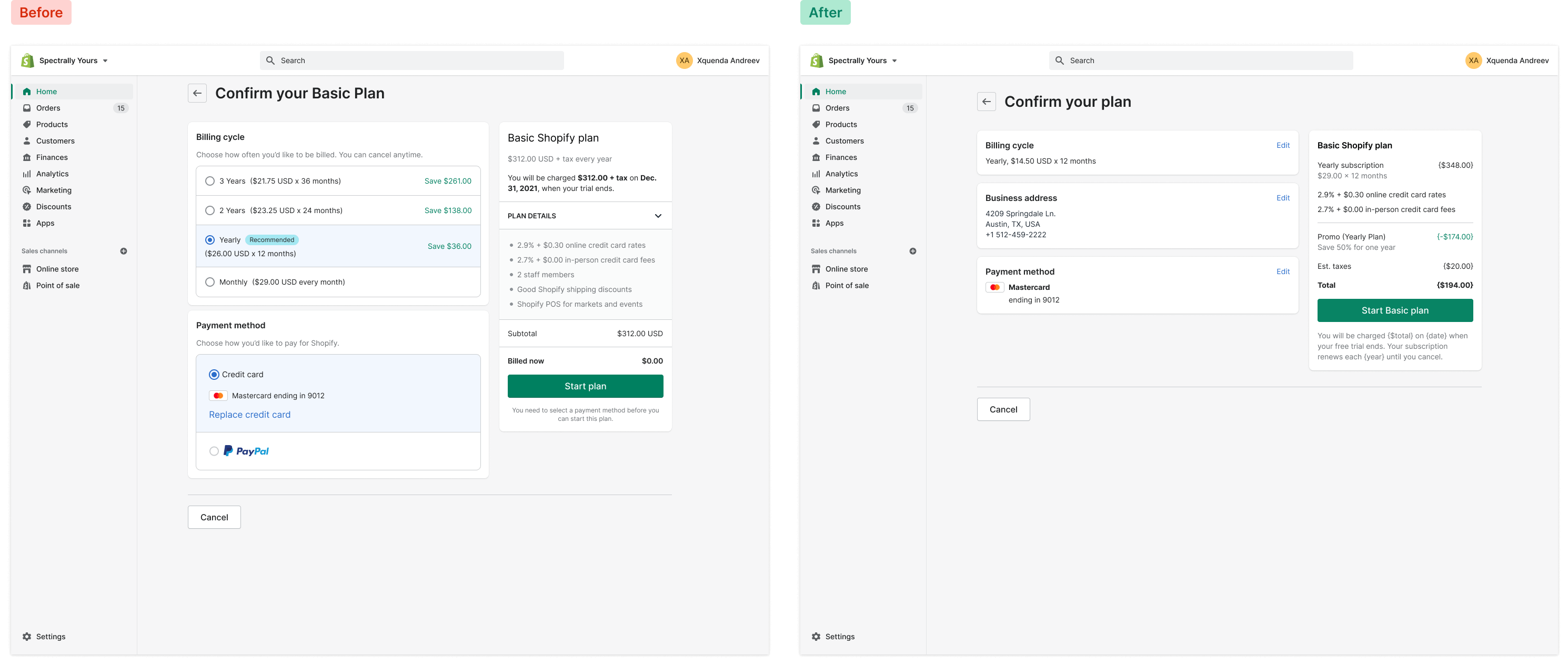
Billing cycle
The legacy checkout experience had a billing cycle component that offered options ranging from monthly to three-year billing cycles, causing cognitive overload and decision fatigue for new users signing up for a plan. There was a "Recommended" badge on one of the plans, which was unclear. The "Save $" info was not based on the monthly billing cadence, along with additional unnecessary information cluttering the presentation.
The legacy components and poor user experience presented multiple issues that required a redesign. Certain product decisions were still in place due to outdated experiments, while others had undergone iteration by different teams for disconnected outcomes.
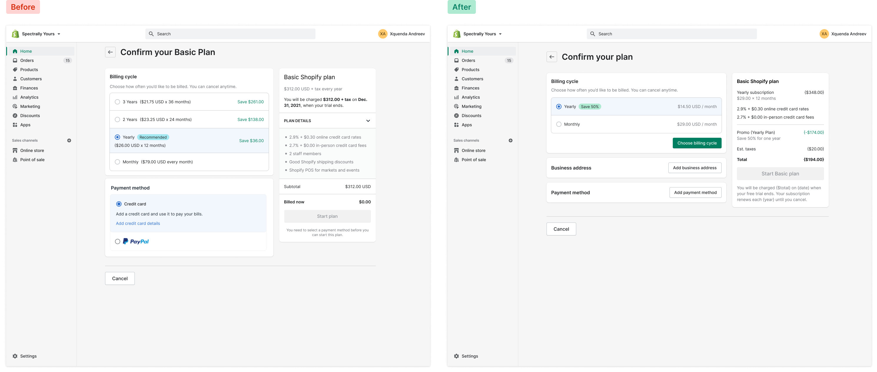
Less than 1% of users interacted with the longer billing cycles, guiding a redesign that reduced decision fatigue and improved checkout conversions. The "Recommended" badge was replaced with a discount percentage badge, and the component now has a default, active, and selected state, requiring users to confirm their selection to prevent unnoticed selections leading to downgrades or churn.

Optimizing payment methods
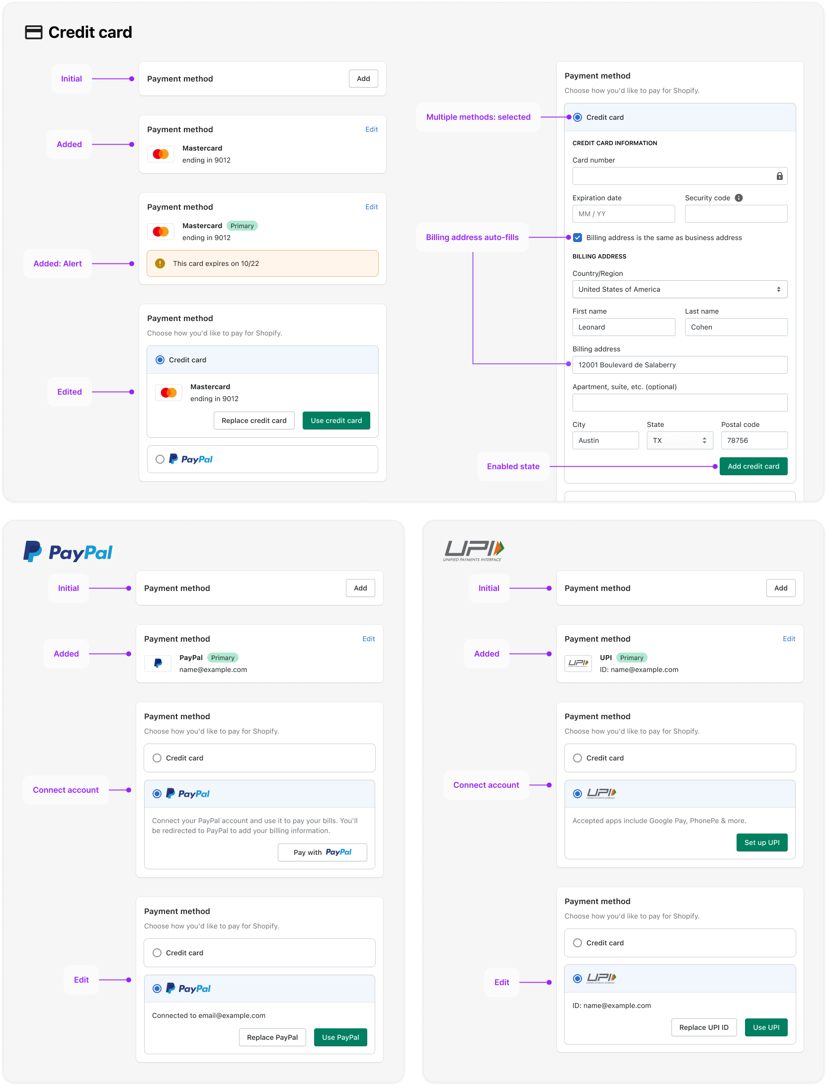
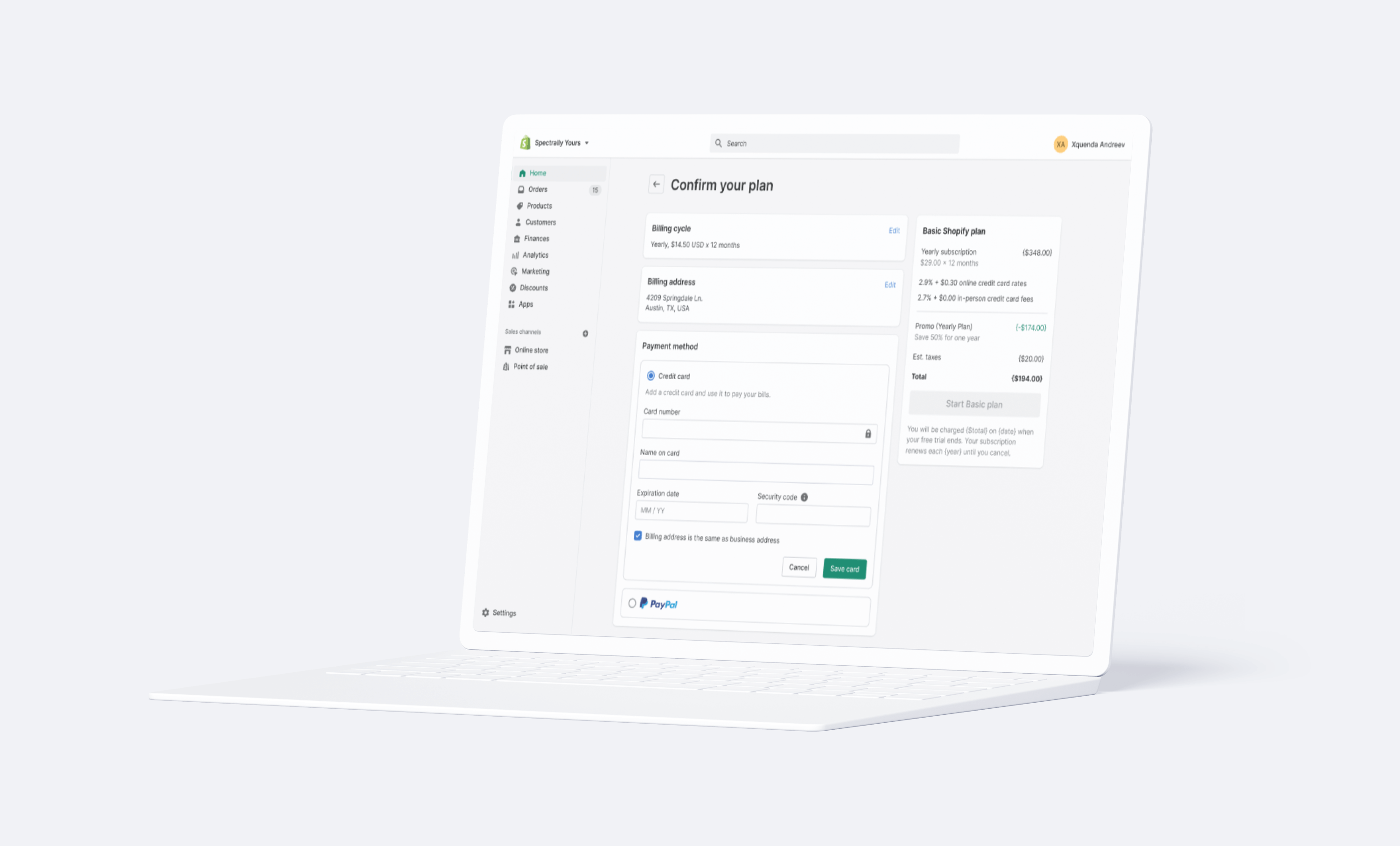
The primary improvement made to the payment method was to bring the credit card input form inline, instead of launching within a modal. With the new inclusion of the business address in the checkout flow, we can now introduce a shortcut in the credit card form, to auto-apply the business address via a checkbox (which also hides the address fields). The condensed state of the payment method was introduced, along with a "save card" (or payment method) button, to bring payment method validation earlier in the checkout flow. Additionally this payment method component was redesigned to be extensible across the entire Shopify ecosystem for all teams implementing a checkout flow.
Each payment type requires it's own user flow, from adding a credit card (and the technical and security considerations), to integrating an oauth to connect PayPal, to connecting the UPI payment method (in India) as an async connection, to connecting ACH payments for the Shopify Plus team. The payment method component needed to account for multiple states, validation warnings and errors, and user moments.

I worked with several teams to ensure all of their use-cases were met, and the component could be extended seamlessly with the introduction of any new payment methods in the future.
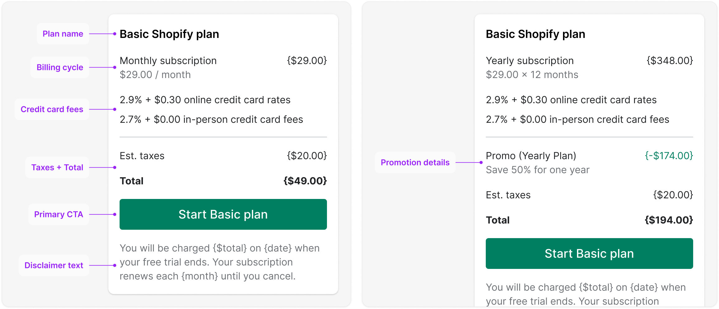
Summary card
The plan summary card requires several improvements. Firstly, the total amount to be charged is redundantly displayed at the top and bottom of the card, which should be addressed. Furthermore, the phrase "Good Shopify discounts" is unclear and does not sufficiently explain the meaning of this value. The plan details are also unnecessary since they repeat information already presented in the preceding "pick a plan" flow. Moreover, the label "Billed now" is inaccurate, as users will be billed once their free trial ends, not immediately.

To resolve these issues, the redesign involves the removal of redundant and unnecessary information, including the toggle component, subtotal, and alert messages. The typography treatment has been updated to ensure consistency with the design system. Changes have also been made to the copy, such as providing details on credit card transaction rates, estimated taxes, and allowing more space for promo descriptions to wrap to a second line. The plan name has been included in the "start plan" CTA, and the disclaimer text has been moved below the primary user action.
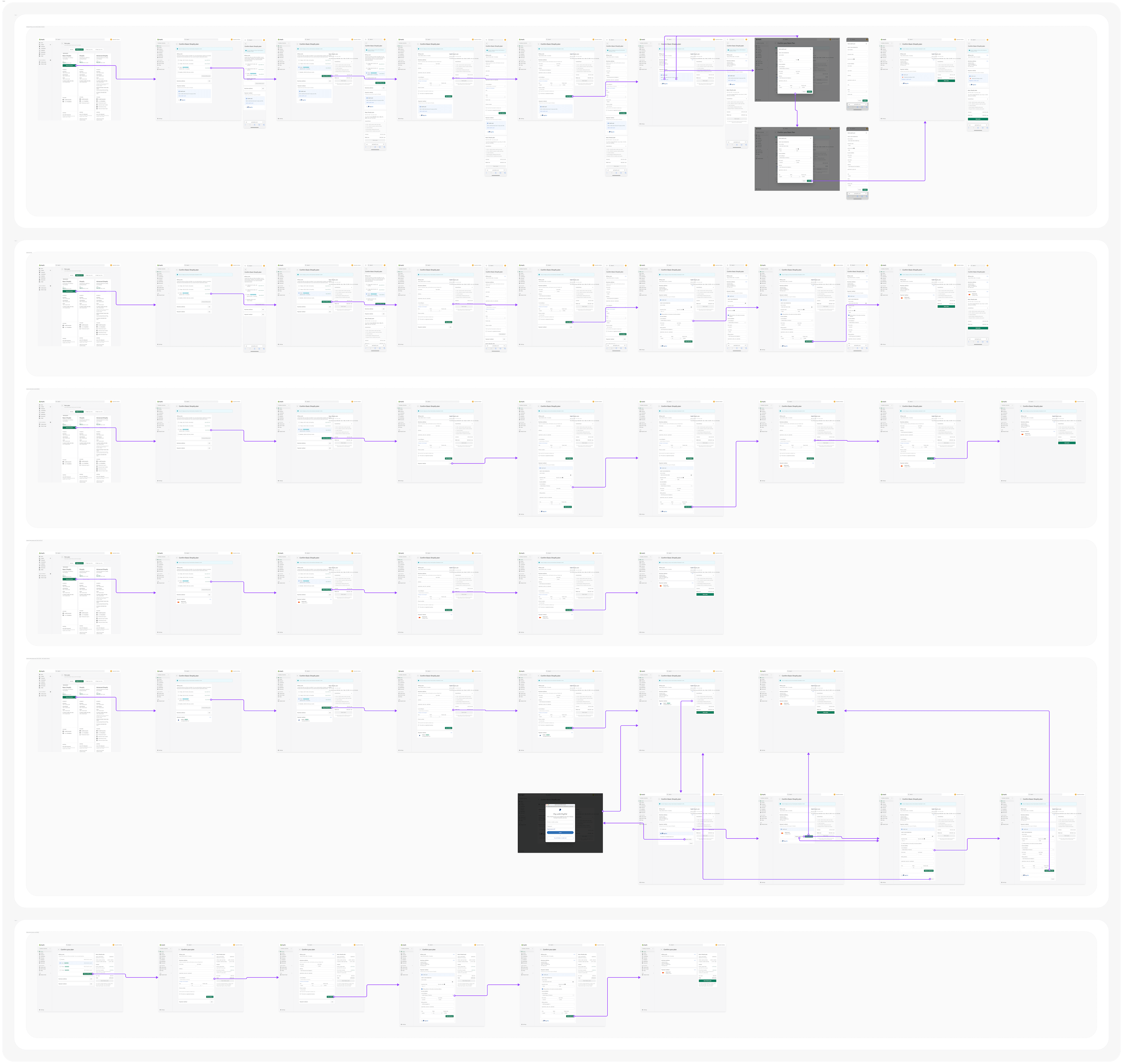
Checkout review
The redesigned checkout experience is now more efficient, streamlined, and consistent across all user interactions and components. Immediate validation for each input form has been implemented through a step-by-step process, making the information architecture clearer and easier to understand. This redesign eliminates the nesting of redundant information within components, simplifying them and enhancing their effectiveness.
The extensibility of each checkout component now allows for use across the Shopify admin and in other user flows, such as the "failed billing" flow, to streamline the user experience and accommodate design needs.
Sequencing release phases and experiments
Phase 1 is an immediate release to ship fixes to the outdated user experience. Although the billing cycle component was identified as problematic, it was deprioritized to phase two to expedite development. In phase 2, the new billing cycle and summary card components will be launched, resulting in a cohesive and revamped core checkout experience. Subsequently, two experiment proposals have been put forth: one to examine if reducing the number of billing cycles will improve conversion rates during the checkout process, and the other to test if incorporating a "how did you hear about us" survey in the checkout process will increase engagement.
Skills & competencies
Key areas of expertise and methodologies applied during this project.